Premier League websites and UX: the good and the (very) bad
The websites of Premier League clubs can seem like a throwback to the old days of the web at times, retaining some features and design elements that most retailers left behind a long time ago.
In this post I’ll look at some of the good and bad from the 20 Premier League websites. I can tell you there’s plenty of room for improvement, but also some lessons to be learned from the better sites.
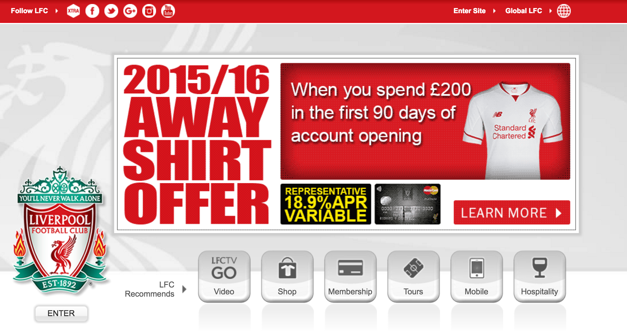
Splash pages are a relic of the early web – mainly used to promote a particular product or aspect of the site, to display key information or advertising.
They are largely pointless and hated by users, yet six of the 20 clubs use them. Here are examples from Liverpool, which wants to encourage its loyal fans to sign up to its credit card, with the lure of a free away shirt…
…and Tottenham, which plugs its third kit:

The point is, they offer an unnecessary step between the user and the home page.
It’s one more page to load, ‘enter site’ buttons are often the least obvious link (see Liverpool example above) and there is nothing that couldn’t be promoted on the home page if it’s that important.
A good question to ask here is what your users are coming to the site for.
Here are my guesses:
Based on these, it should be relatively simple to signpost the way to these features for new visitors. It isn’s always the case though, and many home pages end up cluttered and confusing.
There seems to be a desire to cram everything that may be relevant onto the page, with the result being a mess. For example, Man Utd’s site is 40% ads above the fold, with the rest of the content seemingly arranged without much thought.

By contrast, the football on the pitch may be poor, but Sunderland’s home page does a much better job of signposting its content and sections to visitors.
The ‘hero’ image allows the various links and messages to stand out, which means the links to buy or book products (season tickets, kit, hospitality, hotels etc) are clear.

This can be an incredibly frustrating experience and one you would think clubs would pay more attention to.
For example, after clicking the ‘tickets’ link on the LFC homepage, I get this page, which seemingly has nothing to do with tickets.

It turns out that there’s more further down the page (below the fold), but I wonder how many users think they’ve arrived at the wrong page here.

I encountered a similar issue on the West Ham site. Clicking on ‘buy now’ from the page below just sends me back to the same page. It turns out that, after clicking ‘how to buy’ you can find a link to a separate ticket site, but this isn’t obvious at all.

There is a lot of confusion around ticket sales, for the casual site visitor at least. On some sites, it seems a membership is necessary, while others may simply not sell to non-members online.
The common factor is that none of this is clearly explained, and even getting to the point of finding out about ticket availability is hard work.
For example, I need to register on the SAFC site before I can even view tickets:
I don’t have to do this on Hull City’s site, but the selection screen is baffling:

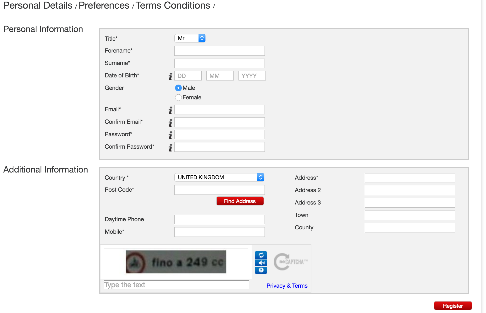
As is that on LFC. They have to work hard to explain it, which shows how confusing it is.
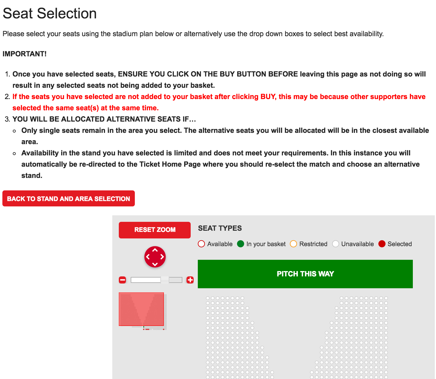
The best I found was from SAFC, in which you can at least relate the tickets you select to where they are in the stadium.

All in all though, buying tickets on these sites isn’t great for users. I imagine clubs rely on the fact that loyal fans will figure the process out and, after all, Liverpool fans frustrated with the ticket experience aren’t going to defect to Everton.
However, though some clubs will sell out for most matches and sell the majority of seats to season ticket holders, there are still plenty of clubs who could make some extra match day income by selling out their spare capacity online.
Selling merchandise should be simple enough, and clubs should be aiming to match the user experience offered by the best online retailers.
This means easy navigation and product selection, good clear product images and information, followed by a smooth checkout process.
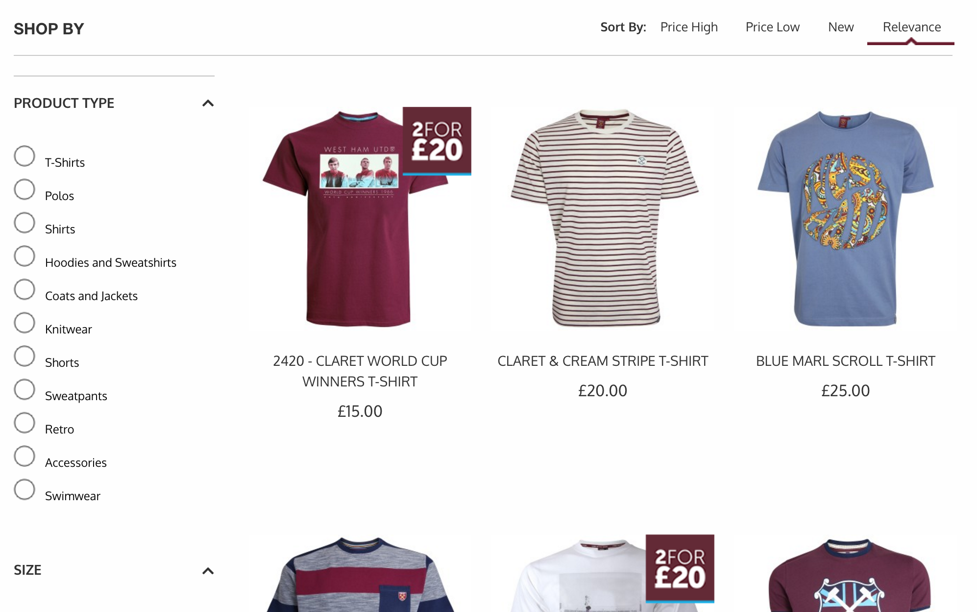
West Ham’s site gets the first part right, with clear filtered navigation to allow customers to narrow their product selection by size, product category, price etc.
On the Liverpool site, just finding the right online store is a challenge. Surely it would have been easier to serve the best store based on user location?

Product pages are reasonably good too on most sites, This from Everton does the basics well, clear product images, information on delivery, and clear CTAs.

Delivery offerings aren’t always the most competitive though. Here, Chelsea charges £4.95 for standard delivery, and the same for click and collect, even though most retailers would offer this free of charge.

A common feature here, especially as many clubs are using the same ecommerce platform, is the insistence on making users register before they checkout.
It may make sense for ticketing, but it’s a clear barrier to purchase here, so a guest checkout option would be preferable, or at the very least worth testing. No evidence of guest checkout on the sites I viewed though.
The obvious conclusion is that most sites have a lot of work to do. Many seem to suffer by trying to do many different things at once, which leads to confusing homepages and navigation for users.
Many have also failed to learn the same user experience lessons that other online business have over the past decade or so. This may be an obvious consequence of the fact that TV revenue dominates so much that online ticket and merchandise sales may seem less of a priority.
Or it could be that may clubs have a captive audience to an extent, so improving things like the ticketing experience may not seem worthwhile for clubs.
However, with the sales to be had, not just in the UK but around the world, I’d say that improving the user experience and with it online sales, should be a priority for clubs.
By offering such a woeful online experience, many clubs are effectively leaving money on the table. Others have reasonably good sites, but I’ve not found any without any room for improvement, much of which is relatively easy and cost-effective with the right digital strategy.
Leave a Reply
You must be logged in to post a comment.