14 ecommerce best practice lessons from Schuh's website
When writing about ecommerce, there are a number websites I can rely on for best practice examples to use. One of these is Schuh.
Whether its examples of a great delivery offering, use of responsive design or product images, Schuh is likely to feature.
It’s a mark of the retailer’s all-round excellence online (and across channels for that matter). So, I’ve decided to look at the lessons others can learn from Schuh…
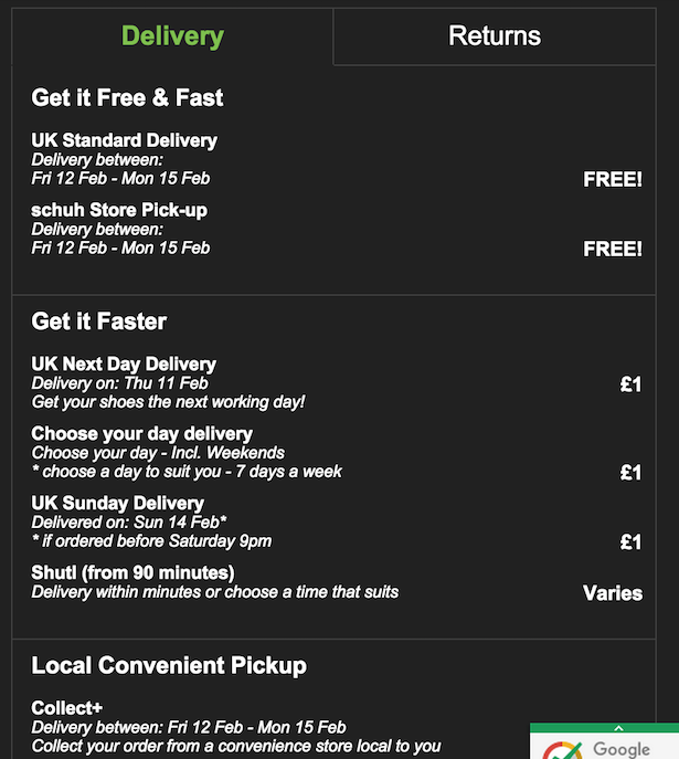
Customers expect more and more from ecommerce delivery now.
Some want free delivery, which is a compelling proposition for any retailer to offer, some want the convenience of click and collect, while others are prepared to pay a little extra to have items delivered faster or within a specific time slot.
Schuh does a great job of covering all of these bases. Here’s what its delivery proposition looks like:
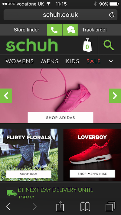
Schuh noted the growth in mobile over the past few years (both for its own site and ecommerce in general) and decided upon a mobile-first approach.
It launched its first mobile site in 2011, and then worked on an improved responsive version more recently (2013-14), which I documented here.
This is the site you see now, and it works very well indeed. It’s simple, yet replicates the main functionality of the desktop site, with extras for mobile such as store location tools.
Site speed and general performance matters a lot. There are plenty of stats doing the rounds on this. For example, a one second delay in page response can reduce conversions by 7%.
The real effects will vary from site to site, but Schuh has focused on performance because it knows this affects the bottom line.
So, in advance on Black Friday this year (which had, of course, knocked over many ecommerce sites) it was testing and optimising speed for the Black Friday traffic surge.
It worked too:
Cyber Monday performance: 79% of our *mobile* customers had a page load time of 1.5s or quicker. 93% in under 3s. #webperf cc @OptimiseOrDie
— stuart mcmillan (@mcmillanstu) December 1, 2015
The use of autocomplete helps users to carry out more accurate searches, while Schuh adds images of selected products (best sellers perhaps?) to offer further options.

Some shoppers require reassurance about payment security, even though Schuh is a well-known brand.
It expresses this in a number of ways. There’s the Google Certified Shops badge which is shown at the bottom right of every page.
It offers protection of up to £1,000 for buyers, and also leads to reviews from previous customers on delivery, customer service and other measures.
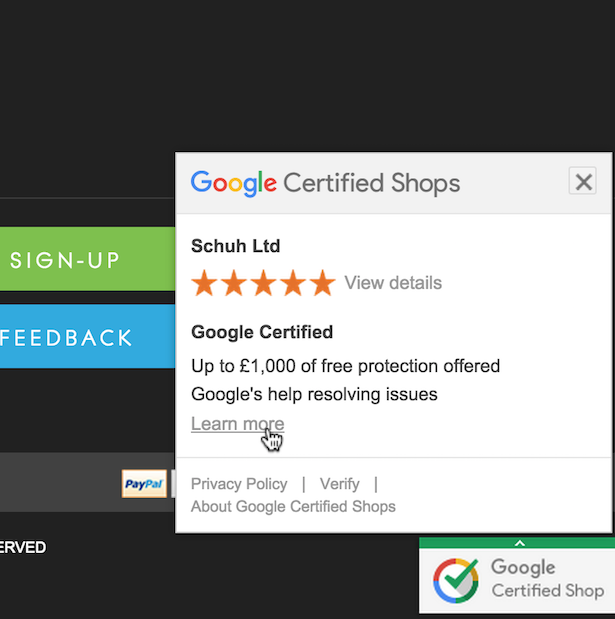
It has two main benefits: the persuasive power of a trust mark from a well-known brand like Google, and it provides the chance for Schuh to show off its service metrics, which are excellent.
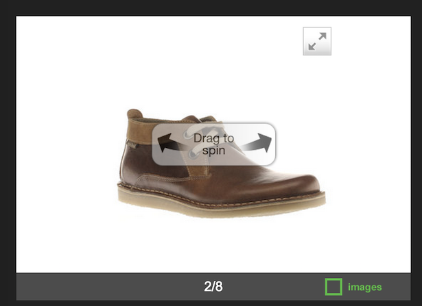
Schuh uses product images very well. They’re high quality, and shown from a range of angles, allowing users to gain a more accurate impression of the products.
There’s a zoom tool and a 360 view. In short, everything customers need from product images.
Significantly, mobile users have the same options.
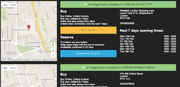
Schuh’s click and collect service is as good as any out there, and I speak as someone who has used it several times.
There are a number of features which raise it above others out there:
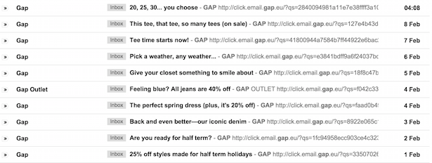
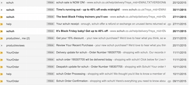
Unlike some retailers, Schuh doesn’t blast out millions of sales emails every day.
Gap, for example, sends one a day or more. It also seems to have a perpetual sale, which reduces the impact of this tactic.
Schuh doesn’t overdo it (in fact, I could receive a few more without being annoyed by it) and it doesn’t uses sales as a regular tactic.
I received one around Black Friday and another before Christmas. This tells me that, since they’re less frequent, these sales actually mean something.
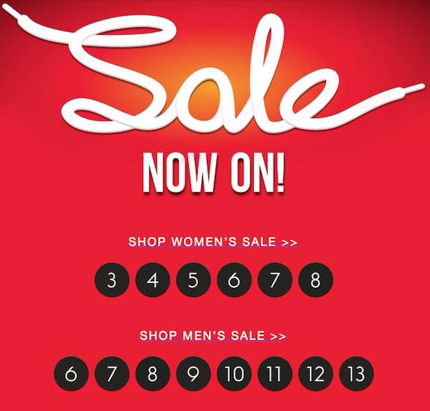
Then there’s little details which make life easier for customers. For example, the sales emails list men’s, women’s and kids’ sale shoes by size.
So, customers can head straight to the relevant section of the sale without having to navigate there once on site.
It’s a smooth checkout process, on mobile and desktop.
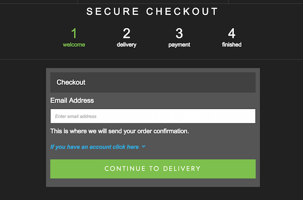
I could write a whole article on the good points in checkout, which minimise the chance that customers will abandon purchases.
Here are just a few:
The key with checkout forms is to reduce the amount of work the user has to do to complete a purchase, and thus the level of frustration.
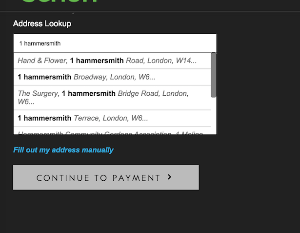
Little touches like removing work from address entry really helps.
Here, instead of having to enter the full address, or even house number and postcode, I just begin typing and the lookup tool does the rest.
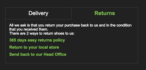
Schuh’s returns policy is nice and easy: 365 days to return items, return to store or head office, whichever you prefer.
It removes a potential barrier to purchase, and removes the risk of annoying customers with nit-picking policies.
Yes, Schuh has great returns policies, and excellent delivery options, but it makes the most of these – and uses them as a sales driver – by reinforcing these messages throughout the site.
So, we have prominent messages on things like next day delivery for £1 and easy returns, and these policies are also displayed clearly on product pages.
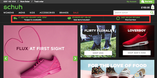
It makes sure customers know about these policies, and saves them having any questions before they make a purchase.
This is partly a reassurance of security – if a site makes it easy to contact them, they’re more likely to trust it.
Also, it’s about customer experience, and helping to drive sales by being there to answer any customer questions and address any concerns they may have about making a purchase.
So, we have clear contact numbers on every page, as well as a live chat option. Crucially, response times are good too.

This is perhaps the most important lesson of all. The ecommerce team behind Schuh don’t just design the site and leave it.
They’re regularly testing and improving the site, looking at things like performance in advance of key sales periods, and learning from others.
Their team is active at industry events and on social media, discussing best practice, sharing tips and data.
Creating an excellent ecommerce site is about continuous improvement, and Schuh’s team is well aware of this.
I could have gone on and got to 20 or more lessons, but I’ll stop at 13.
Individually, you can find these features on many ecommerce sites, but they’re often let down by poor user experience in other areas.
What sets Schuh apart is that it gets most things right. If you want to find a good way to do something, you could do worse than look at Schuh (and maybe copy it).
This is why it offers great lessons for other retailers.


