#ClickZChat: What makes a great ecommerce checkout process?
As you’ve no doubt heard, we recently released the new ClickZ Intelligence Checkout Optimization Report, so this week I thought we’d tie in #ClickZChat and see what our Twitter followers had to say about ecommerce and conversion optimization.
Quite a bit as it turned out…
One hour to go! Today’s #ClickZChat will be all about Checkout Optimization – join us at 5pm UK / Noon Eastern. pic.twitter.com/YpOPoH9Zxu
— ClickZ (@ClickZ) June 1, 2016
#ClickZChat is our weekly Twitter chat, taking place every Wednesday. We ask our followers three questions about a digital marketing topic. If you want to join in, then just follow us on Twitter, or check out the Hashtag.
Q1: Let’s kick off with a UX question – is there a ‘right’ way to structure an #ecommerce checkout? #ClickZChat pic.twitter.com/y6urCJ9nxy
— Search Engine Watch (@sewatch) June 1, 2016
Overall people felt that there was an existing logic to most checkout procedures, which should be followed.
A1) different is okay but with some logic and thought put into how much effort and information goes into each step. #ClickZChat
— Laura Wall (@lauracwall) June 1, 2016
In many cases the user will expect certain elements to be present, but there is always room for innovation:
A1) #clickzchat there are core elements you must include but design/flow is typically custom to your brand and audience
— James Gurd (@JamesGurd) June 1, 2016
A1) #clickzchat what’s critical is to map user journey for mobile and touch first – got to nail mobile checkout not just shrink desktop
— James Gurd (@JamesGurd) June 1, 2016
Ultimately checkout should be all about serving the customer the elements they need to complete a conversion, with a problem-solving mindset behind the design:
A1: Know your customer, user journeys, and paths to conversion. Don’t fear standardisation, but improve on the competition. #ClickZChat
— Chris Lake (@lakey) June 1, 2016
#ClickZChat Q1: features (enclosing checkout, guest checkout) are universal, but consider device, audience etc https://t.co/j5z8r31Zpc
— Matt Owen (@lexx2099) June 1, 2016
Amelia from Yointic suggested that ideally checkout should be limited to one page (which does tie in with functionality like Amazon’s one-click ordering), in order to improve speed and overall UX:
A1. Could be different, but has to be clear and simply, and in one page if is possible #ClickZChat
— Amalia G- Yointic (@amalein) June 1, 2016
This caused some consternation. While most of our followers felt that faster was indeed better, the one-page checkout may not always be possible, particularly if you are selling complex products with a reasonably high price point. For simpler products such as gifts or ‘impulse buys’ however, shortening the process can work wonders.

Q2: Time for a fun one – what annoys you the most when checking out? #ClickZChat pic.twitter.com/HhLwXoBbHk
— ClickZ (@ClickZ) June 1, 2016
Asyou ma have guessed, this question proved popular. We all have our particular bugbears online, and being forced to do something else when we are actively trying to give someone our money is extremely high on the list. In no particular order, here are the top issues:
@ClickZ A2 Spending time trying to figure out the next steps. If it’s not quick and straight-forward, you lost me. #clickzchat
— Tereza Litsa (@terezalitsa) June 1, 2016
A2. ‘Add to Cart’ to find out price and slow checkout page load #ClickZChat
— Raj Nijjer (@rajnijjer) June 1, 2016
A2: Requiring a password with special characters, but not telling me that first. #ClickZChat
— Matt Owen (@lexx2099) June 1, 2016
@ClickZ A2: Having to enter my info repeatedly! #ClickZChat
— Mike O’Brien (@MikeO13rien) June 1, 2016
A2 : requiring a ‘sign-up’. All checkouts should have guest functionality. #ClickZChat
— J. Prentice Parton (@tracknicholson) June 1, 2016
A2. “The empty cart” when was full 🙁 #ClickZChat
— Amalia G- Yointic (@amalein) June 1, 2016
Almost all of these issues can be resolved with some forethought when designing forms. Users need to see clear pricing information upfront, and not be forced to remember or create complicated passwords when they simply want to pay.
In many cases, a message at the end of checkout offering to save information for the future is a far superior experience.
Many users also agreed that interrupting the user experience in order to gather data (which most users are savvy enough to know you want for remarketing) is a pointless and frustrating exercise that should be avoided.
Q3 – examples time – who has a great checkout… and who has a terrible one? #ClickZChat pic.twitter.com/ytqfAMXXIE
— ClickZ (@ClickZ) June 1, 2016
Finally, time for some examples. Which sites are exceeding expectations (and why can’t all sites be that good)? In the ‘good’ camp, takeout food sites gained a number of recommendations:
A3. What about domino’s? I like the pizza countdown timer…#ClickZChat
— Jason Stockwell (@jj_stockwell) June 1, 2016
A3) Deliveroo! Great mobile check out… in fact, almost *too* easy… #ClickZChat
— Laura Wall (@lauracwall) June 1, 2016
A3 On the topic of food, Hungry House is pretty good if you want to place a repeat order; just one press to order again #ClickZChat
— Bex Sentance (@rainbowbex) June 1, 2016
But grocery sites often struggled with user experience:
@gcharlton I’ll add Sainsburys as their overall ecommerce UX for groceries is shockingly bad #ClickZChat
— James Gurd (@JamesGurd) June 1, 2016
Q3: The Tesco meal planner has lovely initial checkout process, but terrible force to register bit. #ClickZChat pic.twitter.com/aNZnEIIx7J
— Matt Owen (@lexx2099) June 1, 2016
Boots were mentioned as a site that desperately needs to improve:
A3 Boots is one of the worst from a big retailer. https://t.co/EA4GzsJFeD #ClickZChat pic.twitter.com/dPp3PGGrpX
— Graham Charlton (@gcharlton) June 1, 2016
While we enjoyed Superbalist’s attention to a clean, simple checkout process that fitted with the site’s overall experience.
@ClickZ A3: Superbalist. Clean checkout and shows you what you need to know, nothing more. #ClickZChat
— Annaleshia Pillay (@annaleshia) June 1, 2016
But one ecommerce site did tend to crop up again and again. There’s probably a reason why they are the biggest…
@ClickZ A3. Amazon Kindle is an obvious winner. (Amazon in general pretty good for repeat customers). #clickzchat
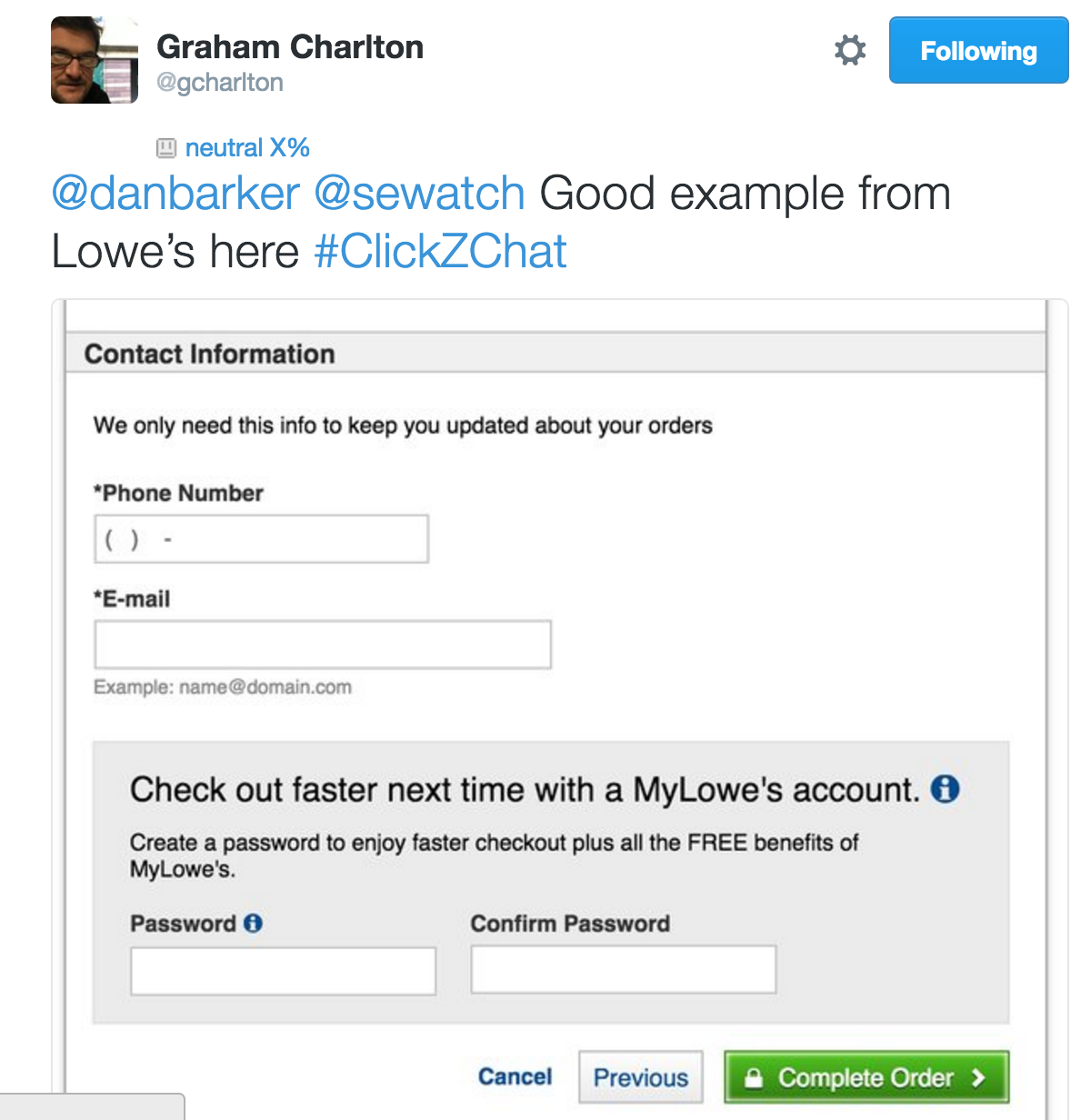
— dan barker (@danbarker) June 1, 2016
Overall it seems the ‘rules’ for checkout are simple: tell the customer everything they need to know upfront, and don’t be tempted to interrupt the process to cross-sell or gather data.
If you have any other examples of best (or worst) practice, then do let us know in the comments. If you’d like to know more about checkout optimization, then check out our latest ClickZ Intelligence Report.


