Filling out forms is one of the hassles of using websites that designers often work hard to minimise.
However on ecommerce sites there are several different types of form field that can’t be avoided as they come together to be filters on search pages.
They combine to form a key role in helping users sift through hundreds of things they don’t want to find that perfect product.

But are your search filters being used correctly and are they working hard enough to help your users?
Based on years of watching users navigate their way through ecommerce sites, I’ve put together a guide to the seven main types found on a search page and what to consider when using them.
Text input
What: a field where the user enters some text, which forms the basis of their search enquiry. The name of an item or a location is commonly entered here.
Consider:
- What is the user searching against? Unlike Google’s search engine, there are unlikely to be an infinite number of things the user can search for on your site, so it might make more sense to limit them to only searching against product names.
- Autocomplete is a good way to help guide the user towards a relevant search so they don’t end up with no results.
- Don’t rely on pre-filled placeholder text for important instructions on what to put in the field. Because once the user has entered their query, that help has gone. Also placeholder text can look at a glance like it’s already filled in and nothing more needs to be done.

- You only want one text input section per search page. Allowing users multiple fields for freeform inputs is going to create more chances for odd or no results.
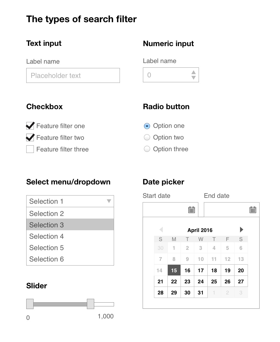
Numeric input
What: much like a text field but for only entering numbers rather than letters. Things like a number of people or dimensions of objects would work for this.
Consider:
- Does it make sense to offer an incremental option so the user can change the figure by one? If it’s for a number of guests staying in a house then yes. If it’s for a budget field on sites where the value is in the thousands then probably not.
- If you’re using this type for budget, is it clear what currency you operate in?
- Do you want to allow the user to enter decimals? If not, either prevent it or round any entries to the nearest whole number.
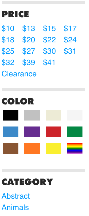
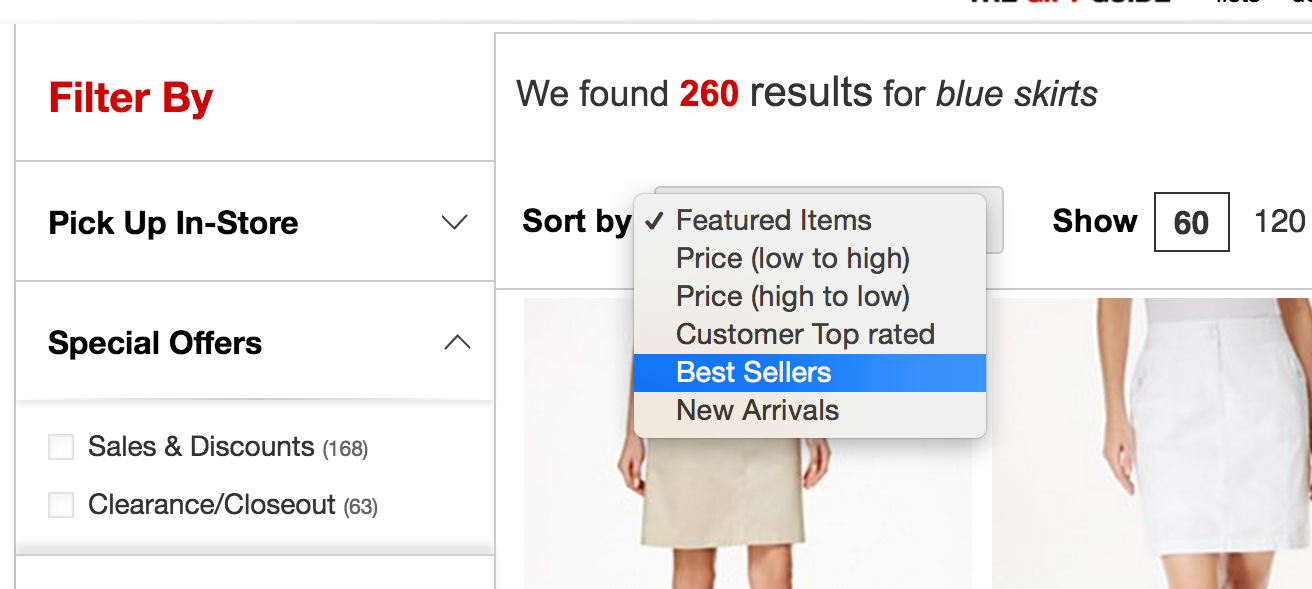
Checkbox
What: boxes which the user can check/tick to search within a certain parameter, with several being common in a group.
Multiple checkboxes often appear on search pages for things like brand names, amenities, and neighbourhoods.
Consider:
- When adding multiple checkboxes together is it clear to the user that they are creating an AND search (“look for homes with a dishwasher AND a garage”) or are they creating an OR search (“look for jeans by Levi’s OR Diesel”).Usually it is implied by the category (you can’t really have one pair of jeans made by two companies) but sometimes it can be unclear for the user what they are doing to their search results.
- Adding some visuals can work here. Rather than writing out a list of colours for example, which can be ambiguous for users, you can just use the colour itself.
- You can have quite a large number of checkbox options and in my experience users tend not to be too daunted. As long as they are laid out in a sensible order (such as alphabetically) users don’t mind browsing long lists.The problems come when you try and sub-categorise them too much (would someone expect to find microwave under ‘electrical items’ or ‘kitchen facilities’?). If in doubt stick to a flat hierarchy.
Radio button
What: boxes or buttons that users can select to search for a certain parameter. They differ from checkboxes in that the options in a group are mutually exclusive so a user can only select one option at a time, and often work as toggles between different types of product.
Consider:
- These are one of the most often confused elements on a search page. They are often styled the same as checkboxes though they shouldn’t be, as their behaviour is quite different.
- They behave in the same way as select menus but make more sense when there are only a few options available (four or fewer as a rule of thumb). They also make more sense if the main device usage is going to be mobile as they are easier to use than tapping dropdown menus.
- Styling them to mimic tab selectors can make sense.
Select menu/Dropdown
What: a multiple choice field that the user taps to see all the options before choosing one.
They often appear for ‘sort by’ options or where the product wants to limit the values that can be entered, such as for inputting specific times.
Consider:
- Make sure to use native select menus for mobile where an enlarged selection spinner appears at the bottom of the users screen. Otherwise it can become very fiddly to tap and scroll through long lists.
- Don’t use these too often as you are hiding content in a menu and it’s less likely to get found by users.
Slider
What: a bar with a handle or two that can be dragged to set values. Most often used for budget or price information.
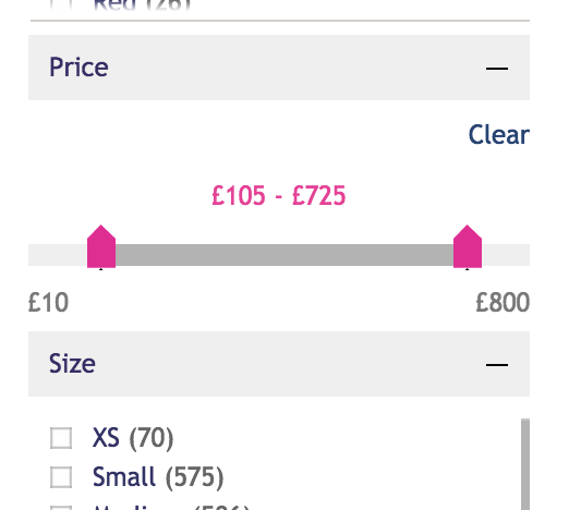
Consider:
- Have you made the handles nice and clickable? If you’re using a slider it needs to be big not small and fiddly just to fit an available space. I’ve watched several user tests where I’ve seen how tough some users find these, particular those who are older or who have difficulty using a mouse or trackpad.
- It should be set up so the user is moving the handles in sensible fixed increments. Add some sensible limits (perhaps round to the nearest 10 or 50) rather than allowing users to set any value.
- If you’re using it for pricing, do you really need that bottom budget handle? Whilst most people have an upper limit on what they can spend, how many care if it’s too cheap? The answer for a recent client I worked with was less than 1%, so we scrapped it.
- These make sense to use when you want to provide a fixed top and bottom end for something that has lots of values in between. Don’t use it for something with only five options.
Date picker
What: numerical input fields with calendar pop-ups that limit the user to entering a day of the year. Generally used on accommodation and travel sites.
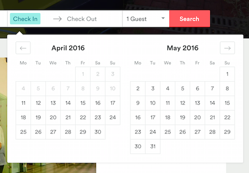
Consider:
- Use sensible default dates in the fields. You can set the start date to be the user’s current day and set the end date to be either the following day or a week later (whatever is a common trip length for your site).
- Link the start and end dates so the user can’t put an end date that comes before a start date. Also make sure they generally can’t choose dates in the past.
- Little things like automatically opening the end date calendar after the user has chosen the start date, help prevent unnecessary clicks.
- Make sure the calendar is tappable on mobile, as they can get a bit cramped. If in doubt, switch to a default date spinner for mobile users.


