E-mail Testing Basics
An in-depth look at an e-mail testing case study with a 30 percent lift in conversions.
An in-depth look at an e-mail testing case study with a 30 percent lift in conversions.
One of the benefits of e-mail is the ease with which you can test – and the quickness with which you can get your results. But it’s important to follow some best practices in order to get reliable results. Often it’s desirable to test more than one item at once; the best way to do this is with a test grid.

In this case study, we were testing a new layout and a different way to express the offer (the value of the offer remained the same). The key to the grid is Cell D; with it we can see whether the test offer (Cell B), the test layout (Cell C), or a combination of the two (Cell D) will produce the biggest lift. This is a simple concept, but one that many e-mail marketers without prior offline marketing experience miss.
Wireframes for the control layout and offer (Cell A) and the test layout and offer (Cell D) are below.


The modifications made to the control layout to create the test are minor, but important. We used learnings from a previous test to guide our redesign. This previous test failed to beat the control, but in analyzing the clicks we found that it drove a higher percentage of overall clicks to the primary call to action. We brainstormed a few reasons that this might be and addressed them in the revised layout:
For the offer test, we used exactly the same copy as the control in the sidebar and in the expanded list of bullets. This wasn’t our first choice, but due to legal constraints we were not allowed to state the offer in a different way in these locations.
Instead we split the closing paragraph, which reiterated the offer (in the control language) and included the primary call to action as a text link. In between these paragraphs we added an additional paragraph which presented the offer in a different way and expanded on it.
If you look at the wireframes, they’re really not all that different:
None of these changes were expensive to make, so any lift would outweigh the cost incurred.
The results were impressive. Both Cells B and D, which featured the test offer, showed a lift over the control (Cell A) in click-through rate on the key call to action link. Cell B’s performance was good, at +24 percent; Cell D did even better, beating the control by 36 percent on this metric.

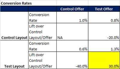
Conversion metrics were a bit more interesting. Although Cell C had the same click-through rate as Cell A (the control), the conversion rate was actually 40 percent less. Cell B, which had nearly a quarter more clicks than Cell A, delivered 20 percent fewer conversions. But Cell D, which had beaten the control in clicks, also beat it in conversions – by 30 percent.

If we had tested just two cells against the control – one with a modified layout and the control offer and one with the control layout and the test offer, we would not have seen any increase in conversions and the control would have been declared the winner. But by combining the new layout with the new offer we were able to recognize a significant boost in the client’s bottom line.
Words to the wise: always use a grid format when you’re testing two variables. And always look at conversions, as well as clicks, to determine which cell won the test.
Until next time,
Jeanne