Mapping results on travel sites: what’s best for usability?
Having a map search is pretty vital for holiday sites. Not surprisingly users want to know how close to the action they’ll be located.
However, it’s not just a case of designing some great map pins and icons. If you’re not careful jumping into map mode can be a disorientating experience.
I’ve designed map searches in the past and it can be a fiddlier task than it first seems, so I’ve put together some of the less obvious things for you to consider when designing and building.
I’ve aimed to cover the ways that you can ease the burden on your users to make the most seamless user experience.
For the examples in this article I looked at:
I’ve mainly focused on the desktop experience as it tends to be where things get a bit more complex.
In all cases they build on top of Google Maps, making it the industry standard in this sector.
Most websites tend to just leave the standard map zoom in and zoom out controls in place. This is fine for usability and there is something to be said for keeping things consistent, however it doesn’t always make sense.
For example do you really want your user to be able to zoom out to country, continent or even world level? Whilst you might have other properties to show them further afield, at this far out the user isn’t getting much sense of where the places are actually located.
The onefinestay map is a good example of placing a restriction on the user. As the site focuses on a few key cities, it doesn’t allow users to zoom out beyond ‘city’ level.
It also limits how far they can zoom in, preventing users from accidentally ending up with a super close up view.
Map search on onefinestay
Following on from deciding how many zoom levels are appropriate, the next thing to consider is how to display the properties at these different stages.
There are two approaches generally used here:
Both prevent the map from being overwhelmed with everything possible and the latter option prevents the awkward task of defining areas of cities.
Comparing hotel website map searches shows how overwhelming it is when all hotels are shown on Hotels.com versus a more select few on Booking.com.
Hotels.com even has to use a message asking the user to zoom in if they go out to where there would be too many results.
A good example of grouping properties by city area is shown by the onefinestay website, whilst lastminute shows a poor execution where the sub-groupings seem to never end.
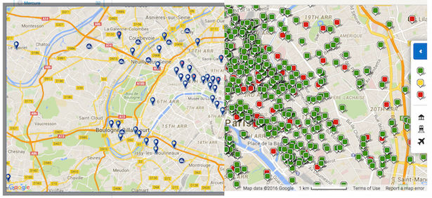
A comparison of the density of results on Booking.com (left) versus Hotels.com (right)
A map search is usually an alternative way of viewing results from the main list style. Thus it is important that when a user views results on a map there is a relationship to the list version and it doesn’t feel like a totally different part of the site.
Airbnb solves this by always serving up results in a split view with both the list and map on the screen (at least on desktop). When the user hovers over a property in the list, its map pin also highlights, helping link the two sections.
Housetrip does a good job of not disorientating the user by having the header bars and filters in the sidebar remain the same between the list view and map view.
On the Hotels.com iPhone app it shows a single search result at the bottom of the map screen, which changes if the user taps a pin and can be swiped to move between the results.
Combined list and map search on Airbnb
When considering how your filters work, you need to be clear how many results you are showing the user.
When a user moves around the map with filters applied, is it the location of the map viewport that constrains the number of results or are there additional results not shown on the map?
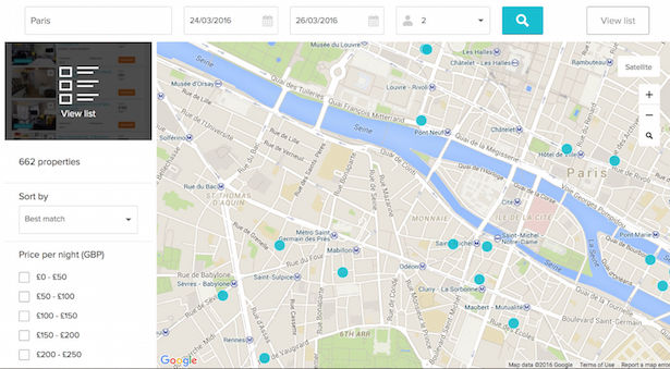
For example on Airbnb the results shown in the list on the left are confined by the location of the map on the right, which could cause the user to think this is all the available properties in the city, though there is an option marked ‘Search as I move the map’ to suggest more results can be found.
On Housetrip the user applies the filters to all the properties in the city and the number of results indicates there are more, even if they can’t see them all on the map.
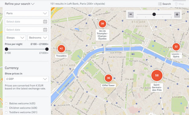
The onefinestay map search aims to do a bit of both with the results bar stating how many the user can see currently on the map with the number of properties available citywide in brackets.
Map search on Housetrip
Property info panels
What’s the right information to show on the info panel when a user clicks the map pin? This is pretty consistent across all the sites I studied: property name, price, and some kind of rating or reviews system are essential.
The image is also really important for helping the user recognise and differentiate the property rather than them having to remember lots of names.
Something that has recently become increasingly popular in search results and is now appearing in map pins, is the ability to show multiple thumbnail images that the user can scroll through.
Anything that helps the user make a decision before clicking the result is often appreciated.
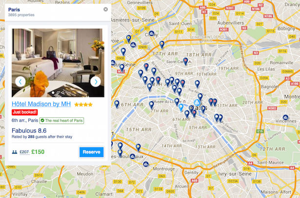
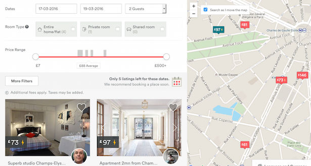
A property info panel on Booking.com
A map can seem like a simple bit of functionality to add on but think about the subtleties and the rules you set for your users when they are browsing.
You don’t just have to take Google Maps straight out of the box as standard and you want to avoid that sudden shift into a new mode that leaves the user confused.


