Testing with Google’s mobile-friendly and page-speed tests is a good, but if you really want competitive edge on the mobile web this is just the starting point.
Google has done an excellent job of promoting the importance of the mobile-friendly website, with its mobile-friendly test and search algorithm that prioritizes mobile-friendly sites in search results.
Now it is putting web performance – i.e. how fast your site loads on a mobile device – in the spotlight with its new business-focused mobile web testing tool, which is based on a revamped PageSpeed Insights tool.
Is this a sign that performance/page speed – like mobile-friendliness – will become a more significant factor in mobile search rankings? Perhaps. Probably. But that shouldn’t be your sole motivation for testing and fixing. Your site should be fast and lean on a mobile device because that means a better usability and user experience (UX).
Testing your webpages with Google’s PageSpeed Insights and the Mobile-friendly tool is a great start to improving the mobile usability of your website. The percentage scores eye-catching and motivational and the recommendations are insightful. But if you want to achieve competitive advantage over your rivals on the mobile web, this is just part of the picture.
This column will demonstrate the importance of taking a holistic view of mobile usability testing, using a range of tools. It will introduce some useful tools and explain how to use them to discover and investigate mobile usability and user experience (UX) problems.
It will also demonstrate the importance of seeing how you stack up against the competition.
Two common misconceptions about Google’s mobile-friendly test and PageSpeed Insights
1.Google’s Mobile-friendly test and PageSpeed Insights tests your whole site – NO.
- Actually you are only testing the one webpage – usually the homepage – that you enter in the search bar. There is no guarantee that because your homepage scores passes either test, all other pages will pass. Or if the homepage fails, all other pages will also. This is a common misconception about many web testing tools.
- At the least, you need to be sure that each key landing page – as this will effect search results – and every critical page on the user journey – because this will effect conversion.
- Web developer Robert Gaines recommends testing each new template: page template, category template, product template.
- Tools such as SEMrush and Google Mobile Usability Report will assist in identifying problem pages (see below) – so you don’t have to physically test each page.
2. 100% mobile-friendly (according to Google) means great mobile usability – NO.
- The mobile-friendly test considers if a) the content fits the screen (viewport); b) the text is correctly sized; c) buttons/links are correctly sized, spaced and easy to tap; d) there is no Flash content; there are no interstitial ads (typified by those irritating, but difficult to avoid “Download our app” ads).
- Mobile-friendly does not test for a) how fast the page loads; b) if it loads properly; c) how quickly you can move from one page to another; d) how large the images are or d) how much data the download consumes. This is where performance testing comes in with tools such as Google PageSpeed or developer tools such as WebPagetest (see below).
- It’s common for sites to pass the mobile-friendly test, but score less well on Google PageSpeed Insights (as witnessed by this test on ClickZ sister site Search Engine Watch).
- Mobile-friendly does not test for visual problems – tools such Mobilizer can help (see below); unintuitive design; unintelligible navigation; broken links etc. No automated tool is an alternative to proper user testing.
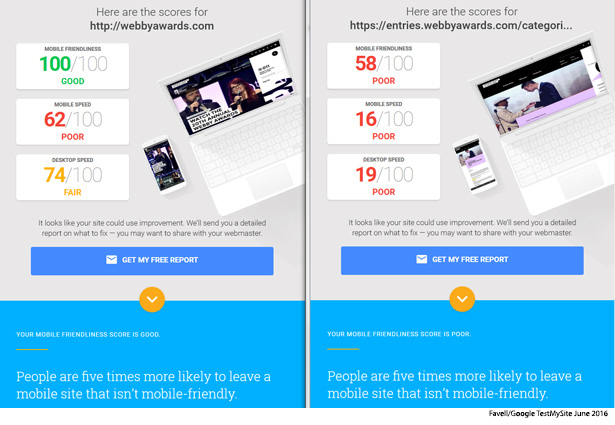
Take a look at the following image.
- This shows two test results (June 8, 2016) for two pages in The Webby Awards website. The homepage and the awards categories page.
- This Webby Awards event does an excellent job of celebrating web/mobile excellence among its winners, so its website seemed an appropriate choice for a random investigation of mobile usability. N.B. This is just for illustrative purposes.
- The results for the Webbyawards.com homepage demonstrate that webpages can score well (100%) for mobile friendliness; but poorly for mobile speed (64%).
- The results for the categories page illustrates that different pages in a site can achieve very different scores from the homepage: i.e. mobile friendly: 58% v 100% and page speed: 16% v 62%.
- The issue with the categories page was highlighted by a search on mobile-unfriendly pages using SEMrush (see below).
We know mobile-friendliness effects search results, but what about webpage performance?
These investigations in the US and Europe by Sistrix for Search Engine Watch have shown how Google’s mobile-friendly algorithm has begun to seriously impact websites’ mobile search results.
The interesting thing about the US research was the observance that many firms had made their homepage mobile-friendly and maybe some other pages. This may stem from the misconception stated above. But the results are a stark: not being mobile-friendly site-wide impacts mobile search visibility.
It would be great to see similar studies on the impact of webpage performance on mobile search results.
Reasons you should take mobile web performance as seriously as mobile-friendliness:
- Page speed has been a factor in search rankings for much longer than mobile-friendliness – see this Google post from 2010.
- Mobile page speed is clearly on the agenda at Google. It has an initiative called Accelerated Mobile Pages (AMP), which is aimed helping companies – mostly news publishers, to date – speed up web pages.
- Various studies and reports, see WPO Stats for examples have shown that improving page speed improves conversions.
- Google new testing tool claims almost half of visitors leave a mobile site if the pages don’t load in three seconds, which, if true, should keep marketers up at night. Unfortunately, none of Google’s scary stats are sourced.
How to test
The best place to start is with a tool that tests your entire site. Not just one page.
Two good tools for highlighting mobile-friendly issues across your site are:
- SEMrush which is a paid tool, but allows testing of competitor sites.
- Mobile Usability Report in Google Search Console which is free, but you can only run tests on site if you are the owner, so no good for competitor analysis or random tests on awards sites.
A good tool for highlighting performance issues across your site is:
- Site Speed Data tool in Google Analytics – again this is only available to site owners. This gives page-load time for a sample of pageviews on your site and offers suggestions to help improve performance on under-performing pages.
- As this tool requires verification, we were unable to test it with Webbyawards.com.
SEMrush (limited free service, then monthly subscription starting at US$69.95 per month).
Despite its roots in the SEO world, this is an excellent tool for assessing mobile friendliness and making comparisons with close competitors.
It also highlights issues across the domain. To date, the mobile filter is only available for US searches, but SEMrush plans to expand to the UK and other markets.
Useful features include
- Competitive positioning map – shows which sites you are competing with for organic keywords in desktop and mobile searches and how you compare in terms of visibility on both platforms.
- Mobile-friendliness ratio – shows the proportion of pages that are Google declares “Mobile friendly” in search results. Compare this with the competitors highlighted in the competitor map.
- Mobile-unfriendly results – shows which pages that are Google declares “Mobile friendly” in search results.
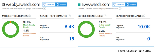
Take a look at the following image.
- SEMrush suggests the Webbyawards.com scores much more highly for desktop keywords than mobile (58k v 6.4k), but estimates that webby awards receives more mobile traffic than web (78.8k v 102k).
- SEMrush also suggests that Webbyawards.com is trailing Awwwards.com (a site that commemorates a different website everyday) on both keywords and traffic on desktop and mobile.
- N.B. we use “suggests”, because you can never assume any tool is 100% accurate.

Take a look at the following image.
- SEMrush suggests 98.9% of Webbyawards.com search results are mobile friendly. This is gratifying, but are the 1.1% of mobile-unfriendly pages a concern? This needs further investigation (see below).
- But this is all relative. Comparing this with the competition, suggests only 0.2% of pages on Awwwards.com has mobile-unfriendly results.
Take a look at the following image.
- SEMrush finds 71 mobile unfriendly results for Webbyawards.com, compared with 18 for Awwwards.com.
- Top of the non-friendly list for Webbyawards.com is the search term “awards categories” leading to: https://entries.webbyawards.com/categories. This page details all the awards categories, which is presumably an important step for the Webby Awards entrants, making this a key page from a search and user journey.
- Top of the non-friendly list for Awwwards.com is the search term “calligrapher” leading to http://www.awwwards.com/30-inspiring-examples-of-lettering-in-graphic-design.html. This is a blog post about typography.

Google Mobile Usability Report (Free)
To use Google’s Mobile usability report you need to be the verified site owner. So we are unable to test webbyawards.com or awwwards.com. This also means that you are unable to test rival sites.
The mobile usability report will show for the entire site:
The number of pages with mobile errors.
- A list of the pages showing each type of error.
- Most common errors identified are: Flash usage; Viewport not configured; Fixed-width viewport; Content not sized to viewport; Small font size; Touch elements too close; Interstitial usage.
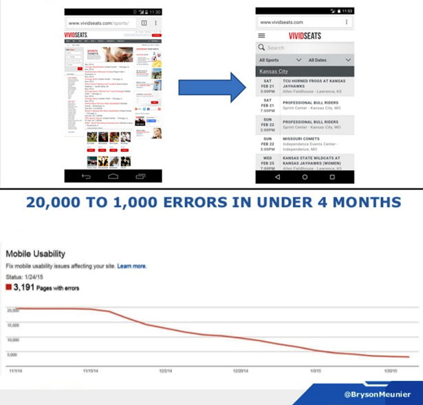
By way of illustration we will use the example of VIVIDSEATS, where under the guidance of SEO director Bryson Meunier the sports and concert tickets vendor was able to reduce 20,000 errors to 1,000 in four months as it moved from a PC to mobile-friendly site.
Errors were mostly: “Viewport not configured,” i.e. didn’t fit the mobile screen, “Touch elements too close”, i.e. difficult to tap the right link, “small font size” i.e. can’t read it.
Next you need test the pages highlighted as mobile unfriendly or with page speed issues.
Mobilizer (freemium)
Mobilizer shows a screenshot of how your webpage looks on a number of different Android and iOS smartphones and tablets (real ones in a testing lab) with page loading times.
Use it to see if:
- Important parts of your webpages are off the screen to right/left or below the fold (i.e. you need to scroll horizontally or vertically to view).
- Images are too large.
- Text is too small.
- Buttons and links are too small or close together.
- If the page loads, and how fast it loads on each device.
Take a look at the following image.
- The Webby Awards Categories page was one of the 71 pages highlighted by SEMrush as potentially mobile unfriendly.
- The content is not appropriately sized for the devices, either the smartphone or tablet. The text is too small to be read easily without zooming.
- The links – particularly those listed below the title General Website are too small, too numerous and too close together to make it easy to tap the correct link.
- Pictured is only a snapshot of an extremely long page. Every category in every section is listed on this single page. The page is so long that Mobilizer cuts it off after 50,000 pixels.

Google Mobile-friendly test (free)
Google has recently updated its mobile-friendly testing tool for webmasters. This appears to be different to the mobile-friendly test used by the new Testmysite tool, which replicates the user experience test used in PageSpeed Insights tool (below).
It tests for common mobile errors on the single page entered.
- Viewport not configured
- Fixed-width viewport
- Content not sized to viewport
- Small font size
- Touch elements too close
- Interstitial usage
Take a look at the following image.
Testing the two pages selected from the top of the lists of pages flagged by SEMrush as mobile-unfriendly for Webbyawards.com and Awwwards.com reveals the following.
- The Webby Awards Categories page confirms the errors which were visible in Mobilizer, with problems with text size, spacing of links and the incorrect setting of the viewport.
- The Awwards Typography article, on the other hand, passes Google’s test. But as you will see below, it does not score well in the performance/page-speed test, which may explain its presence in the SEMrush mobile-unfriendly list (above).

You should also test your pages on other search engines:
- The Microsoft search engine provides a similar mobile-friendly test to Google.
- Microsoft states that being mobile-friendly can “help you rank better in Bing search results on mobile devices.”
Google PageSpeed Insights
- This is the developer tool that underpins Google’s new testing tool (see results for the two Webby Awards pages pictured above).
- It gives a percentage score to indicate how fast a page is expected to load on mobile devices and the anticipated user experience. There is a basic traffic light system: red for “should fix”; amber for “consider fixing” and green for “pass”.
- B. As with any tool, Google PageSpeed should not be taken as gospel truth and should be used in conjunction with other tools, such as WebPagetest.
WebPagetest (free)
This excellent tool allows you to run in-depth speed tests in different locations, using different networks (including using a limited number of mobile networks), devices and browsers around the world.
It provides a much more detailed breakdown of page performance than Google PageSpeed and give real numbers for download speed and page size. At first it can be a bit daunting to the new users and those without technical knowledge.
Use WebPagetest to calculate the:
- The speed that your key pages load a) homepage; b) key pages; c) any pages flagged by SEMrush, Mobile Usability Report or Site Speed Data tool. Do this on a mobile and a relevant fixed network.
- The size of each key page.
- The estimated cost of download your webpage in terms of customer data allowance.
- Benchmark these results with the main pages of your competitors.
- Analyze what is causing pages to load slowly – e.g. large uncompressed images.
Take a look at the following image.
This shows the headline stats from the performance reports of the two homepages and the two pages that topped the lists of mobile unfriendly pages in SEMrush (above). These were one-of tests conducted using a US mobile network undertaken on June 08, 2016 – these are for illustrative purposes only.
- Of the two homepages, Awwwards.com loaded considerably faster (4.3 seconds) than Webbyawards.com (8.1seconds).
- com also weighed considerably less (1.4MB) than Webbyawards.com (8.5MB).
- The estimated cost of downloading the webbyawards.com pages on the least expensive prepaid plan in the US is 81 cents, compared with 14 cents for Awwwards.com is.
- The slowest and largest page of all is the typography blog post on Awwwards.com (10.1 seconds; 11.8MB).
- All pages are flagged with an F score for large, uncompressed images – which is a major contributor to bloated page size, and slow load speed.
- If Google’s claim that almost half of visitors leave a mobile site if the pages don’t load in three seconds is correct, then both sites should be concerned about these results.

Special thanks for recommending usability testing tools and techniques:
- Bryson Meunier https://www.linkedin.com/in/brysonmeunier SEO director VIVIDSEATS
- Robert Gaines, http://www.rgaineswebdevelopment.com/ a Kansas, US-based web and app developer
This is Part 22 of the ClickZ ‘DNA of mobile-friendly web’ series.
Here are the recent ones:
- The three Us of mobile design: UX v usability v UI
- Mobile design and the art of doing one thing well
- The essential role of wireframes and flow diagrams in mobile design
- Understanding the mobile customer journey and user journey; use cases and user stories
- Getting to grips with mobile design methods and lingo: empathy maps and storyboards
- The key ingredients of mobile design and UX methodology
- Why user testing should be at the forefront of mobile development
http://www.clickz.com/intelligence/report/dna-of-a-great-m-commerce-site-part-1-planning/?utm_source=clickzblog&utm_medium=blog&utm_campaign=INTELBLOG