Boots: the worst checkout process on the web?
The checkout user experience matters a lot. While retailers seem to have ironed out many of the major conversion killers over the years, there’s often plenty of room for improvement.
If customers have reached this stage, the job of the checkout process is to move them through address and payment entry with as little friction as possible.
A well-designed checkout should achieve this and minimise checkout abandonment by giving shoppers a smooth ride.
Here, I’ve looked in detail at the Boots checkout process, using Superdrug to compare and contrast.
This is the connecting page between product and checkout, so it needs to perform a number of functions:
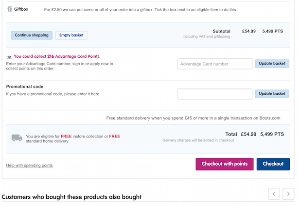
Here’s the Boots shopping basket page. It’s fairly big so I’ve taken two shots of it.
Above the fold:

And below the fold:
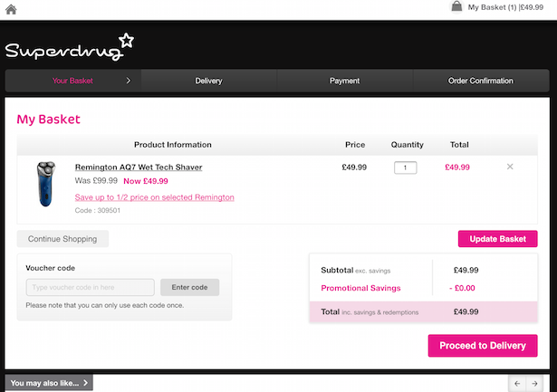
And the Superdrug version:
Notes:

Yes, registration. Ok, many studies may have made the point (and convincingly too) that asking customers to register before checkout is a barrier to conversion. And most sites now tend to offer guest checkout as an alternative option.
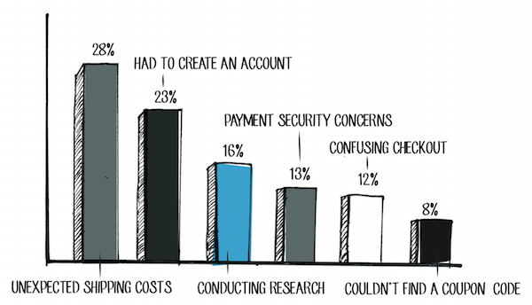
The chart below shows some of the major reasons for checkout abandonment. Creating an account (registering) is second here.
Not Boots though.

By contrast, Superdrug takes a more laid back approach. Register or sign in if you want to, or checkout as a guest if that’s too much trouble.

It gets worse though. This is the page I get after entering my email to register.
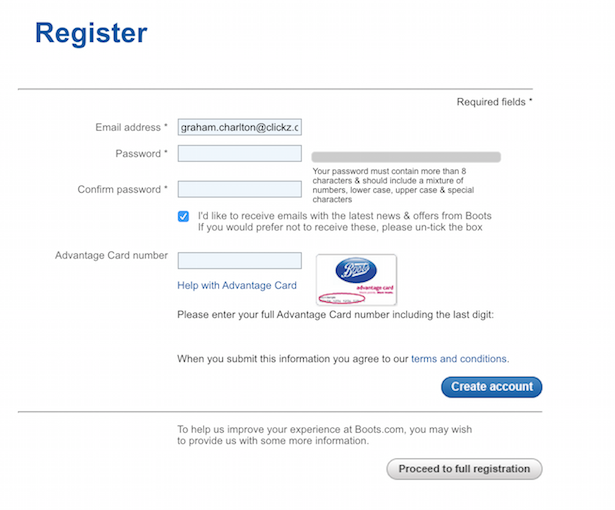
Check out the password rules. Yes, it’s good for your customers to have secure passwords, but those rules are almost guaranteed to produce a password that people will find it hard to remember.
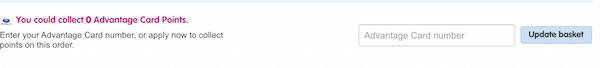
Bizarrely, I’m then placed back onto a slightly different version of the basket page. What would users think of this? In my case I’m wondering whether something has gone wrong, which probably isn’t the reaction Boots is aiming for.
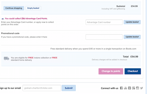
Note that I now have potential advantage points. I have to register to find this out. Why?
Then we also have an email box. If I decide, there and then, that I absolutely must sign up for Boots’ emails before I checkout, I’m taken away from the process altogether.
I’m beginning to think Boots has never tested its checkout process….
The next step on Boots is to select delivery options.

We have to do this on Superdrug too, though we’re straight onto payment after this.
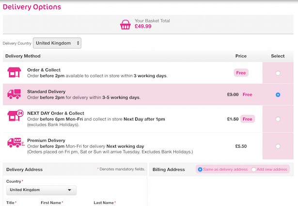
On Boots though, there’s another delivery page where I need to choose my delivery options and confirm them.

Notes:
I entered my address when registering and selecting delivery options. However, I’m now asked for a billing address.
Almost every ecommerce site on the web has a tick box or similar which allows shoppers to use their delivery address as the billing address. It’s simple, it saves users from entering their details twice. There isn’t such an option here.

So, I have to select my address for the second time, before entering my name and choosing a name for this address as well.
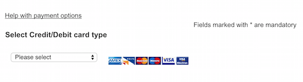
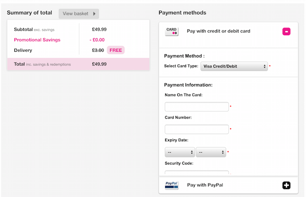
I then need to select payment type, then card type. Of course, more forward thinking sites could detect card type as users enter the first few digits, but I’d be foolish to expect that from this site.
By the way, the Superdrug process works reasonably well. It isn’t without faults but I can get through to the payment page without too much effort.
This article started out as a straight comparison between the two checkouts but, while I thought Superdrug would perform better in this area, I didn’t realise just how bad Boots could make a checkout process.
Here are just some of the issues:
Boots is a long established retailer, and it’s rare to find such a poorly designed checkout process which contains so many obvious barriers to conversion from such a business.
UX, user testing A/B testing etc may have been strange concepts to some 10 years ago, but now it’s bizarre to see a (major) retailer who doesn’t seem to have used any of these methods. Or at least applied the lessons.
There is so much wrong with this process that Boots does actually have an opportunity to significantly increase conversions by applying some basic ecommerce best practice.
Is it the worst checkout process? I’m sure there must be worse checkouts, but I’ve yet to see one from an established retailer. All suggestions welcome…
For more information on Ecommerce Checkout Best Practice Guide (and how to avoid the mistakes that Boots makes), as well as guides on mobile commerce, customer experience, and social customer service, head to ClickZ Intelligence.
Leave a Reply
You must be logged in to post a comment.