A mobile wireframe is a picture, sketched by hand or digitally produced, of a concept/design of an intended mobile-friendly website or app, showing how it would look on the screen of a mobile device.
Wireframes can have several purposes, from communicating the look, feel and purpose of each key page to business stakeholders and the project team, through to a development blueprint describing the user interaction of each key page.
A flow diagram shows how users are expected to progress from each wireframe screen to the next.
Smaller projects and start-ups, particularly those that don’t have a UX or design specialist, might not use wireframes.
Developers of these projects argue that the structure, templates, tools provided in their chosen mobile development frameworks do a sufficiently good job, so traditional design techniques including formal wireframes are not required for planning. And they will use informal conversations and white-boarding sessions to convey features and concepts to stakeholders, where traditionally wireframes are used.
But for mid-to-large mobile projects and/or ones in the corporate or agency environment, the wireframe remains de rigueur.
Doug Brams, principal UX architect, mobile web at The Home Depot:
All new mobile work at Home Depot uses wireframes. However, for quick changes to existing experiences in-sprint communication between the Dev team and UX will sometimes suffice. Similarly, when demonstrating a user flow, a quick prototype may be created in Axure rather than traditional static wireframes.
It’s important to put one person in charge of ‘Wireframing’, as the process is commonly known, typically this will be the UX architect, information architect or UX designer, but titles and roles will vary with different projects and budgets.
Responsibility for wireframes, advises Brams, ought to rest with someone trained in human computer interaction (HCI) and aspects of cognitive science, rather than the visual designer.
Wireframes form the backbone or blueprint for the mobile project. However basic the images might be – initially these are likely to be a pen and paper sketch (albeit often artistically drawn) – having something visual will help bring the concept to life for everyone: business, designers, developers etc.
A good set of wireframes will provide a sound basis for discussion and collaboration. It will highlight potential issues and opportunities; and can be used to test the concept with potential users.
Doug Brams:
If we don’t do white-boarding or sketches, then often a conceptual wireframe is the first artifact that we discuss with the team/stakeholders to demonstrate the direction we are headed.
This typically shows the “happy path” [how a normal user is expected to use the site/app]; and then once a direction is agreed upon; you proceed to wire out the edge cases [the alternative ways that people use it] and also iterate the main screens to more mature detailed and annotated wireframes.
What’s the difference between storyboards, wireframes, prototypes and flow diagrams?
Storyboards, wireframes, flow diagrams, site maps and prototypes are easily confused by people outside design and UX. In fact many people within design and UX will disagree on exactly what each is, what it does and when in the project they will be used.
This doesn’t matter too much, as long as everyone on the project is on the same page.
The following image, shows a storyboard, pen and paper wireframe and a digitally produced “high fidelity” wireframe for a charity donation project.
It was a concept developed by students on the Advanced mobile UX course run by Greg Nudelman at San Francisco State University, as profiled in his book the $1 Prototype.
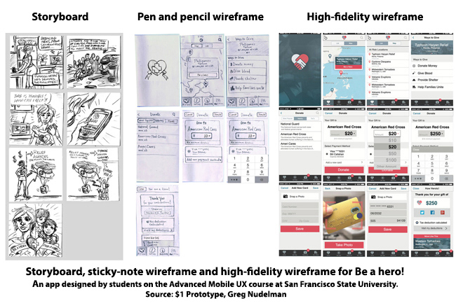
Storyboard
As explained in this column, a storyboard describes in a comic-strip style the purpose of the site or app i.e. the scenario when the target customer is expected to need to/wants to use the site/app.
Hand-drawn wireframe
Wireframes focus on how the customer will use the site. It is about user interface and user interaction with the site. It’s about the architecture of the pages and site; the placement of buttons, links, text and images, less concerned about visual style.
The first wireframes in the mobile project, like the storyboard, are typically hand drawn. A useful way to do this is to draw each wireframe on a sticky note. Sticky notes allow designers to change a frame or alter the order of frames without having to redraw the whole thing.
Greg Nudelman recommends distinguishing the two by using square 3×3 inch (76x76mm) sticky notes for storyboards and rectangular 3×5 inch (76x127mm) sticky notes for wireframes – which look more like the proportions of a mobile screen.
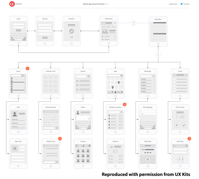
Flow diagram and site map
Flow diagrams are used with both hand-drawn (above) and digital wireframes (below) to show how users will progress from one screen to the other through the site (or app). The most common user journey is sometimes called the “happy path”, but designers should also map alternative paths.
This is different to the site map which shows how pages are organized within the website/app. It is a hierarchical system that looks like a family tree. The site map influences the navigational structure of the site, but not how users will actually navigate the site.
The following is a sample template for a flow diagram from UX Kits.
Digital wireframe
As designers move from hand-drawn to digital wireframes, they will use tools such as Balsamiq, OmniGraffle, Axure, Microsoft Visio or Adobe Illustrator, depending on their personal preference and the complexity of the project.
This is just a fraction of available wireframing tools, for a complete list of see: Protomoto or Konigi.
Designers may also use templates, from a supplier such as UX Kits – the following image is an example contact form for a responsive site – showing the display on web, tablet and mobile.
The advantage of digital wireframes is that they are easier to share with team members, stakeholders and clients. But hand-drawn wireframes can, and should be, photographed or scanned; and can also be shared and used for testing.

High-fidelity wireframe
As the project progresses the digital wireframe will become more sophisticated and will start to look less like a skeleton plan and more like a mobile product, perhaps adding color, images and style.
Strictly speaking the traditional wireframe is a static representation – with no interactivity – but the distinction between high-fidelity wireframes and digital prototypes is becoming increasingly blurred.
Kyle Schultz, director of UX at Austin, Texas-based digital agency Springbox:
There are a few wireframing tools I’d suggest, depending on the visual design chops of the user. For nicer-looking, high fidelity wires I recommend Sketch or Adobe Illustrator. For quicker, lower fidelity wires, I’d point you towards Balsamiq or Wireframe.cc.
Then, there’s a new class of tools that combine wireframing/design and prototyping – Adobe Experience Design and Axure fit in this category and are both great.
Interactive prototypes
The interactive prototype turns the static wireframe into something that can be clicked and tapped to progress from one screen to another. This enables designers to test and refine the functionality and usability of the site before it goes to development.
An increasingly popular tool for turning static wireframes, into interactive prototypes, that can be shared and tested is InVision.
Kyle Schultz, Springbox:
InVision is an excellent tool that we use every day, but it isn’t actually a wireframing tool. It takes static wireframes or visual comps, created using a different tool, and allows you to create a realistic interactive prototype in seconds.
Having clickable or tap-able prototypes – even ones made from simple wireframes – allows companies to user test products much earlier in the process. Testing can be done in person or remotely using a service such as usertesting.com or whatusersdo.
When designing OS Maps, the UK mapping agency, Ordinance Survey used two stages of interactive prototyping: early on it used Marvel to test out interface types, then later a more detailed prototypes of specific experiences using Axure. (See this column for full details of the design process at OS).
Wireframes from the viewpoint of the UX architect:
Doug Brams, The Home Depot:
At different stages wireframes have different roles. Early on they are a way for UX folks to communicate initial conceptual design direction. Later they will have evolved into detailed design blueprint for development.
A good place to start is by considering specific design problem we are trying to solve for the users. What information needs to be conveyed to the user and/or collected from the users? This should result in an interface ingredient list, so to speak. As you begin to think about the information architecture you begin to think about how to parse this information into pages/areas of the website or app.
The output will be a web/app map or flow diagram. This in turn guides which wireframes or screens need to be developed.
Depending on your timeframe, it is best to start with sketching low fidelity wireframes on paper and iterating there before moving to digital. Sometimes I will just draw conceptual wireframes on the whiteboard and take pictures of them and drop them in a PDF to share the general conceptual direction with the team.
Low-fidelity wireframes capture the essence of the conceptual experience, but not all the detailed interactions. For example, a header here, an image here, some text links here, an action button here. This is the sequence of key screens I imagine without showing all the helper/secondary optional screens or “non-happy path” as we say.
This is a useful way to communicate to your stakeholders, where the information will live, and what the general information hierarchy and structure of those pages may look like.
When I move to digital, I usually use tools such as OmniGraffle, Visio, or Axure, often starting from a file, I had created in the past, allowing me to copy, paste and reuse elements. But most wireframing applications also offer a variety of stencils with appropriate drag and drop components.
The structure of a typical wireframe is the screen you are developing on the left and a vertical column on the right hand side where you add your annotations explaining the functions and interactions. These notes/annotations are typically numbered and mapped to numbered elements on the wireframe on the left screen for easy reference.
At times, some interactions are difficult to convey in a static wireframe and an interactive prototype is used. This may be as simple as linking one wireframe to another to a show flow or using tools in Axure to show conditional logic.
This is Part 19 of the ClickZ ‘DNA of mobile-friendly web’ series.
Here are the recent ones:
Leave a Reply
You must be logged in to post a comment.