What can digital PR learn from traditional PR?
I passionately love communication in every single form that there is. For me there should never be a distinction between ‘what has gone before’ and ‘what the present and future looks like’.
There is just communication.
Communication evolves. Communication which beautifully ebbs and flows and embraces which ever format it desires. Verbal, artistic, musical, hand written letters, imagery, printed word, technology, emoji’s – you name it we use it for communication.
To reach out. To connect. To influence. To defend. To inspire. To learn. To mark moments in time.
To me the principles of communication and PR exist together, there is a fluidity that embraces them and I find it difficult at times to see where one stops and the other continues. So when asked to reflect on how digital can learn from traditional PR I initially had a stumbling block as to me the two are entwined.
To start looking at a distinction between the way I worked when I first started out in traditional PR being a theatre press officer many moons ago as opposed to now, Head of Creative Communications at Zazzle Media.
I felt like I needed to come up with a ground breaking revelation, rooted in technology, probably with an acronym.
As a starting point I read extensively around a multitude of articles on digital PR and heck there is a lot out there. Which is fabulous and great when you have so many questions and a thirst for knowledge. But it sure can befuddle you.
I continually questioned my gut instinct in the first couple of days until the realisation (and my own professional confidence finally kicked in) that I was trying to over complicate matters for my first ever blog post.
So here we are, back again at communication is communication.
Therefore, the overarching conclusion I have come to is that PR is PR.
The fundamental skill set is the same. The toys we all now play with have evolved and enabled PR to be so much more creative and engaging.
To be a great PR the foundation skill set and core principles are the same for 2016 as much as they were for the old PR great’s such as Howard Strickland who ran the Hollywood studio’s in the 1940’s and 1950’s onwards.
It’s just today, with Digital PR, we have an armoury of tools and technology to play with. Look at Hollywood today and the campaigns when a new blockbuster is released…
In the same way Hollywood progressed from predominantly using 1-2-1 media management on stars to creative jaw dropping campaigns utilising technology to the full – what can digital learn from traditional?
What are the common factors between the two worlds which turn a good PR into a great PR?
Telling a good yarn, pulling on the heart strings, making it real and empathetic, putting the reader / viewer squarely in the situation / experience.
In the last few years ‘storytelling’ has been a buzz word banded around like it is the holy grail. Any good PR will tell you they have been ‘storytelling’ for decades (if you have been working as long as me that is) and long before thought leaders ‘named and claimed’ the phrase.
It is what we do, it is in our DNA. Without this quintessential ability we would be just mere marketer’s / advertisers. Contentious?? Oh yes. But I am not alone in this viewpoint.
Paul Holmes – publisher and CEO of The Holmes Report (the annual global benchmark for PR) – says
“Public Relations finds real stories and shares them. Advertising makes up stories and shares them. The issue facing us here is advertising has better budgets so we (PR) need to learn to tell our stories in a better, smarter, more engaging authentic fashion.
The great aspect of the skill of storytelling within digital PR is that you can really add a level of creative turbo power of awareness through technology.”
Below have been judged to be the best in class – all embrace technology and therefore create truly memorable brand messages and experiences.
PR can now engage in ways which seemed incomprehensible when the stiff boring press release was god and daily newspapers ruled the news waves and the 24-7 always on challenge was the stuff of press officer nightmares.
Part of Digital PR now is harnessing the challenge of 24-7 always on media.
Stories spread across the globe in a nanosecond and we have to rise to the challenge of issues management in what is now a global media community. Working in this space really stretches you professionally and without the core foundation skills of understanding media management you really are up the creek without a paddle.
As KFC has recently shown even with swift media relations and a strong holding line the issue still flies across the world in the blink of an eye. When their recent issue was googled for this post there was already over 300,000 separate mentions (editorial & social) globally from an issue that had been ‘live’ for under 12 hours. Reputation management at it’s most acute.

Digital PR is not all issue management on a global scale – on an extremely positive note, to tell a story now you have a whole box of goodies to play with; sound, imagery, footage and you can play across many platforms.
This can lead to amazing campaigns which connect emotionally and change behaviour fundamentally. PR at it’s very best. The absolute sweet spot. There is no better example than the Cannes Lion Winner Like A Girl.
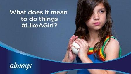
As Like A Girl utilised fully engagement now isn’t one way – we no longer just talk at the observer / reader / listener. They now have the power to participate back and tell us exactly what they think of our messages, campaigns, values and identity.
If our fundamental skill as a storyteller and communicator is left wanting some what the internet & global community will find you out in as flash and show you up.
Digital media on a global scale now speeds the whole process up and if you aren’t being seen as authentic, reactive and listening you will quickly get knocked on a global scale. Who among us isn’t aware of the fiasco VW got themselves into when they inadequately responded and just refused to listen to feedback on all their platforms.
We have already established that fundamentally it is all just PR…. But let’s not be so narrow as to not to learn.
So let’s start with the planning stage. A good campaign does the following;
These top line goals, from traditional campaign planning days, now easily transpose into Digital PR campaign planning.
Digital campaigns, working with SEO, have a primary objective to get high quality links that will never diminish in search value. Accompanying this is raising brand awareness on key sites.
The other key consideration at planning stage is the ultimate call to action.
Links, awareness (coverage) are all there to do something. Notably stimulate the audience into action – buying something, visiting something, subscribing to something, using something. Clients need to make money / drive traffic. That end goal needs to be built into campaign planning.
So how can we best do that? How can we get customers to buy washing machines / kitchen appliances from, for example, the AO.com site?
From a PR perspective we approach this creatively and look beyond just generating a large volume of links.
We use link generation as a bed rock and foundation. Then we use bloggers to ‘storytell’ their experiences and through these blogger challenges and targeted site placements / editorial we direct prospective customers to a bespoke creative hub onAO.com called ‘Life is Messy’.
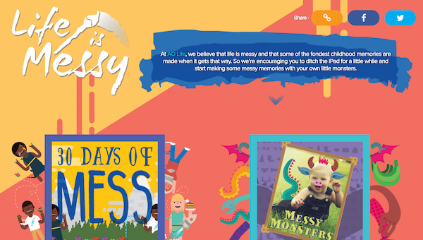
Once there we actively encourage the audience / prospective AO.com customers to turn off their reliance on tech to entertain their children & encourage them to go outside and get muddy or baking cakes and turning their kitchens into the Great British Bake Off tent.
To aid this, we put forward a real life case study to a news site of an average family switching off tech – what do they do, how do they overcome habits and challenges, what has it made them evaluate and what is the final outcome?
Here the simple goal was using a news media site with extraordinarily high metrics in a creative ‘this could be me & my family’ case study.
A placement here elevates the campaign way beyond simple link generation and places an engaging piece of cultural / on trend editorial which whilst informing you of ways to live your life with more balance it also takes you to the best washing machines etc. via a creative interactive hub.
This is just one small example of how digital PR learns from media relations and then puts a technological / interactive / creative spin so we are looking at something beyond just ‘buy washing machines from us’.
On a pure media relations level which traditional print / broadcast outlet now doesn’t have a web presence??
In fact, some of the highest value digital outlets are going to come from the digital side of traditional media.
Running alongside these sites with big hitter brand awareness / strong ranking links we need to have a clear focus on bloggers and secondary sites (regional press, lower level ranking sites etc).
A good campaign (traditional or digital) is like a jigsaw puzzle, all the bits fit together to create one large fabulous picture. If pieces are missing the picture isn’t complete.
Yet again a ‘new’ buzzword for activity that has been happening way back into the dark ages of traditional PR.
Paid, Earned, Shared and Owned is crucial to the comms mix. However, the fundamental change today (which has brought about the handy buzzword) isn’t that PR is suddenly using PESO, but that it is now more important than ever in PR campaigns – it is essential.
Native advertising, PESO, and content marketing are the shiny new names for work that PR has always done. We, as PRs, now need to start shouting about this and ‘own that room’ because we can use the fact we have always done it as evidence as why we are best placed now to run with this.
I spoke a bit about this at a panel discussion a couple of years ago when the PESO terminology was new and digital PR was just beginning to define itself. Have a look here. My fellow panellists put forward some great thought provoking comments and it was a good feisty discussion.
Fast forward two years and there is much more clarity on what is what in our digital comms revolution. There are some great papers to explain it all which we really could have done with during our panel discussion. Everything feels simpler and clearer.
A master of explaining all of this is Chad Pollitt – top 5 content marketing thought leader and top 20 digital strategist. Click here for ‘The Content Promotion Manifesto’. Essentially you need nothing else.
But please let me explain how digital has taken from traditional with regards to PESO.
In 1998 a small regional beer – Wells Bombardier English Premium Bitter – ran some brand research off the back of the explosion of patriotism across the country when Euro ’98 was held in the UK.
For the first time outside of major royal events the St George’s flag was seen displayed in residential window’s and in pubs, corner shops, post offices etc for the duration of the tournament.
People wanted to be patriotic but didn’t feel they had anything to express this with other than national supporting events. They felt overt patriotism had negative connotations and were confused how to express this.
Step forward a humble beer – a real ale at that.
Off the back of this research Bombardier English Premium Bitter was repositioned as the Patron Pint of England.
The comms strategy had to raise the beer’s profile and reposition the beer to the new patriotic stance.
Most of the strategy, in the early days, was PR led. The Guinness St Patrick’s Day template was adapted and the campaign started. Now-a-days it would be a perfect example of PESO in action. Back then it was called ‘covering all bases and leaving nothing to chance’…
PAID
Advertorials in drinks trade publications were written and placed to demonstrate the commercial benefit of stocking Wells Bombardier in the run up and on St George’s day.
OWNED
Websites were set up to support the campaign. An array of sales literature was created, by lined editorial was written and every pub company and supermarket in-house magazine was targeted and carried editorial.
SHARED
With the creation of a double decker bus (see below) the brewery ran tasting roadshows to get the beer out into the hands of drinkers under the most impactful ‘umbrella’ it could do – here a fully working cask ale bar on a fully working authentic route master double decker bus.
Plus, a bespoke designed pint glass. Roadshows were aimed at quintessentially events and partners and drove amazing awareness and great word of mouth / recommendations (the world of social media wasn’t around then)

EARNED
Traditional media relations – lots of impactful column inches in key publications / broadcast media and audio.
So without realising Wells Bombardier was in fact trailblazing PESO and Digital PR. And the above worked. The beer went from a little known guest ale to a must stock in national pub groups and supermarkets.
St George’s Day went from a ‘what are you on about’ response to the third biggest day in the pub commercial calendar (behind Mother’s day and Christmas) and pleasingly 16 years later the campaign is still running….. Probably now with a whole formal PESO strategy!!
Audiences / drinkers / consumers don’t think in PESO segmentation and they do not analyse messages via their platform. They just take on messages. Integrate and align, do not silo and together you come up with a strong message.
Where Digital PR can teach the more traditional practioners is through creativity.
Arguably as Digital PRs we are making our own take on news. We must religiously monitor trends and news daily. From this we can take our own creative spin and here really use the fantastic armoury of creative digital tools we have.
The trick here is to think about what you personally and indeed what your friends will click on, read and then share. Think about what you like – infographics, slideshows, widgets, gifs, videos and what leads you in – snappy headline copy? Then use that in your work.
Essentially the ball is in your court – you are master of your own news creation so get creative and make it happen.
This emphasis on ‘always on’ trend analysis and taking a strong creative focus to communications appealed to me in making the switch from traditional to digital. Also I love the emphasis on tools being on hand to add strategic development.
It is no longer just your personal instinct – don’t get me wrong. That gut instinct is still so very important but now it can be backed up by tools and technology to ensure you are indeed on the right path.
They are many way more experienced than me right at this moment in time who write about how digital can modernise your work flow.
The master of them all, to me, iswww.wadds.co.uk. He, with others, devised #PRStack. He has since put me onto #FuturePRoof. Both of these will blow your mind and become must refer too as you plan campaigns and lead your teams.
PR is PR but we wouldn’t be where we are now as an industry without learning from our past experiences.
In a nutshell Traditional PR gives core evergreen values and principles which Digital PR extends by combining these with data and modern technology.
Digital and traditional PR’s both embrace instinct, engagement, storytelling, emotions, trust, communication, passion and appetite and bring these to life in numerous ways.
Unique to Digital PR is the use of technology – we are adapting too and cracking on with embracing forms of new media to engage in a two-way dialogue. Engaging, listening and responding. Simple formula but elevates good PR to outstanding awesome PR – again look at #Likeagirl.
Relying on writing and sending out press releases without giving consideration to listening or engaging can no longer work. PR needs to get out of it’s traditional comfort zone of straightforward imagery and text. A modern practioner needs to be confident in working with and producing all forms of content.
People who I learn from daily and who have gone on a journey from traditional to digital and exemplify best practise in both are below and I highly recommend you seek them out on social, LinkedIn, TED talks, conferences etc.
These guys all have brilliantly creative media minds and embody the excellence of media relations but now have the added twist of being digital masters. Give them a go, see who they follow and build up your own network of influencers.
After all a modern PR practitioner never stops learning and isn’t afraid to acknowledge this. Learning is what keeps us all evolving.
Leave a Reply
You must be logged in to post a comment.