Using Attributes for Navigation: The Good and the Horrible
Some examples of attributes that shine, and some that don't.
Some examples of attributes that shine, and some that don't.
For the last 14 years, I have done my best to extol the virtues of attributes (both product and user) as the way to really enhance the user experience. Attributes can be used in a number of different ways, from navigation to personalization to mass customization.
Using attributes to your advantage requires two important things: clean, robust metadata, and a great intuitive user interface. Today we’ll look at some examples that shine, and some that don’t.
First, let’s talk about getting clean, normalized, and robust metadata. Where does that data come from? Most of our clients create it themselves after we do an extended working session on generating the taxonomies, ontologies, and lexicons they will use to describe and order their products and users. This is not a simple process, however, and someone must be in charge of making sure human error doesn’t dirty the metadata. Some companies, like Edgenet, are meta-data creators and are in the business of selling clean, robust, and normalized meta-data to customers. (Edgenet, for instance, supplies meta-data to Google and Bing to assist in those companies’ e-commerce/product page, such as the data on this page.)
Wherever the data comes from, it needs to be well-defined (the least variation necessary to cover the entire scope of current and future products), normalized (the same terms are used across the enterprise to indicate the same idea), extensible (so future products and categories can fit without destroying the ontology), and clean (so the automation acting upon the attributes is accurate).
The next step is to build an intuitive user interface that uses these attributes. Let’s concentrate on a common use of attributes that comes with a well-known user interface: attribute-based filtering.
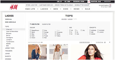
I’ll start with what I consider to be good examples. Here is an example of the expandable filter capability my company built at HM.com:

After the user chooses a major category or subcategory (on the left), she has the ability to use the product attributes to further refine her view. The system is dynamic, so she selects attributes, the products reshuffle, and conflicting attributes are greyed out.
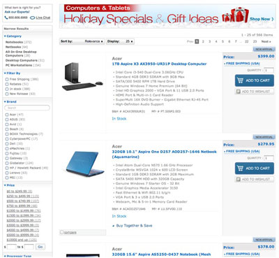
Here is a slightly more complicated, but still functional version at B&H (not a client of ours):

Its list of attributes is perhaps too long to be presented the way it is (it goes all the way down the left-hand side of the page), but it is functional and works.
The key here is that both of these companies understand the difference between the use of attributes for filtering and for navigation. While technically attributes are used to underlay both ideas, they need to be presented as different ideas. For example, the B&H page above allows the user to click a category to narrow results. The idea here is that the user is navigating into a subcategory. In reality, this subcategory (Notebooks, for example) is just another attribute, but it is not presented along with the rest of the “filter by” attributes.
The H&M example does something similar. Categories are displayed on the left, along with their subcategories and a “View All” link. Filter attributes, however, are reserved for the top of the page and presented differently.
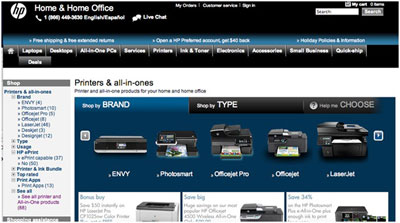
Let’s look at a bad example, which I discovered this weekend while looking for a new printer.

There are so many things wrong here it’s hard to even know where to start. The overall concept of the left navigation is flawed to begin with. It mixes category navigation with attributes, making it very unclear where the hierarchy is. This is much clearer on the next page after the user clicks “See All” (the last link above). We’ll get to that in a moment.
Most of the issues I have with this navigation is that it is a motley selection of ideas, some of which are sub-categories and some of which are attributes that shouldn’t be thought of as being on the same hierarchical level. For example, “Brand” and “Top Rated” are high-level ideas, whereas “ePrint” and “Print Apps” are less important. Because there already is a main navigation in the center of the page (and in the top nav), it is not intuitive that this left-hand section is also navigation and not a filter.
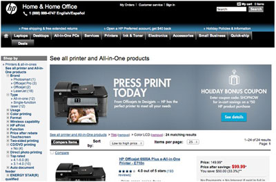
Confusing the issue more is that this area is used for product filtering on the next level down:

On this page, we see all printers, and can select items in the left-hand navigation, but this time they are attributes that filter the results. If you look at the breadcrumb, I’ve already selected “Color LCD” and the poorly named “Yes” attribute, which was the option under one of the other attributes. I have no idea which one it was simply from looking at the fact that “Yes” is selected, and that is the point. As these are presented as navigation, it was almost shocking that one could have multiple “categories” selected at the same time.
If you look under “CD/DVD Printing,” the only option (even when no other filters are selected) is “No,” making this an unneeded attribute.
This page is a mess. The navigation doesn’t make sense to start with, and the way it implemented attribute-based filtering compounds the problem. If this left-hand area was strictly for attribute-based filtering, there would already be enough problems to discuss. But add to that the multiple use of this area for filtering and navigation, and you have a site that is simply frustrating to use.
This is a case in which a company (HP) has the metadata they need, but has no clue how to present it to a user in an intuitive fashion. To succeed in using metadata, you need to not only start with great data, you need to understand how to use it.
Questions, comments? Leave them below.
Until next time…
Jack
Leave a Reply
You must be logged in to post a comment.