Every Email Version Is Your 'Mobile Version'
If you ensure a good experience across devices, you can bank on a continuing increase in opens, clicks, and conversions.
If you ensure a good experience across devices, you can bank on a continuing increase in opens, clicks, and conversions.
What a difference a year makes.
Return Path reported last month that mobile device email opens increased 82 percent over March 2011. At the same time, email read on the iPad increased 54 percent. Marketers are seeing an average of 30 percent of emails opened on mobile devices, with this rate expected to climb to over 50 percent by the end of 2012.
Some other telling results: 63 percent of U.S. smartphone users say they would delete an email not optimized for their mobile device. Only 2.4 percent of smartphone users said they would open an email on both their mobile devices and computers.
In May 2011, I recommended that you start optimizing your email creative for viewing on mobile devices (“Optimize Your Email for Mobile“).
This new research indicates that the time to prepare is behind us. You can no longer think you’ve done your job if you simply link to a “mobile version” in your preheader.
Every version of your email is now a mobile version with almost nine of every 10 email readers checking messages via mobile devices every day.
It is now imperative to make your email creative easy to view on a mobile device. Your creative needs to adapt whether your subscriber is reading it on a desktop, a tablet, or a mobile device.
Design With Mobile in Mind
As more subscribers use their smartphones to view your email, it becomes even harder to get the subscriber’s attention in the mobile inbox. The mobile inbox takes up a third of the viewing space, leaving you only 200px to get your message across.
As a result, the subject line counts as your headline. Mobile users are relying heavily on subject lines to signal messages they should open immediately, so yours needs to be compelling and make an impact.
Consider these tips:
You also must keep the following creative considerations in mind when you are designing your creative for mobile devices:
Test a Responsive Layout
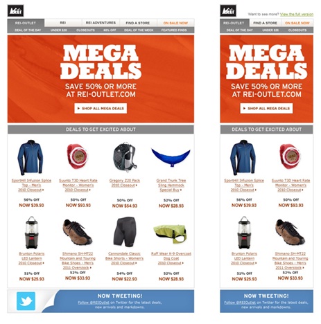
The ultimate in mobile-friendly emails is created using a responsive layout. Responsive-layout email creative relies on the same HTML code for all versions and uses media queries to style the HTML based on screen size.
Subscribers viewing the creative on larger screens (desktop, tablet) see the full design, while subscribers using native email apps see the smaller mobile version.
REI is an excellent example of a marketer that has gotten this concept right. Its navigation condenses down from four items on the desktop version to two across on the mobile view.
The primary imagery and content in the creative can scale to drop extra space when viewed on a smartphone. Tertiary messages are designed so that the image can be hidden while the overall message stays intact.
 |
|
| Desktop/Tablet version | Smartphone version |
The Last Word
If you have been on the fence about getting your email creative in shape for mobile devices, now is the time.
Your subscribers’ move toward mobile is not showing any signs of slowing down. You can no longer assume that mobile users are returning to their desktops to get the full email experience.
Don’t try to fit everything in your desktop version of an email message into your mobile version. The secret is to plan to streamline content and ensure that your subscribers get your message and take action no matter which device they use to view your content.
Research shows that 63 percent of U.S. consumers who have made a purchase via their smartphone did so in response to a marketing message delivered via mobile email.
If you ensure a good experience across devices, you can bank on a continuing increase in opens, clicks, and conversions.
Leave a Reply
You must be logged in to post a comment.