Media buyers are a demanding bunch. They have decisions to make, and in order to make informed choices they need a lot of information. They have questions aplenty. And they want answers.
Several of the most popular probes have to do with banner ads. What size is best? What should banners contain? Where should they be placed on the page? To what degree should we rely on display media, anyway? One day the banner’s all but dead and the next it’s being used by Chanel No. 5 to generate 7.4 million views of Brad Pitt waxing poetic about a metaphorical journey.
In fact, banners like Chanel’s, which began its viral climb after appearing on the home page of NYTimes.com, leave us even more confounded. An ad’s success depends on a lot of different things, from the advertiser’s objectives to its past campaigns (Chanel’s impressive exposure was largely due to a series of spoofs that drove viewers back to the original, as well as to previous ads). Regardless of who the advertiser is and what’s being offered, there is no “one-size-fits-all” solution. Until now.
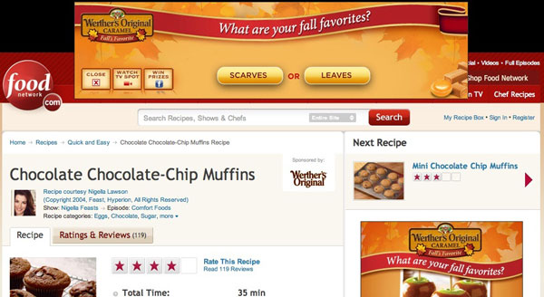
Meet the perfect banner.
At first blush it might appear a little nondescript. It doesn’t streak across the site page or leave consumers clambering to forward it to their friends. It does, however, contain six of the elements most critical to a functional and effective banner ad.
- It’s relevant. Above all, banner ads should be pertinent: to the product they’re promoting, and to the environment within which they appear. Werther’s Original’s “Fall Favorites” theme speaks to the product’s autumnal flavor. That it chose to sponsor the “Quick and Easy” section of FoodNetwork.com – sweet recipes in particular – reflects the nature of the product, while simultaneously putting it in front of the right audience of buyers.
- It’s prominent. This top-of-page expanding leaderboard is hard to miss. Couple that with the user-initiated expansion and the banner achieves that coveted blend of being both present and non-intrusive.
- It’s interactive. To interact with Werther’s Original through the ad, the user begins with a multiple-choice survey featuring fall-related questions like “What are your fall favorites? Scarves or Leaves?” Each time the user clicks, that selection is pitted against a new option. After a few rounds of this the user is asked whether she’s had enough and she’s given a new choice: continue with the in-banner poll or click through to Facebook for a chance to win a prize. Either way, engagement with the brand continues.

- It’s social. The link to Facebook, which appears as both a post-poll prompt and a stationary button on the banner, moves the user activity from a one-sided media environment to a platform built for conversation. There’s a good chance that once she’s entered the contest she’ll explore the brand’s Facebook page further, and Werther’s has made sure there’s plenty there for her to do, including browsing product-related recipes and brand event news.

- It incorporates video. Americans are spending billions of minutes each month watching video ads on sites like Hulu, YouTube, and the BrightRoll Video Network. Including a video in a banner is a surefire way to tap into this prevailing behavior. Werther’s has done it right by requiring the viewer to initiate both the video and the audio on the clip. The video is also based on a TV spot, for added familiarity.

- It’s seasonal. From the product positioning as a “Fall Favorite” to the imagery, the poll questions, and the contest prize (“A luxurious Ralph Lauren Cashmere Blanket! Perfect for cuddling by the fire on a fall night, with a good book and some Werther’s Original”), everything about this banner is seasonally relevant, and thus more likely to catch a consumer’s eye. This is particularly important when the ad is placed on a site that produces a lot of seasonal content of its own.
Marketers have a lot of options when devising a banner ad campaign. While this is hardly the only design that works, work it does – on multiple levels, with virtually all of the qualities and characteristics a consumer could want in a display ad.
If that isn’t perfection, I don’t know what is.


Leave a Reply
You must be logged in to post a comment.