Automate Dashboard Updates to Focus Your Time on Analysis
If you ever find yourself spending too much time manually updating dashboards, stop. Think. Figure out the best way to automate.
If you ever find yourself spending too much time manually updating dashboards, stop. Think. Figure out the best way to automate.
Updating customized dashboards, spreadsheets, and reports manually is a time-consuming process. It’s also one no one really enjoys doing. Sure, it’s quicker to do it once, but over time automation will save you a lot of effort. Especially if you are an agency or have a lot of sites you want custom dashboards for.
While it may come as a surprise to some of you who set up automation ages ago, I know many are still manually updating dashboards both on the agency and the brand side. The good news is tools exist to not just make your life easier, but free up time previously spent entering data. This allows for more focus on the fun, creative, and ultimately valuable part of analyst work: fleshing out insights, giving actionable advice to your team, and sharing results.
Today I thought I’d share three ideas to help you stop any manual updating of dashboards that are particularly useful if you’re using Google Analytics. However, these tips should still have value no matter what you’re using: most major analytics packages have application programming interfaces (APIs) and configurations that allow for similar automation and exporting of data.
1. Use APIs/scripts to auto-populate a custom dash in Google Docs.

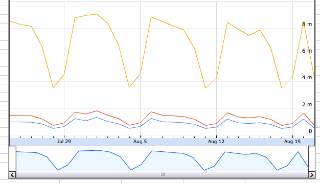
Google Analytics data input into a spreadsheet via the Analytics API and Apps Script.
It’s now relatively easy to create your own automatically updated dashboard in a Google Doc if you’re using Docs and Analytics. This is a great way to share your data in a malleable/social format with your entire organization (or just select people) with a simple link. Once the data is inside a spreadsheet, it’s easy to manipulate, create new visualizations, and build internal dashboards. Also, after you have built one it’s easy to copy-paste it over and customize versions for different stakeholders. Learn more here (no code required!).
2. Use a connector to pull data out of Analytics into the desired visualization tool.

Scatter plot created from GA data in Tableau.
While I’m clearly preferential to the sharability and simplicity of Google Docs, some brands and analysts like to get dashboards and data to play with in offline spreadsheets or apps. For this, I’d recommend checking out some of the many great tools out there like Excellent Analytics or Next Analytics. Additionally, a popular data visualization tool Tableau recently released a connector that plugs right into Analytics as a data source and lets anyone create beautiful and highly customized visualizations.
3. Build custom dashboards right in the product.

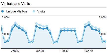
Area chart in Google Analytics custom dashboard (via Justin Cutroni’s PR dashboard).
Alternatively, skip exporting altogether and just make/share custom dashboards (which have an ever-growing list of widgets) right in the product. While this is listed last, it’s possibly the best solution as it’s the easiest to create and lives right in the product. You can even automate the delivery of these dashboards to various stakeholders so they don’t even need to log in to the product to get their daily or weekly update. Most analytics solutions offer this as standard functionality and I’d recommend you try to stay within your main tool as much as possible and build custom dashboards for each of your stakeholders or groups. To give you a head start, our team has built a solutions gallery with many dashboards tailored for specific industries and specializations.
I hope that no matter what you’re using you consider spending time up front as part of your measurement planning process to automate the busywork. Save your manual efforts for analysis and creative presentations of data with insights to prove your point and make decisions. If you ever find yourself spending too much time manually updating dashboards, stop. Think. Figure out the best way to automate.
Leave a Reply
You must be logged in to post a comment.