17 inspirational examples of data visualization
We can all collect masses of data, but it only becomes useful when we use it to make a clear point.
This is where data visualization comes in. Showing data in context and using creativity to make data tell a story can bring the numbers to life.
There are a whole bunch of data visualization tools out there to create your own, but here are some existing examples for inspiration.
This excellent visualization from Flowing data uses information from the American Time Use Survey to show what Americans are up to at any time of day.

This, from the wonderful information is beautiful website, looks at how the major online streaming music services compare in terms of paying the musicians.

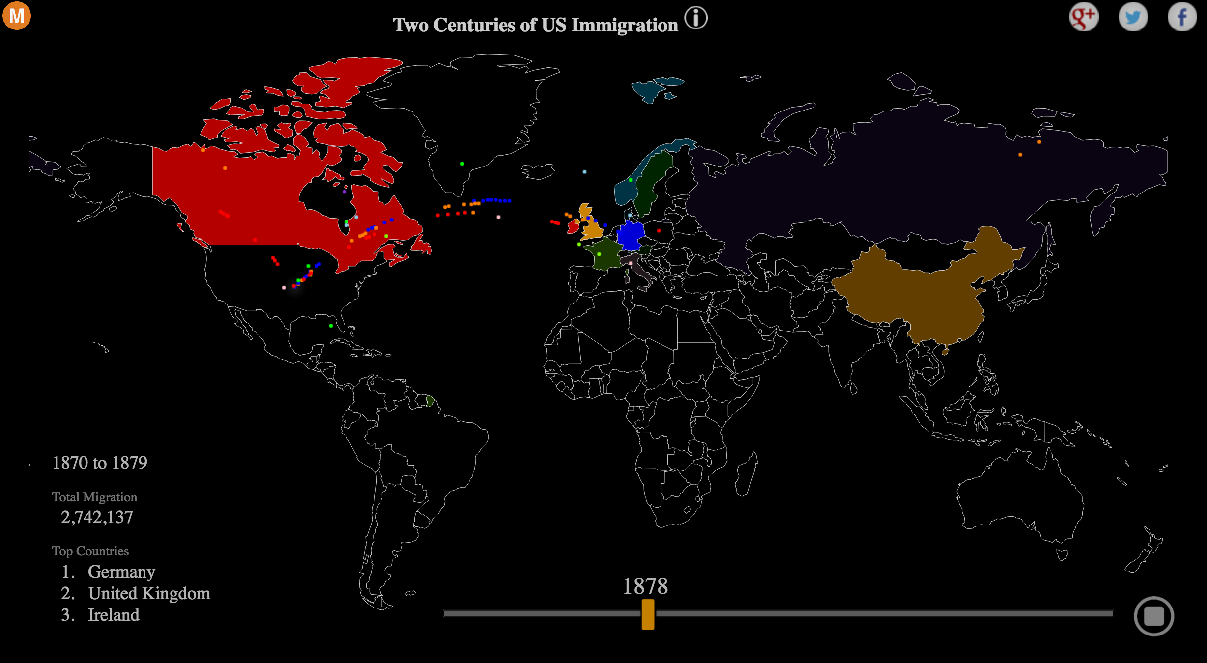
This fantastic visualization from metrocosm shows the various waves of immigration into the United States from the 19th century to the present day.
This gif from the Pew Research Center is a great example of how movement can be used to convey shifts and trends over time.

The German town of Münster produced this series of images back in 1991 to encourage bus use. It’s beautifully simple showing the relative impact of the same number of people (72) on bicycles, in cars, or on a bus.

This infographic from excelacom presents what happens online in 60 seconds, including:

This moving visualization shows wind speed and direction in real time.
It looks great and is easy to understand, which is key to effect data visualization. This one comes from hint.fm.

I’ve always been pretty cynical about this ‘X things successful people do before breakfast’ stuff – as if by following this, people are suddenly going to become Steve Jobs or Albert Einstein.
However, this one from podio showing daily routines of creative people is very interesting. It won’t turn you into a great composer, but it’s a fascinating insight nonetheless.

This is a series of visualizations from the Wall Street Journal, which shows the impact of vaccines on various infectious diseases.
It’s striking stuff, which clearly demonstrates the incredible positive impact of vaccination programs in the US.

This is a great use of freely available data to provide useful information for the public. 
This uses tweet data to present a geographical representation of where people tweet about topics. The example below is for ‘Brexit‘.

This, from Neil Halloran is a cross between data visualization and documentary.

There are two versions of this. The video version you can see embedded below, and an interactive version.
A simple but very effective visualization of the world’s population, and the speed at which it increases.

This, again from information is beautiful, uses data on the intelligence and other characteristics of dog breeds, plotting this against data on the popularity of various breeds from the American Kennel Club.

This, from Mike Moore, shows the relative writing percentage for each Beatles album, as well as the contribution over time.

From Will Gallia, who used data from a single day’s use of the London underground to produce this timelapse visualization.
A day on the London Underground from Will Gallia on Vimeo.
This is from way back in 2010, and illustrates the fact that antidepressants and other pharmaceuticals are now showing up in fish tissue.

Leave a Reply
You must be logged in to post a comment.