5 great examples of UX in ecommerce and what you can learn from them
User experience (UX) for online retailers means giving potential customers the best possible journey - all the way to the checkout. These are the ecommerce sites doing it best.
User experience (UX) for online retailers means giving potential customers the best possible journey - all the way to the checkout. These are the ecommerce sites doing it best.
User experience (UX) for online retailers means giving potential customers the best possible journey, all the way to the checkout.
Here are a range of examples from ecommerce sites, showing the big and little touches that can make a difference.
Amazon doesn’t necessarily have the cleanest design, and has been criticised from a UX perspective, but there’s much to learn from its approach.
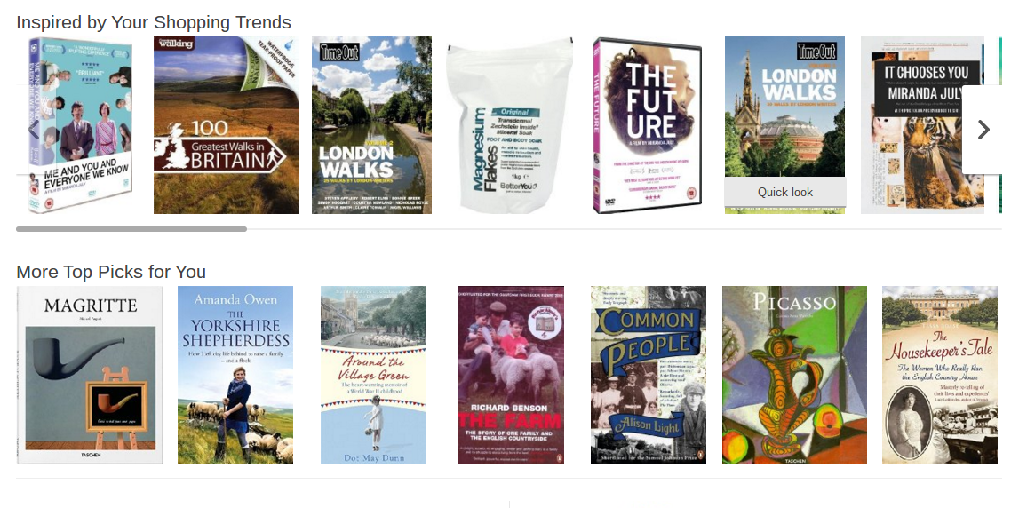
For example, Amazon ensures an easy journey – straight to the checkout – by recommending items according to your shopping history.
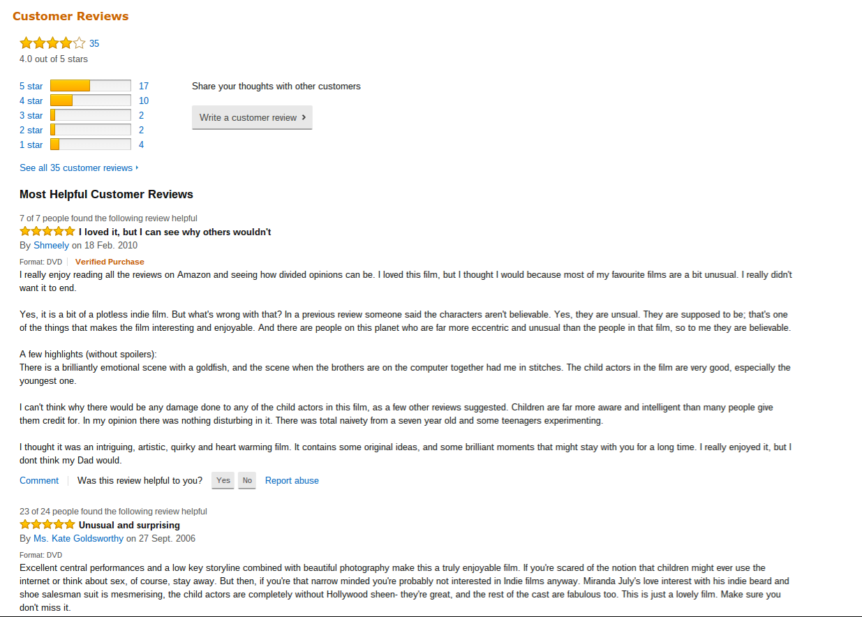
In addition, the way Amazon ‘rates’ its reviews is really useful. They are filtered as helpful or unhelpful, and ranked according to how helpful they are. This is great UX for customers on the site, because it ensures the immediate availability of the most relevant and useful review for a particular product.
Perhaps the key feature, and one which has played a big part in Amazon’s success, is the sheer smoothness of the checkout process.
The ‘one-click’ ordering feature, which relies on saved customer payment and address details shortens the distance between product and checkout, and has spawned many a million drunken purchases.
This is a site which doesn’t necessarily offer the greatest overall user experience, but there are some good features.
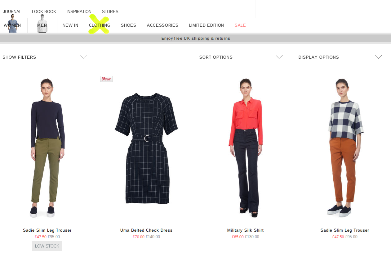
The site is sleekly designed with images that change from the product modelled, to the product itself when a user hovers over it. A good way to convey the products simply and easily to shoppers.
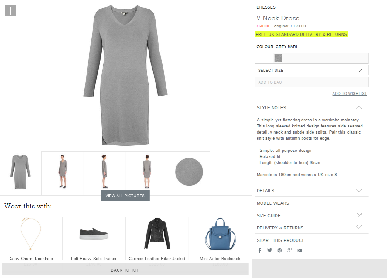
Product information is clear, and the retailer does a god job with cross selling, recommending other items to wear each specific item with.
This is a widely used tactic, but not always done well.
Apple is a pretty obvious choice, but there is no denying that the brand’s super sleek website design makes for great UX.
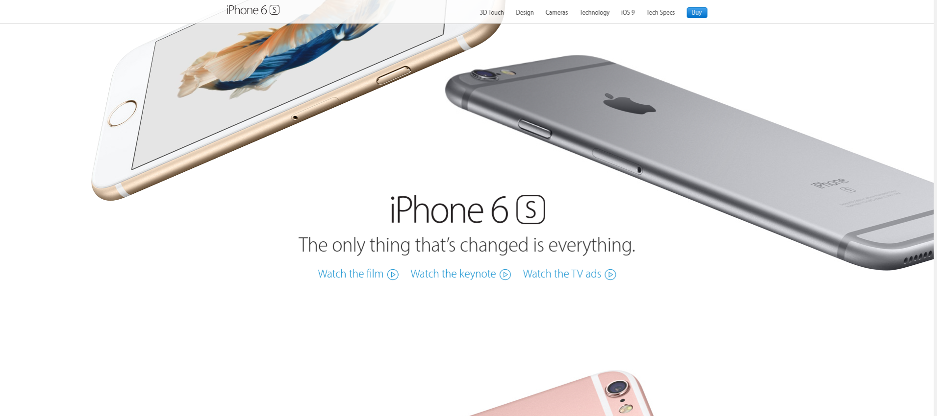
Apple’s site stands out for its use of imagery. Product images are clear and detailed, and instead of providing static images of different angles, products on the site are interactive and move according to a user’s actions.
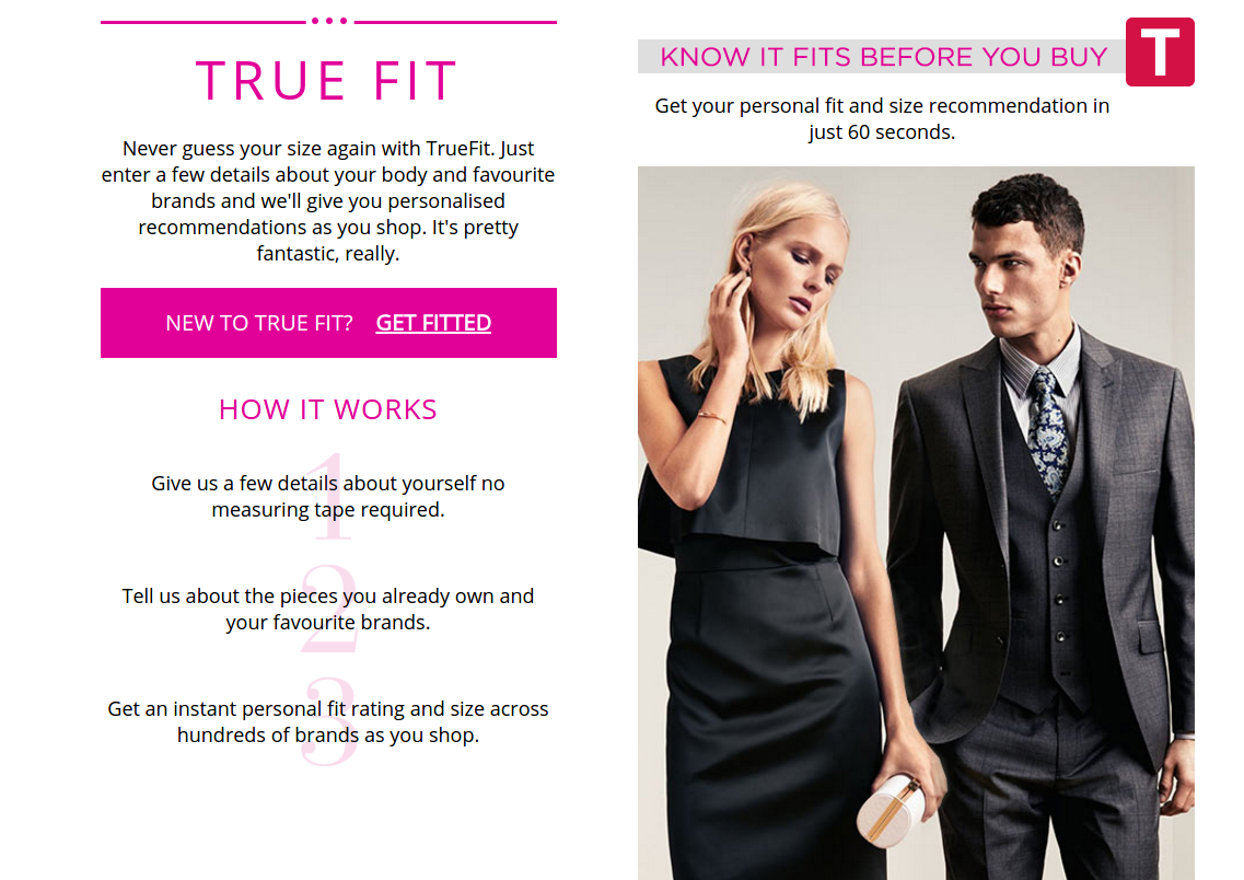
House of Fraser, like many department store sites, faces a challenge of stocking so many products yet making them easy to find and creating great product pages for each.
It does a lot of this very well. We have great filtered navigation, clear product imagery, transparency over delivery, and more.
An added level is the little details which make it easier for customers to select the right product.
For example, the True Fit tool takes details on fitting from customers and then uses this data to recommend which size to buy on product pages.
It’s a great way to ensure customers find the product that is right for them, and also helps to reduce returns rates.
There’s much to praise about Schuh’s site in general. For now, let’s look at its mobile site.
The retailer has managed to slim down the product page for mobile users while still retaining the features which make it successful.
For example, we still have a choice of images for each product, and even a 360 view.
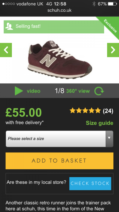
Another great feature shown here, and one which is perfect for mobile shopping behaviour, is the check stock option which allows you to find stock levels at local stores without leaving the product page.
With online retail becoming more established, the best retailers should seek to differentiate themselves by providing a great customer experience.
Customer experience encompasses everything from on-site to customer service, delivery and returns, but UX plays a part in this.
Therefore it’s important to really consider the user experience on your site.
Is information clear? Are images of a good quality? Is shipping information accessible? Is the buying process relatively simple? Does your site recommend products according to past purchases? These are just some of the points to consider.
Leave a Reply
You must be logged in to post a comment.