Why user testing should be at the forefront of mobile development
This article explains the why, when, what, how, where, and who of user testing for mobile friendly websites or apps.
The sooner you find out your what is wrong with your *brilliant* concept, the easier, quicker, cheaper (and less embarrassing) it is to put it right or – if it is a total flop – go back to the drawing board.
That is why it is never too early to start testing and why testing should be ingrained into the design and development schedule.
Dr David Travis, chartered psychologist and managing director of UK-based user experience and training company, Userfocus:
What are the dangers of not testing? Designing the wrong product that doesn’t have a user need; designing a product that people can’t or won’t use; design teams failing to understand their users and designing for themselves; and/or developing a system for the wrong context.
However you judge the success of your mobile project – whether a mobile-friendly website or an app – the reception it receives from users will be critical.
This means it you have to test to see if it:
There are plenty of methods and tools that will help highlight issues (e.g. things that don’t work properly, or are unpopular with users), but if you really want to know what works with users, you need to test it on real people.
Doug Brams, Principal UX architect, mobile web, The Home Depot:
The Home Depot conducts both qualitative and quantitative research to reveal what users need from our website and app experience. We work hard to improve both the general usability based on known HCI principles [Human-Computer Interaction], but also to understand some of the often subtle platform differences in terms of context of use and key tasks. This helps us present the right information at the right time to create workflow efficiencies and delight our users.
There are many facets to truly understanding our target users so it is important to employ a variety of methods. Some tools such as clickstream analysis, tracking/analytics, A/B testing or multivariate testing and clickstream analysis help to elucidate where problems spots exist with the interface or task flow.
However, these are just clues as to where to look and do not explain why the problem is occurring. Rather than guessing at causality, it is best to follow up with other techniques such as usability testing and user research.
Testing should start ASAP. Long before coding begins, perhaps even before you start putting pen to paper. Stop thinking of testing as reactive, testing should be proactive.
Nothing to test? Rubbish.
Dr Raluca Budiu, senior researcher, at US-based user experience training/consulting specialists Nielsen Norman Group:
Test as soon as possible. You can sometimes start testing even before you have the first designs. For example, if you have competitors in the same industry and they do have mobile products, you can start by testing those. In that way you can learn which design mistakes to avoid. You can also do diary studies and field studies to better understand the needs of your users and how they currently do the tasks that your site or app will address.
As soon as you have your first candidate wireframes, test with paper prototypes to make sure that you are on the right track. You don’t need to put effort into high-fidelity prototypes in the beginning — just test your flows to make sure they make sense for the users. At the later stages, as you refine your visual design and individual page layout, high-fidelity prototypes become important.
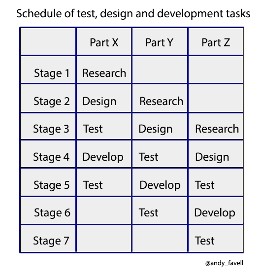
Regular testing should be interwoven throughout the planning, design and development process.
Consider it as three disciplines/teams working in parallel, each feeding and feeding back to the next stage, with all teams discussing and agreeing in a regular meeting at the end of each stage/iteration (these stages are sometimes referred to as a sprint and may last two to four weeks).
A simplified schedule of test, design and development tasks, might look a bit like this:
Nielsen Norman’s Budiu:
Leave room for testing when planning your design and development process and interweave testing at various stages in the development.
Use a pipeline model where designers and researchers work on refining the next area of the user interface (UI), while the developers code those areas that have been already tested and for which the team has agreed on a design. Start with the areas of the interface that are difficult to design and/or important to the organization.
Testing advocates love to quote – with good reason – the old adage that the same problem that costs $10 to fix early in the development process; will cost $100 pre-release; and will cost to fix $1000 if discovered post release.
While the origin and empirical proof for this maxim is hard to come by, the logic is as applicable to mobile user testing as any other form of software development.
Testing can cover innumerable aspects of your site, from size of a button to content headlines. But one critical thing is to concentrate on testing tasks – both the tasks that are important for the user as well as those that the business wants them to achieve.
Keep it simple and to the point to avoid influencing the outcome. E.g. Your task is to use your mobile device to find/purchase a new bed; a hotel for tonight; a night out.
As the subject carries out the task, you will study:
Usability and UX are often confused, and regularly argued over. The first is concerned with how easy people find it to complete the tasks they want to do.
The second is concerned with how much people felt about using it e.g. like/dislike. Often mobile design is a compromise of the two.
This is a subject for a future column, but if you’re unclear, consider Thomas Baekdal’s analogy: how do you get from A to B? Do you take the wide, straight, fast, but dull, highway – the usability option – or the twisting, engaging, mountain road – the high UX option?
One major difference between usability and UX is the measurability of results. Usability is often more easily quantified: Was the task completed? How long did it take? Was the navigation intuitive? Did they attempt to tap pictures that weren’t links? Did they take the expected route? How fast did the pages load? Did it crash? Etc.
Testing for UX is more emotive, often personal to the individual, making it harder to measure. What may be a frustrating, tedious task for one, may not be for another.
Also the user may not be able to quantify why they preferred one site to another e.g. was is it the images, font, colors, navigation, content or a general look and feel? And it can be harder to design UX test without influencing the outcome.
What you test also depends on where you are in the process.
This might be:
A previous column on identifying the needs of your mobile audience touched on the various ways to solicit user feedback – e.g. through surveys and focus groups and to track user behavior through heatmaps and web analytics.
This all provides valuable insights, but the king of user testing is being able to “watch” and “hear” how the user interacts with your site or app.
The tests can be conducted:
And will, arguably deliver better results when it is conducted in context:
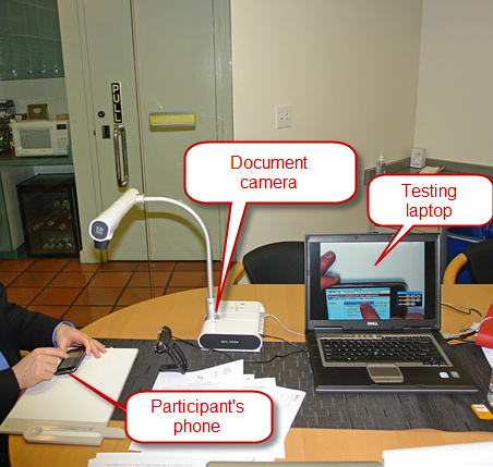
A common scenario for a user test would be: a camera (ideally a document camera) videos how the user interacts with the site/app on their device and sends this to a monitoring computer. This is often accompanied by the user describing what they are doing – known as thinking aloud.
The following image shows the user test set up recommended set up by Nielsen Norman.
The Home Depot’s Brams:
Remote unmoderated usability testing can be done rapidly these days through services such as usertesting.com. The advantage of this is the speed which a test can be done.
However, in my opinion, nothing beats a one-to-one moderated usability study to help explain why issues may be occurring. The downside is you must think of all your questions and tasks beforehand. Live moderated sessions have the advantage of being both more organic as well as allows the researcher to probe deeper when you hear something of interest with follow up questions.
For longer term understanding you need to get out in the field and into users’ homes to interview them, conduct shop-along studies or ethnographic research. This helps reveal when in their journey they use your site and where it fits into their thinking, planning and decision process. It also helps identify the trigger points that kick off a session or moments of truth where brand loyalty can be developed.
Analyzing the user research from lots of users can help you begin to truly understand their motivations, inspirations, and aspirations. From all this data you can produce useful artifacts such as customer journey maps and user personas. These can become tent poles to help anchor your design thinking.
One of the most important lessons in user testing is to keep it simple. Often conducting multiple short tests with a few participants will be more effective than expensive and complicated studies with large groups.
The other advantage of small user tests is it provides empirical proof to back up your pitch to senior management, explains Joe Pendlebury, mobile user experience consultant who has advised major UK retailers.
In usability testing sessions, I’ve found that you start to receive repetitive feedback with any more than five participants. Sometimes, even four is enough. Whilst face-to-face sessions are well-recommended, they are time-consuming to prepare, set up, facilitate and moderate. With remote user testing, you can have a test up and running, and be receiving feedback from participants, within minutes.
In addition, as these remote sessions are often recorded, you have visual feedback available on demand, to present back to internal stakeholders. This is an extremely powerful tool to have in your inventory, and can greatly help with decision-making, and seeking UX buy-in, at a much senior level (such as with C-level execs).
Often overlooked as a testing resource is the company’s employees:
When you’re looking at the same thing, day-in, day-out, it’s easy to reach a point where you think you’ve found and addressed all the bugs you need to. Chances are, you’ve not even touched on half of them. That’s where internal beta testing can come in handy.
Distribute what your build to internal employees and ask them to test the app/site on their device. Offering some sort of incentive (such as a £5 or £10 gift card for every previously unknown bug found) will drive participation in the program.
No test or testing method is infallible, which makes it imperative to have a number of testing methods in your arsenal.
The Home Depot’s Brams:
An important aspect of testing is to take each finding with a grain of salt and employ multiple methods to look for patterns to get closer to the truth.
This is Part 15 of the ClickZ ‘DNA of mobile-friendly web’ series.
Here are the recent ones:
Leave a Reply
You must be logged in to post a comment.