11 of the smoothest ecommerce checkouts on the web
Ecommerce checkouts are where much of the action happens for retailers, so which sites do this well and which need to improve?
With contributions from our recent #ClickZChat, our recent Ecommerce Checkout Best Practice guide, and yours truly, here’s a list of the bad and good.
The good examples below have been selected for all round usability, or sometimes some key features which other retailers could learn from. The last two have room for improvement thanks to issues which may cause customers to abandon the process.
I should also add a caveat here. While there are certain features which many would agree are best practice, what works on a checkout can be unique to a particular retailer or type of website. Finding the right blend requires a continuous testing and improvement process.
Ease of use. Unless users have an account already, they essentially need to enter address and billing details to complete the process. A good checkout should seek to make that work as easy as possible, adding shortcuts where they will help, and avoiding anything which adds extra friction.
Helpful time-saving features:
Sources of friction:
Domino’s has made a big play around mobile, and it has paid off big time. It recognised the changing device habits of customers and adapted accordingly.
Here, the checkout is nice and easy – no registration, easy forms to fill in, saved payment details for repeat customers, and more.
What I find impressive is that, if I forget my password and use the same email address, I can order easily In this situation many sites would force me down the route of password resetting, which isn’t a lot of fun.
It even has a ‘zero click’ app which removes any remaining hassle from checkout. Simply open the app and, after a ten second countdown, your ‘go-to’ pizza will be sent out.
Registration can be a barrier to purchase. It’s an extra step before entering checkout, and can seem like more hard work for shoppers.
On the flip-side, retailers want to encourage customers to register, as this makes it easier to retain customers through easier repeat purchases, and the ability to market to them. There benefits can apply to customers too.
One easy and very obvious thing to do is to offer account creation on the final step. Lowe’s does this just before the final ‘complete order’ button. No extra hassle and no risk of deterring customers.

This is a nice smooth checkout. It takes you straight from the shopping cart page into the address and payment screen – no registration / guest checkout step in between.
It’s a one page checkout, so everything can be seen and reviewed on the same screen. It just works well.
Amazon just makes repeat purchases so easy. Of course, you need to have customer’s payment and address details already, but once you do, Amazon is one to learn from.
It’s all about minimising clicks and steps. From adding a product to basket to confirmation it’s three steps. Not many can beat that. It costs me a fortune in impulse buys too.
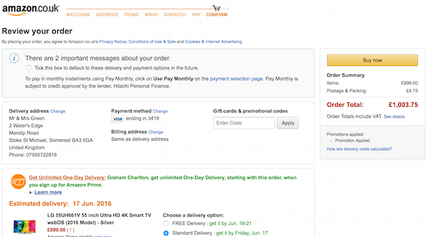
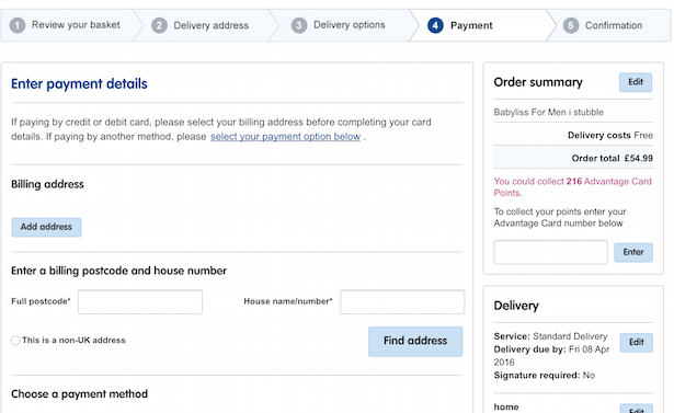
A well-designed checkout, good design. One possible improvement would be to enclose the checkout process, at the moment some of the top navigation links remain, leaving an accidental route away from checkout for users.
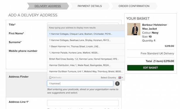
That aside, we have a clear progress indicator, a useful summary of the order contents, price and shipping method. Also, the address entry uses autocomplete to make it easier for users. Always good to remove the hassle from the process.
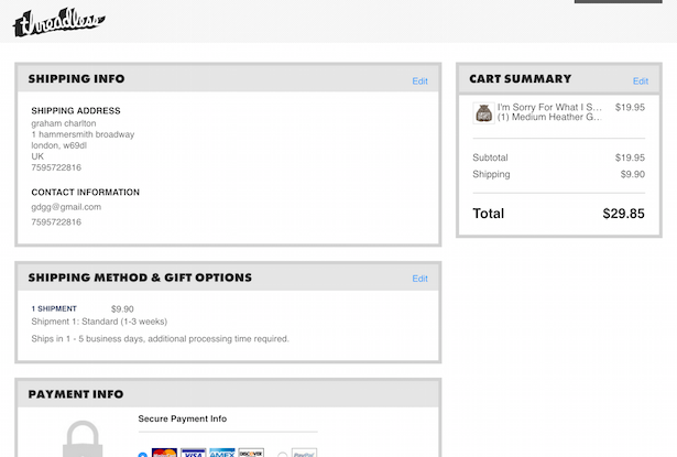
I often refer to Schuh when writing about ecommerce, but that’s because it’s very good indeed. The team understand the importance of checkout usability and test and improve regularly.

Take the screenshot above, here are the features I’ve picked out, from top down:
A well-designed and easy to use checkout which contains plenty of best practice features.
Forms are clear, required fields are marked as such. There’s a clear progress indicator and the checkout has been enclosed to remove distractions.

A good solid example of a one page checkout. One advantage of the one-page checkout is that it seems quicker to users, even it’s really more or less the same amount of form-filling as on any other checkout.
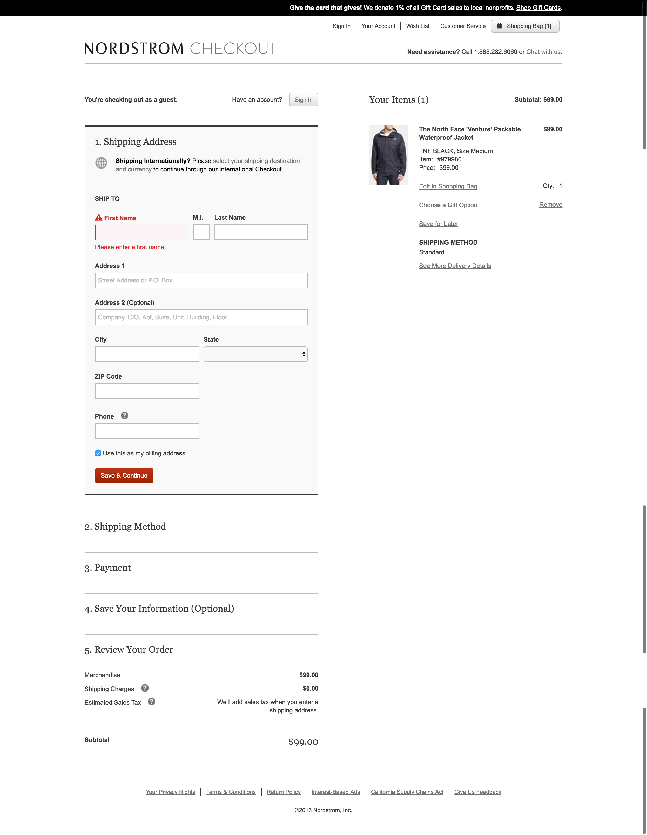
Nordstrom has clear forms, a useful summary of cart contents, and clear steps to complete the forms.
This site has a novel approach to registration – as soon as I add an item to my cart from a product page I’m prompted (via a popup) to create an account via email or Facebook, or to login to an existing one.
Then I’m asked to create a password before I can continue.

After this I’m sent into a very well-designed checkout (though this doesn’t cater for users who want more than one item).
What’s notable here is that Superbalist has added plenty of text (micro-copy) which helps to explain delivery, and the individual form fields.

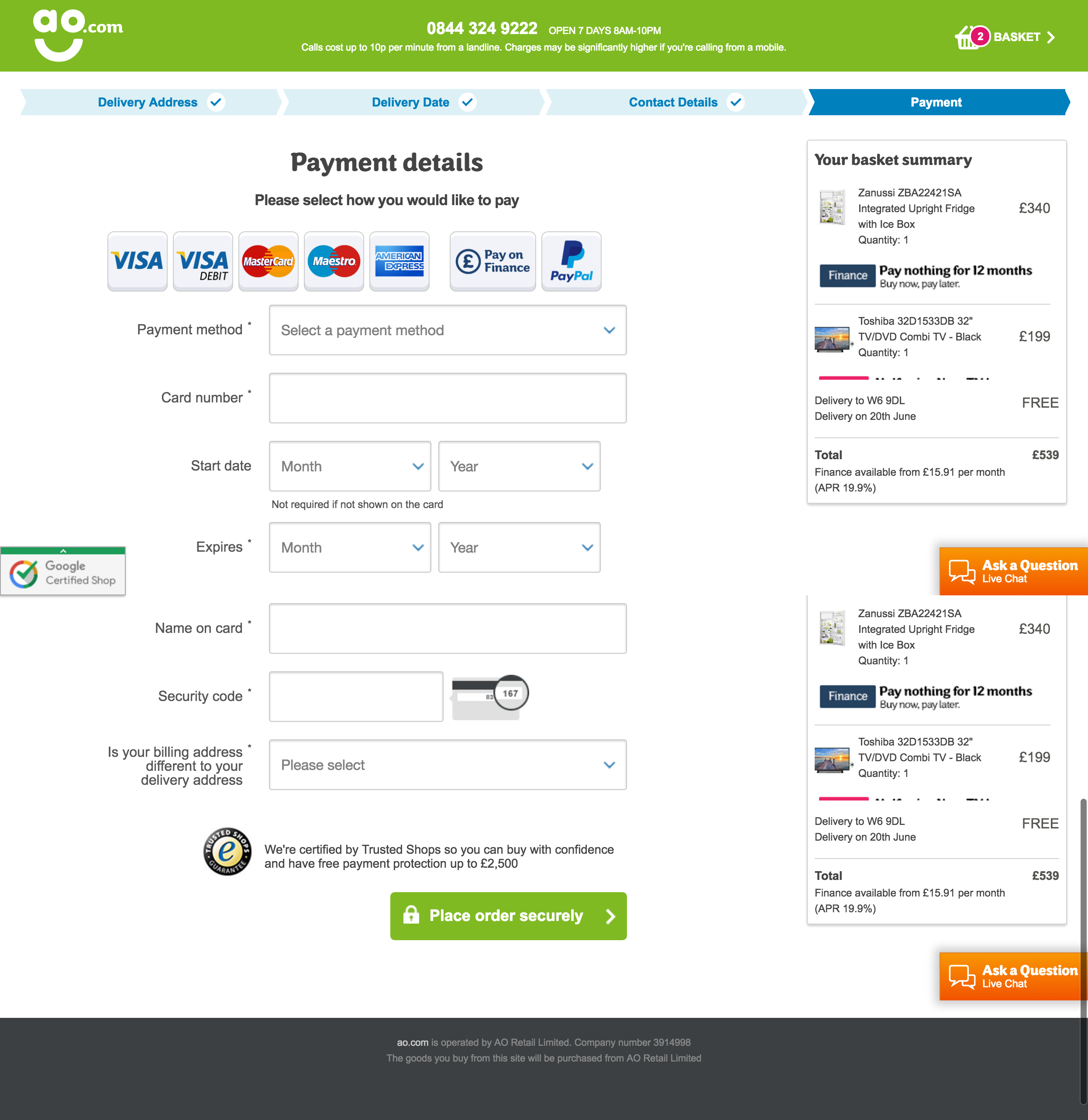
AO.com does so much well here. This screen to select delivery date and time is so easy to use:
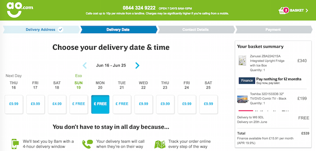
The payment screen is great. There’s a clear summary of the order, delivery date, cost etc. AO has left clear contact details for any shoppers who may have last-minute doubts, or require some sort of reassurance.
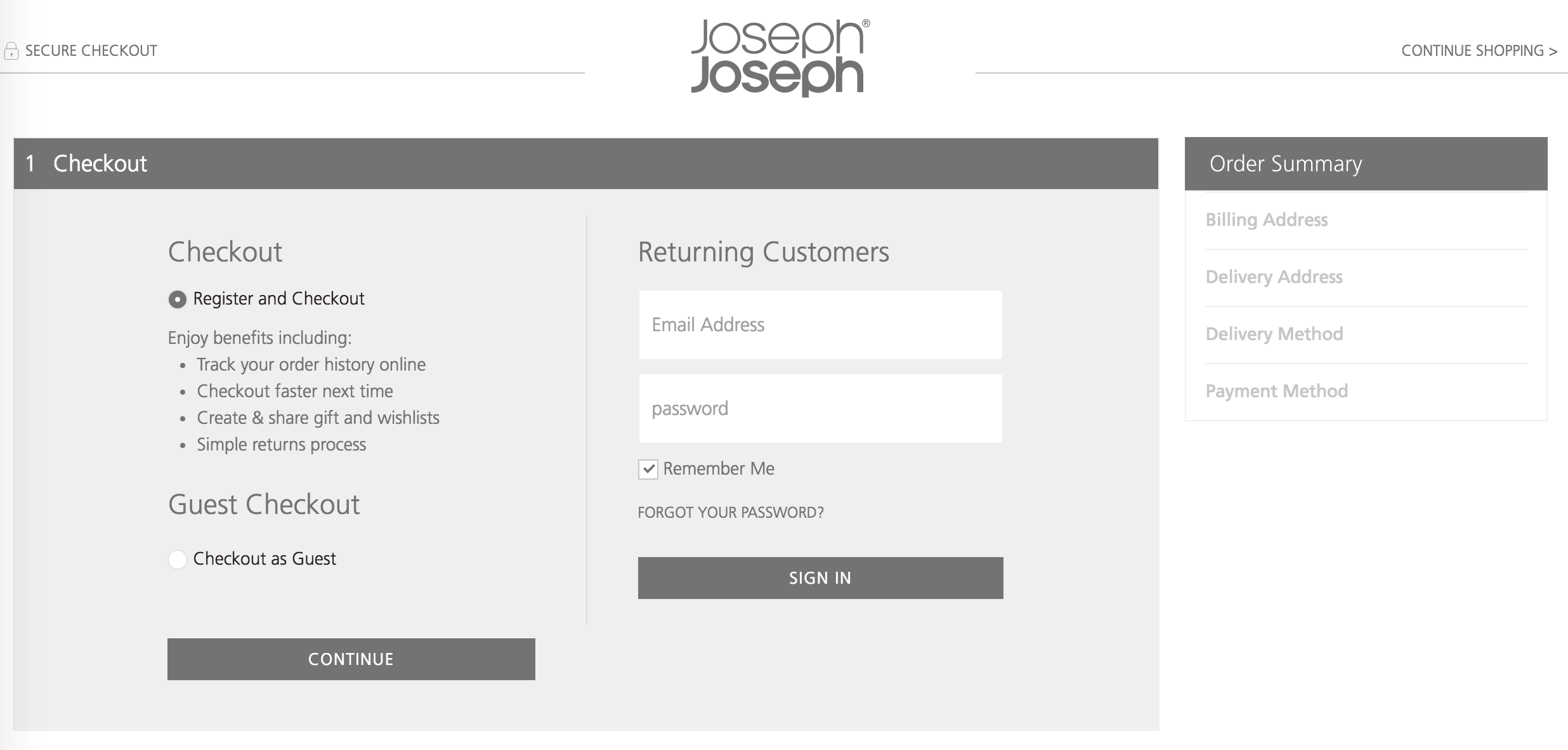
Another smooth, well-designed checkout from Joseph Joseph. The page I’ve picked out here is the registration / guest checkout stage.
I like the fact that it tries to persuade people to create an account, setting out the benefits for customers, but doesn’t push too hard. A good way to increase registration while still catering for other preferences
Zappos does a lot well, and rightly receives praise for its approach to customer service and loyalty.
However, its checkout process isn’t perfect. For one thing, account creation is mandatory, something which can be a cause of abandonment.
Perhaps in the case of Zappos, brand reputation trumps this potential barrier, though I’d be curious to know if it has tested alternative approaches.
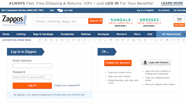
It also places users back on the shopping cart page after registration, which is not what users would expect.
Then we have an unenclosed checkout, with the main navigation, site search box, alphabetical index etc offering both a distraction and lots of ways for customers to leave checkout.
Enclosing checkout isn’t about trapping users into the process, but about doing what you can to focus them on the task of completing the transaction.

I’ve written about this before as the worst checkout process on the web so I won’t go into too much detail here.
I’m sure there are worse out there, but it’s very bad for a big retailer, and suggests a need for more ecommerce expertise in the company, or for people to listen to the team that’s already there.
There are quite a few examples of poor practice, such as making users enter a billing address when they’ve already entered a delivery address. Using the same address as default is basic stuff that the vast majority of ecommerce sites offer.
The first ten checkouts may not be alike, but they all contain some useful features that other retailers could learn from, and perhaps try on their checkouts.
The common factor is that many of this features are about reducing friction for shoppers, and this has to be the aim, though of course a balance has to be struck with other goals. For example, it’s worth an extra form field or two at the end of checkout to encourage shoppers to create an account.
Have you seen better checkouts than this? Please let me know…
For more information on this topic, see our Ecommerce Checkout Best Practice Guide. For more reports, including guides on mobile commerce, customer experience, and social customer service, head to ClickZ Intelligence.
And why not check out our latest ecommerce article, crammed full of useful advice: Three ways retailers can future-proof the checkout process
Leave a Reply
You must be logged in to post a comment.