Checkout best practice 101: enclosing the checkout process
This is the first in a series in which I’ll look at some checkout optimisation basics, features or practices which are likely to reduce abandonment rates.
In this article, I’ll look at the practice of enclosing the checkout for users, why this is a good idea, and how retailers apply this in practice.
(I feel I should add a caveat here. Best practice is merely guidance, and while applying the basics will work for many, retailers should always test and optimise to find the right blend for them).
Enclosing the checkout process means removing many of the (mainly) navigational features that are shown throughout an ecommerce site.
So, the top navigation bar should be removed, the site search box, and any unnecessary links or features.
So, here’s the Macy’s shopping cart page with navigational links still in place.
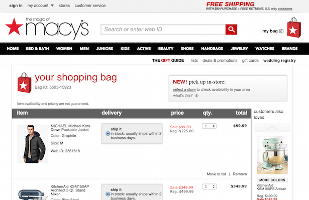
Note that, when users head into the checkout process, these elements are removed and the page is stripped down to its essential elements.
This is the theory behind enclosing checkouts…
People may still need information, so the checkout process shouldn’t be cut off completely.
Here, Schuh has enclosed the process, but has left some key information clearly visible. A telephone number provides an option for customers who have any questions, as does the ‘help’ link.
There are also links to privacy policies and terms and conditions.
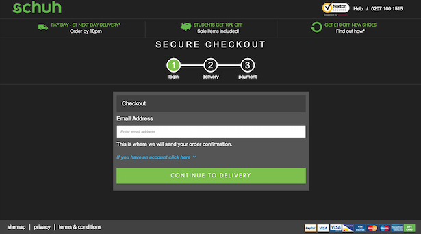
If a user clicks on any of these links, they are taken away from the checkout, so it could be argued that this information should be displayed in a pop-up box which can easily be closed, so the shopper doesn’t have any difficulty returning to checkout.
These are some of the key things that users may want to see during checkout:
By providing this information in an accessible way, retailers can enclose the checkout while ensuring that customers can view any information and make any last minute checks they feel are necessary.
Of course, many customers enter the checkout as they are ‘just browsing’ – perhaps they want to check the final cost, or are simply adding items to use the cart as a wish list.
In these cases, retailers can do little. Enclosing the checkout is about ensuring that those shoppers with an intent to purchase aren’t distracted along the way.
Here’s a couple of good examples, and one bad example…
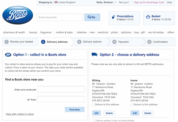
Boots’s checkout process has plenty of room for improvement and enclosing the checkout is one change it could make.
This screenshot illustrates why the checkout should be enclosed. There’s just so much here to distract the customer, and the links and navigation left on the top of the page just make the checkout forms less visible.
This checkout is sparse, with very little visible above the fold except the checkout forms, except for a survey link (which opens in a new window) and a phone number.
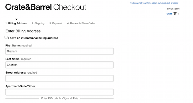
At the foot of the page, there are links to terms, privacy policy and contact details. All of which take users away from checkout.
This is an excellent example of an enclosed checkout. We have security logos for reassurance, a reminder of order contents and total costs.
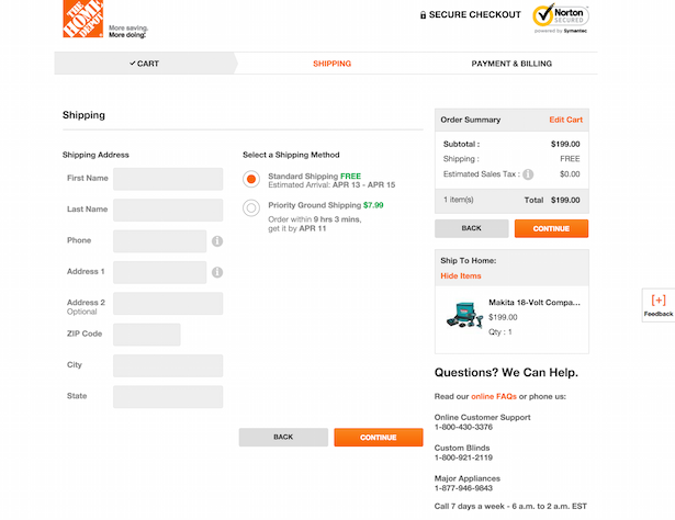
The logo links to the homepage for those that want to exit checkout, while information on returns etc is dealt with by the ‘online FAQs’. This link also opens in a new page, thus ensuring that customers aren’t forced to leave the checkout.
Enclosing or isolating the checkout is now common practice for many ecommerce sites, and while I would always recommend testing what does and doesn’t work on any individual site, this is a tactic which works for many retailers.
For more information, see our new Checkout Best Practice Guide, as well as guides on mobile commerce, customer experience, and social customer service, all under the ClickZ Intelligence banner.
Leave a Reply
You must be logged in to post a comment.