Mobile design and the art of doing one thing well
How to stay lean, mean and fit for purpose with minimum viable product (MVP) and working backwards.
How to stay lean, mean and fit for purpose with minimum viable product (MVP) and working backwards.
It’s best to do one thing really, really well – is one of Google’s “10 things” philosophy, written when the company was in its infancy. This is a great mantra for mobile projects to follow.
Where the young Google focused on excellence in web search, so mobile sites and apps must focus on meeting an identified user need in the most effective (usability) and rewarding (user experience) fashion.
This column will consider two approaches that help the business and the project team establish and implement a focused, user-centric project:
As articulated in previous columns, the audience and their need are identified through research, and user testing, and articulated through user stories, use cases and user journeys.
The benefits of the do-one-thing-well philosophy are:
One of the major advantages of taking a do-one-thing-well philosophy is that it focuses attention on the mobile context. Good mobile-friendly sites anticipate when, where, how and why the user is visiting. Poor sites will simply reformat untargeted desktop content for the mobile device.
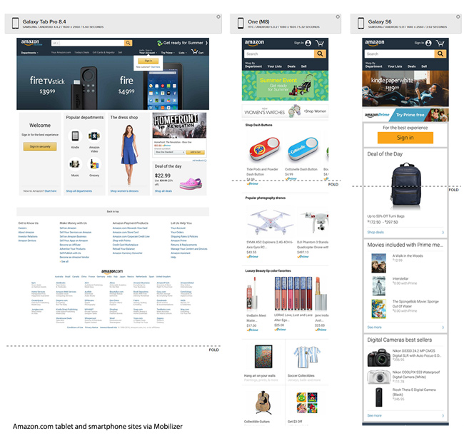
The following image shows the different incarnations of Amazon.com on three Android devices, a Samsung Galaxy Tab (tablet), an HTC One (smartphone) and Samsung Galaxy S6 (smartphone).
These were rendered concurrently using the really useful Mobilizer testing service. Note the difference between the tablet and smartphone sites, and even between the two smartphones.
Parisa Durrani, director of mobile strategy, at mobile agency Plastic Mobile
Doing one thing well is extremely important for mobile web because you want to answer the user’s question immediately. If a user is opening your web page in-store, they are most likely either searching for an item or checking a price. You want to give them a great web experience to entice them to download your app, if you have one, and further extend your relationship with the consumer.
The working-backwards methodology was developed at Amazon, one of the world’s most success digital/mobile commerce ventures, and has been emulated by many other m-commerce success stories, including Airbnb.
This is a great way to sell/explain/justify your m-commerce product internally, as well as making the customer central to the concept.
As explained by Werner Vogels, CTO, Amazon.com on his personal blog All Things Distributed in 2006, working backwards at Amazon involves:
While experts appreciate how working backwards helps companies zero in on user-centered design, not everyone welcomes the extra documentation.
Allen Smith, VP of customer experience (CX) and head of Innovation at global digital agency DMI International:
Working backwards is really just an attempt at user-centered design, but from a non-practitioner’s standpoint (hence, why there’s such an emphasis on document types like a user manual and FAQ). Being user-centered is important for mobile web as well as every single other project, and this is built into the DNA of our projects.
We’ve found that most documentation really adds no value for our clients, and only contributes to either expensive over-runs or lowers the quality of projects because it leaves less time for actual user discovery. For this reason, we got rid of it (except for the rare occasion when a client has a need for a specific documentation type). We are radically collaborative and work principally from prototypes, which capture all of our learnings about a particular problem space and how to express a particular solution.
Once we’ve reached a certain fidelity in terms of the customer experience and testable business propositions, we essentially have the MVP target. Software is much easier to change after it launches, so we take advantage of that to release a testable hypothesis of the user value first and use feedback loops from various channels to help us understand which direction the service offer should take.
Arguably the most important part of working backwards is the press release headline or marketing message, the rest of the documentation is justification.
Consider the following four messages, if your call to action isn’t compelling, then nor is you mobile site/app.
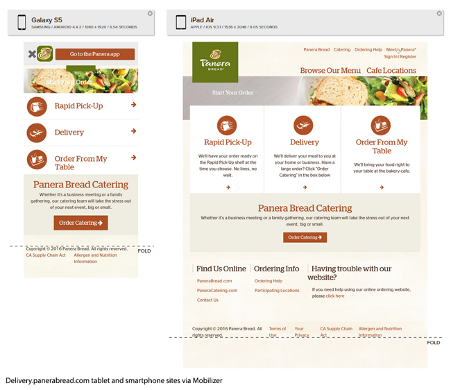
“Avoid the line. Order online” is the tagline for the US chain Panera Bread for its web/mobile ordering service.
It is unclear if this impressive service originated from this tagline, but it’s evident on first glance at the Panera smartphone or tablet site that design was based on three very clear use cases:
The concept of the MVP was popularized by Eric Ries on his book The Lean Start-up. His original definition is:
The minimum viable product is that version of a new product which allows a team to collect the maximum amount of validated learning about customers with the least effort.
The Ries Lean Start-up Methodology is based on a cycle of build, measure and learn. The quicker the MVP is built the quicker the learning and improvement starts.
An example of a lean start-up cited by Ries is online shoe vendor Zappos. This started with Nick Swinmurn posting pictures of shoes from local shoe shops on his website.
When customers placed the order, Swinmurn bought the shoes from the stores then sent them to the purchaser. Thus he validated the concept that customers would purchase shoes online, without needing to build out the infrastructure first.
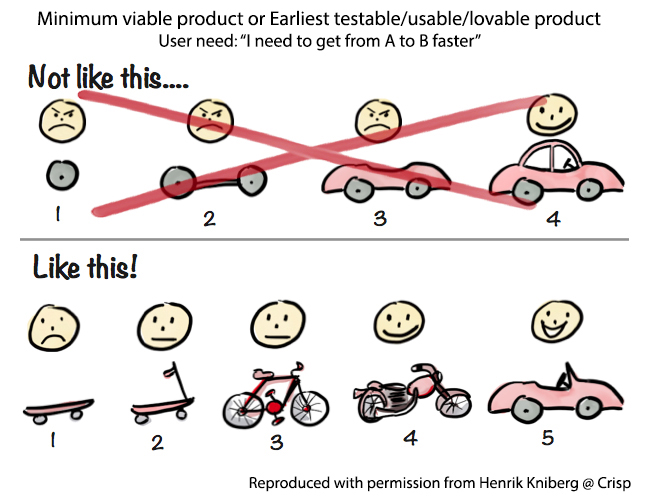
The best visual metaphor for MVP, was created by Henrik Kniberg, an agile/lean coach, at Swedish consultancy Crisp, and a long-term collaborator with Spotify & Lego.
The diagram (much copied) contrasts two approaches to solving the customer problem: “I need to get from A to B quicker”, where the end result will be a car. First, the big bang which gradually provides the user with a part-built non-working product until the car is completed; whereas the second, the MVP approach, delivers gradually improving modes of transport: skateboard, scooter, bicycle, motorbike and, finally, car.
In this article Kniberg explains that he has gone off the term “minimum viable product” as it can give the wrong impression to the client i.e. concern that they will receive “minimum releasable crap”. He prefers these terms:
MVP has become popular with mobile app start-ups, many of which have re-interpreted the concept, so the MVP model now increasingly looks like the doing-one-thing-really-well philosophy.
The first version of the MVP app concentrates on delivering the core expertise, with the view that additional functionality will be added in future iterations, further down the roadmap assuming it is proven to meet a customer need.
Mobile-friendly web design – including responsive design – should also apply this same lean, laser-focused MVP methodology. Mobile-friendly does not mean repurposing of bloated untargeted PC websites for the smaller screen.
Large organizations will sometimes spin off mobile projects into a separate entity to try to recreate the start-up environment. An example of this approach is ShareTheMeal, which is a World Food Program initiative that enabled donors to share 5.6 million meals (May 2016) with needy children with a single tap of their smartphone.
Matthias Hellmund, chief technology officer, ShareTheMeal (WFP):
While almost every start-up out there claims to work “agile”, for us that means we try to reduce features to an MVP, which can be implemented and launched within a few weeks’ time. Especially with anything transaction-related, I think it’s really crucial to test and verify your hypothesis with actual users doing actual transaction. In our case this is giving meals to children in need via PayPal or credit card transactions.
So the important aspect is that we test those “experiments” with segments of our users. That means we need to be able to enable variants of the user interface only to specific users and compare their impact with a corresponding control group. We configure both from our server side, so we can increase distribution of a successful experiment to a larger part of our user base. We work in weekly sprints, so we can react on feedback and test results quickly.
Because of our small team size, we develop the different parts leading to an MVP implementation, depending on the feature. For some parts, we created early draft designs as static screens on a smartphone then get feedback by inviting users to come into the office and swipe through the screens.
For more complex and flow-related changes, we usually do a UX sprint first which results in sample designs for the corresponding screens, sometimes we also use interactive prototypes or click dummies. Then it’s a pretty close collaboration between implementation and design and some smaller tweaks based on QA (quality assurance) builds of the app. This allows us to swap graphical elements in the app with different variants, based on the experiment group.

This is Part 20 of the ClickZ ‘DNA of mobile-friendly web’ series.
Here are the recent ones:
http://www.clickz.com/intelligence/report/dna-of-a-great-m-commerce-site-part-1-planning/?utm_source=clickzblog&utm_medium=blog&utm_campaign=INTELBLOG
Leave a Reply
You must be logged in to post a comment.