A Sense of Mobile - Responsive Template Design
Consider the responsive design approach for your mobile email communications.
Consider the responsive design approach for your mobile email communications.
Hot summer days are here. Many customers are now on vacation or in holiday mode – the perfect opportunity to prepare and plan for revenue-generating campaigns, and improve support of communication channels toward this year’s fourth quarter, which usually drives a lot of the annual revenues.
In one of my previous columns, I reviewed my mobile email strategy and argued that you should be investing time, thoughts, and resources in ensuring that your mobile communications are geared and perfected for higher conversions from your mobile email campaigns.
In this column, I will explain more about responsive design that senses the device of your users; what is it, how to automate it, and what makes it the best approach to mobile email communications today.
Approaching mobile users differently is no longer nice to have, it’s a must-have approach.
The Challenges
More and more users (mobile is huge in our region) choose to consume messages on their mobile devices, rather than on their desktops. Typically the smaller the screen size is, the lower the conversions are.
Why? Because recipients need to “pinch” to zoom in, links are too small to hit on (hey, this is your call to action we’re talking about here!), desktop-optimized campaigns contain too much information that makes it hard to fit to a mobile screen, there is not enough space between photos and HTML blocks, font sizes are too small, the horizontal layout approach doesn’t fit mobile screens that use a vertical layout, alignment of text (most mobile users uses their right hand to hold the device and click with their thumbs), and the list goes on, and on, and on.
Put yourselves in the shoes of your customers, and think how your campaigns could work better in mobile.
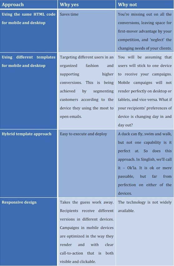
Many Approaches, and the Winning One Is…?

What Is Responsive Design You Ask?
Now that we’ve gone through the different approaches, I am hopeful that you are convinced that responsive design is the way to go.
But hold on, I didn’t explain what a responsive design is. So here we go:
Responsive email design is additional code that is embedded into the email HTML so it can respond or “sense” the screens that open it, and make the email render differently on different-sized screens. When responsive design is applied to emails, it dramatically improves mobile click rates.
While seen more and more with websites, when it come to emails, this approach is quite new and is lagging behind the rate of smartphone adoption. So far early adopters with knowledge and resources are using it in the custom HTML level, but ESPs are not yet embedding it into templates so it is not yet widely available and therefore beyond the reach of most digital marketers.
Messaging today should be “recipient centric,” where the marketer should strive to message recipients with the most relevant content: according to their interests, time zone, location, and the device(s) they are using.
Responsive design addresses the latter challenge, you cannot guess where and with what your user will open your email: it could be a desktop, a tablet, a mobile phone, or any other gadget. The difference between hitting the delete button to hitting a link is made within a few seconds, so have a template design that “senses” the device your recipients are using and adapts to it automatically.
Analytics
What you then want to look at is the open and clicks from all mobile users, and the percentage of mobile clicks and opens from overall recipients. Don’t forget to check if mobile users behave differently in terms of open or click time from your desktop users, so you can optimize the best time of sending to support higher click-to-open ratios.
On a side note, my company has recently launched a benchmark report on the behavior of users globally. If you’re a marketer it is recommended to see where you stand, so you can improve your work.
Have a great summer, and take the time to analyze the information, check where you stand with recipient performance vs. the market trends, and optimize your campaigns and channels.
Till next time, stay tuned.
Business hand hold touch image via Shutterstock.
Leave a Reply
You must be logged in to post a comment.