Five simple user experience tweaks for better conversion
Sometimes the functionality and user experience (UX) on a website can make or break a business.
Things like mobile optimization or page load-time are talked about so often in the SEO world purely because a user will have no hesitation leaving if they are not having a positive experience on your website. It’s that simple.
That being said, not all “good” websites are created equal.
The more research that is done on user experience, the more we learn about optimizing for better conversion results, and the more we realize that user experience is more than just a fast site that seems simple to use.
GoodUI.org constructed a project on user experience and has developed 75 “good ideas” that produce amazing results when it comes to UX.
All the data has come from real websites and brands/businesses that have decided to share their data for project analysis on user experience. Reading some of their tips was like finding gold.
After looking over their ideas, along with other recent research, below is a list of five user experience tweaks that you can make to see better conversions because of improved user experience that so many are still missing:
One of the most impressive discoveries has been in regards to repetitive layouts with CTA (call-to-action) buttons.
The only thing that was changed in these tests from a control page was an additional CTA button at the bottom of the page as well as the top of the page.
In the data set that GoodUI developed, this was shown to have an 84% median effect for conversion on product pages. So, rather than just having the CTA button that you want users to click at the top of the page, add and additional CTA at the bottom and you are much more likely to see results.
The screenshot below shows the study’s results:

User engagement is a huge part of ranking organically, so the more you can get people talking about your brand in a positive way, the better it is for your SEO. Why not use this to your advantage?
One of the best ways that you can improve user experience is to use social testimonials on your site rather than solely providing descriptions that you have written.
Testimonials have been proven to help conversions because users feel as though they can trust the experience of others. This one tweak can make a substantial difference for how your brand is perceived.
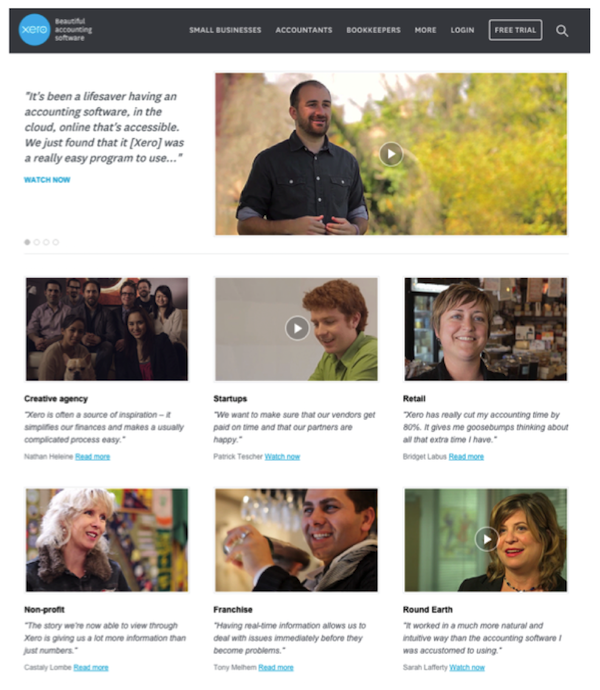
Take for example this beautiful Xero Accounting Software testimonial page:

Visitors can click through videos and hear directly from other users about their experience with the product and see quotes immediately next to the video.
This is a really great way to use social testimonial rather than talking about the positive aspects of your product or service yourself.
The videos from Xero are also really high quality and show that they are committed to telling the story and perspective of their clients, which is really impressive to people who are deciding whether to give you their business.
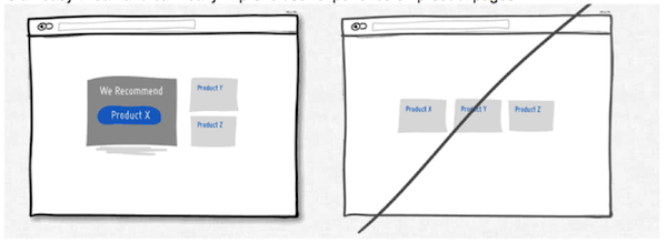
Have you ever been at a restaurant where something is highlighted as a staff or chef recommendation on the menu? Or perhaps you’ve come across an item that is a “popular” choice by others?
Recommending a certain product or service over an equal display has been shown to increase conversion.
When people are given too many choices they can often have a difficult time making a decision. When this situation occurs, people are often likely to turn to recommendations and are more likely to follow-through with a purchase.
If your company offers a variety of products or services this may be something you want to consider. It is an easy tweak and can really improve user experience on product pages.

If you want to get more people signed-up or on your mailing list, sometimes the best way to go is actually fewer fields at once.
In many cases you can eliminate fields and still get the information that you need.
Ask what is really necessary to get a visitor on your email list (it is usually just their name and email) and consider moving other question fields to another area after they are signed up.
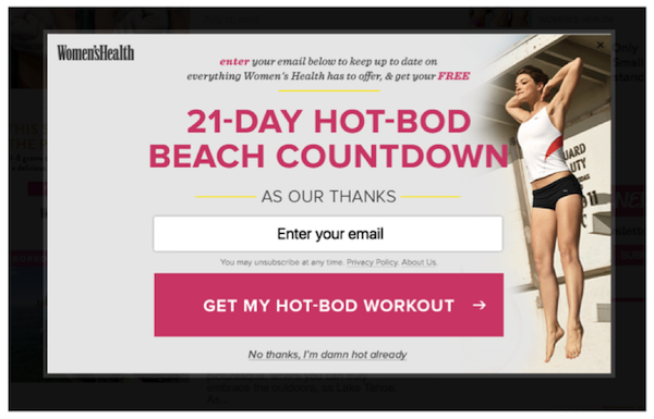
This particular user experience tweak was shown to have a +7.6% medium effective rate. The result when altering this format (vs a control with multiple fields) was +53% more quotes with fewer fields.

In the example from Women’s Health magazine above, all the site asks for (at least initially) is the visitor’s email in order to get access to a 21-day workout. This is the perfect way to get people on your mailing list without bombarding them with too many fields to fill out.
Lastly, one of the most successful tweaks you can make is having a clean layout with fewer borders. So many sites have side bar, top bar, bottom bar options… and it can be totally overwhelming for users to navigate the site.
Remember, the goal is to direct people where they should go without all of the guesswork. Take for example the website layout below:

The site utilizes a clean and focused format, which draws the visitor to the action they want them to take.
For example, they present a few pieces of content and then ask the user to “scroll down or die.” By doing this they can use an infinite scroll form and not require the user to have all of the information in their immediate visual field. This obviously makes things a lot clearer and intentional.
Borders compete for attention with real content—plain and simple. There is really no reason to overwhelm a user with them, and in fact, you are more likely to get a positive result from visitors in terms of conversion if you adjust to a cleaner presentation.
What do you think of these tweaks? Do you intend to implement any of these yourself? Let us know in the comments section below—we would love to hear from you!
For more information on ecommerce and other topics, including guides on mobile commerce, customer experience, and social customer service, head to ClickZ Intelligence.
Leave a Reply
You must be logged in to post a comment.