How to fix your bloated mobile website: fewer, better, smaller images
Images are the main culprit for causing oversized web pages (average size 2.2MB) that can perform slowly on mobile devices.
Images are the main culprit for causing oversized web pages (average size 2.2MB) that can perform slowly on mobile devices.
Images are the main culprit for causing oversized web pages (average size 2.2MB) that can perform slowly on mobile devices.
This column, the second of three, will discuss the different ways to reduce the impact of images on the performance of your website.

You need to fix your mobile image problem. You are not alone. As detailed in my previous column, the average mobile webpage is now a ludicrous 2.2MB and this can severely impede how quickly the page loads on a mobile device. At 68% of total page weight, images are the main culprit. This column will look at the different ways to reduce the impact of image on the performance of your website.
For those you like a step-by-step approach, here are ten steps to speedy mobile web pages.
Steps 1-4 were mostly covered in Part 1. This column will concentrate on steps 5-7. Part 3 will concentrate on steps 8-10.
The first and easiest step to improving page speed is to remove unnecessary images. If images do not add value and are taking up valuable real estate get rid of them. Crappy stock image just there to fill space? Be gone.
When you are auditing your existing pages or creating a new one, ask: does this image justify:
Robert Gaines, a Kansas, US-based, web and app developer:
“Before you add an image to a webpage, decide if you really need it; if it really adds value. Every image that you add slows the webpage down, impacting both user experience and search rankings. If you don’t need an image, cut the fat!
Slider images are a great example of images that can be cut from a webpage. Studies have shown that sliders do not have a significantly positive impact on either conversions or user experience – they are unnecessary bloat.”
Use heatmaps, user testing and A/B testing (see previous column) to assess the impact your images are having on the users – is it positive, negligible or negative?
Once you have illuminated the images that don’t add value, concentrate on making the remaining images work harder for their pixels/KBs.
Raluca Budiu, Director of Research at Nielsen Norman Group:
“As web images can take longer to load on mobile devices, it is usually a good idea if they contain information, and are not purely decorative. Users rarely appreciate a pretty picture that is unrelated to an article. Ecommerce sites, in particular need good images — people can rarely make a buying decision if they cannot see the product well.”
One company that has really flung its weight behind making images more useful is Unilever.
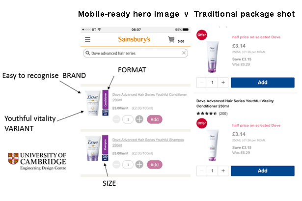
Working with Cambridge University Inclusive Design team, the company has redesigned all product shots for all its brands to make them easier for web customers to instantly recognize and pick the right product, just using visual recognition, as they speed through any retailer’s catalogue of products “Vegas style” (i.e. spinning through results like the reels on a slot machine).
The idea is that by highlighting the essential details – brand, product type, size and quantity – on the image, shoppers don’t have to read the copy for every product.
In case you were wondering, a hero image is the term given to the fat clickable/tappable banner image, often on a carousel, at the top of homepages (particularly), featuring a new product, promotion etc. and a call to action. Mobile-Ready Hero Images are the smaller thumbnail images found on a page of product listings either in a category or following a search for e.g. men’s deodorant.
Oliver Bradley, Global eCommerce Experience Design Director at Unilever, explains:
“Mobile-Ready Hero Images were created specifically for online retail to act as the primary image in search / favorites thumbnail results. They are designed to work well on all screen sizes that are typical for online retail (16mm on mobile, 23mm on tablet and 48mm on laptop / desktop).
They allow the online shopper to better recognize brand, format, variant and size as they are perform that fast vertical scroll which is typical behavior when scanning through long lists of products on a mobile or tablet.
The images can be zoomed and/or cropped to deliver better legibility & recognition of brand and variant esp. on portrait packs. If required brands can add the size of the product or number of contents in the bottom right-hand corner. If necessary, the type of product may be added as a stripe on the right-hand side (portrait packs), or as a stripe along the bottom (landscape packs). Makes better use of space than with a conventional packet shot.”
First introduced in 2014, Unilever has moved rapidly to convince retailers in 20 countries – including many of the retail giants e.g. Walmart, CVS, Walgreens, Tesco and Carrefour – to introduce the enhanced imagery to their e/m-commerce sites. With some retailers, such as Asda.com (Walmart’s UK subsidiary), every Unilever product is now marketed with a Mobile-Ready Hero Image.
What’s more, Unilever, with the Cambridge team, have turned Mobile-Ready Hero Images into a standard: available open source and free for any competitor to pick up. And many of Unilever’s biggest competitors have done just that, says Bradley:
“We realized that we needed to create a versatile category solution with the same visual architecture and consistency across the board. Since doing this we’ve been pleased to see L’Oréal, GSK, P&G, Kellogg’s, Kimberly Clark and J&J follow our approach.”
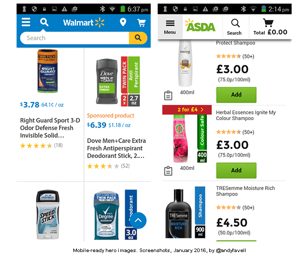
The image below displays two screenshots. The first captures a deodorant search from Walmart.com, showing two Unilever brands with hero images with the product type and size alongside the product shot. With the two rival products, it is more difficult to establish the type of product or the size, without zooming in on the product. As Walmart does not include these details in the blurb, this makes the hero images doubly useful.
The second image captures a shampoo search from Asda.com, showing a Unilever product (TreSemme), a P&G product (Herbal Essences), both using the hero image. The third product, also a P&G brand (Pantene) does not use a hero image. While the hero images are considerably more high-impact, Asda does include the product type and size in the blurb… assuming that the consumer reads it.
At the start of the project, Unilever and the Cambridge team conducted quantitative research (i.e. interviews and surveys) with 3000 shoppers in and then verified their findings/work by conducted eye tracking tests with more than 100 shoppers, to watch how they interacted with the site and images using mobile devices on mobile to verify.
This user testing put Unilever in a good position to rebut any doubters from the retail business.
“Some retailers argue pack shots are necessary for e-commerce, because the text description next to the pack shot provides all the information that cannot be obtained from the photograph. But we know from eye tracking that 90% of the e-commerce page is ignored.
We know that the majority of shoppers don’t bother to check the product name, size or format on retailers’ websites or apps. That’s why nearly every shopper we interviewed had a story of accidentally buying a product online that turned out to be not as expected (especially on size). If a pack looks similar to the one their used to, they don’t bother to check the text to verify.
The point of online grocery is convenience and saving time. It’s about selecting a large number of products as quickly as they can. Because you don’t have to check the text with hero images, it makes shopping even faster.
We know this is true from the conversions the hero image have delivered. The A/B test results have been amazing: a 24% lift on Magnum, a 19% lift on Simple, and a 4% lift on Ben & Jerry’s.”
The biggest issue for any sort of image, but particularly an image that contains important textual data, is that that they are invisible to people with visual impairments. People who don’t see well or at all, use screen-readers to read the text on the site aloud.
There’s nothing wrong with using images, or hero images for that point, but it is essential that the content in the image should be either written in the web copy and/or in alt tags (these tags describe the image to a screen reader, but are invisible to the able-bodied reader).
Generally, accessibility experts frown on the use of text being placed within an images, because screen readers are blind to the data it contains. This is why, for example, it is preferable from an accessibility point of view to prepare tables of data as an html table, rather than simply uploading an image of the table – but this will always take additional time and usually won’t look as good.
Marco Zehe is an accessibility evangelist and QA engineer at Mozilla:
“Mobile images need alt text, just like for the desktop, of course. But it helps if the images are responsive, because people with low vision or elderly people will benefit from them zooming better.
“However screen readers do not do image recognition on the web, yet, so if there is text on the image, this is will be inaccessible. In principle, text on images should be avoided. But if the text helps clarify a photo, especially for people with low vision, and as long as it is only duplicating what is said in the copy and in the alt text, this is acceptable.”
So, if text genuinely adds value to an image, as is the case with Mobile-Ready Hero Images, then it is safe to assume this is acceptable, as long as it is duplicated in the copy and the alt tag.
So looking back to our Walmart and Asda examples pictured above:
In the next column in our mobile images series, we will cover optimization, sizing, placing of images, alternatives to using traditional images and web design techniques to speed up page load.
This is Part 40 of the ClickZ ‘DNA of mobile-friendly web’ series.
Here are the recent ones:
Average mobile webpage is now 2.2MB, 68% is images: let’s trim the fat
Why brands should care about brand safety in mobile advertising
Mobile ad viewability: what is it and does it matter?
Andy Favell is ClickZ’s columnist on mobile. He is a London-based freelance mobile/digital consultant, journalist and web editor. Contact him via LinkedIn or Twitter at Andy_Favell.
Leave a Reply
You must be logged in to post a comment.