How to make longer web forms easier for users
Some web forms have to be longer than normal. While an ecommerce site can limit the user entry to an email, delivery address and payment details, some sites need more information.
For example, forms on travel and financial websites have to be longer than most by necessity.
Long forms like this can be off-putting for users as they can give the impression that the process is going to be time-consuming.
For example, 13% of users abandon bookings on travel websites because the booking process is too long or overcomplicated.
So how can forms be made more palatable for users?
It can be about the customer’s perception of the form. If it looks like hard work, people will assume it is. This is one of the reasons why some websites use one-page or accordion checkouts, as even though they require the same amount of information as other sites, they can seem like less work.
One way to do this is by chunking up the form into more manageable segments. For example, Confused.com requires a lot of information for a car quote – job details, no-claims details, previous claims etc – but it does help the make it seem less work by breaking it up into sections.

One way to reduce form length, as previously mentioned, is to remove any unnecessary fields. Ask whether the information you ask for is really necessary to complete the process.
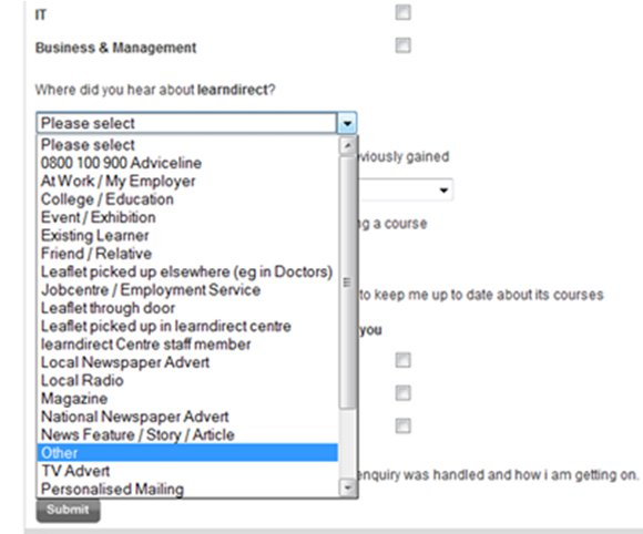
For example, the ‘how did you hear about us?’ fields in some web forms are just extra work for many. I doubt whether many people even take them seriously. Besides, analytics and other customer data sources should help you find the answer to this question.
There are ways to make things easier for users, simply by designing the forms more effectively.
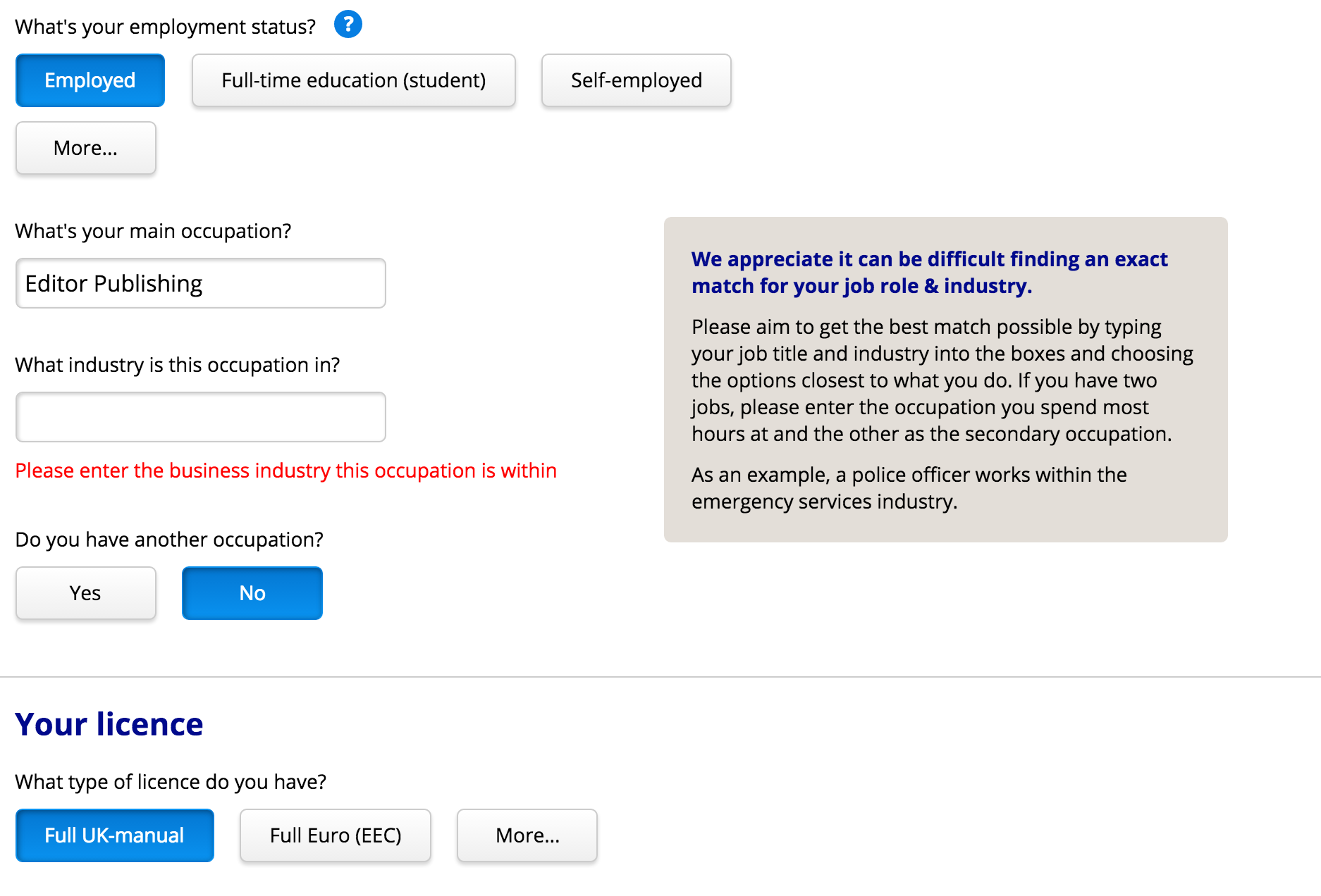
Here, Confused.com opts for buttons rather than drop-downs for most fields. Also, on the occupation question, rather than making me choose from a list of job titles, it suggests roles as I type. This saves a lot of time.
Small touches like allowing users to use delivery address details as their billing details help, and are now commonplace. Postcode lookup tools can also save time entering full addresses.
Well-implemented form validation assures that customers can correct any errors as they go along.
This saves time, as well as the frustration that results when customers attempt to move on to the next stage of the form, only to find they have errors to correct.
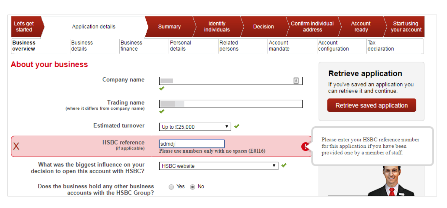
Here, HSBC presents a tick to confirm that some fields have been entered correctly, and clearly highlights those that need attention. (Taken from the Mapa Research guide to financial forms).
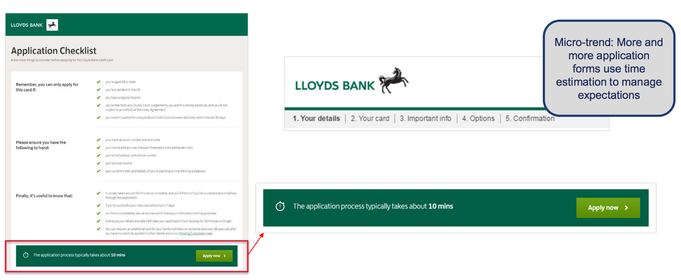
Some forms provide an estimate of the time it will take to complete a form.
It could be argued that this will deter some, but I think it’s good to be upfront and give users an accurate estimate.
Here, Lloyd’s provides an estimate before customers embark on its forms. (thanks again to Mapa).
Where possible, saving user details already entered can really help. Perhaps they could save it to come back to later, or in case users bail out during the form.
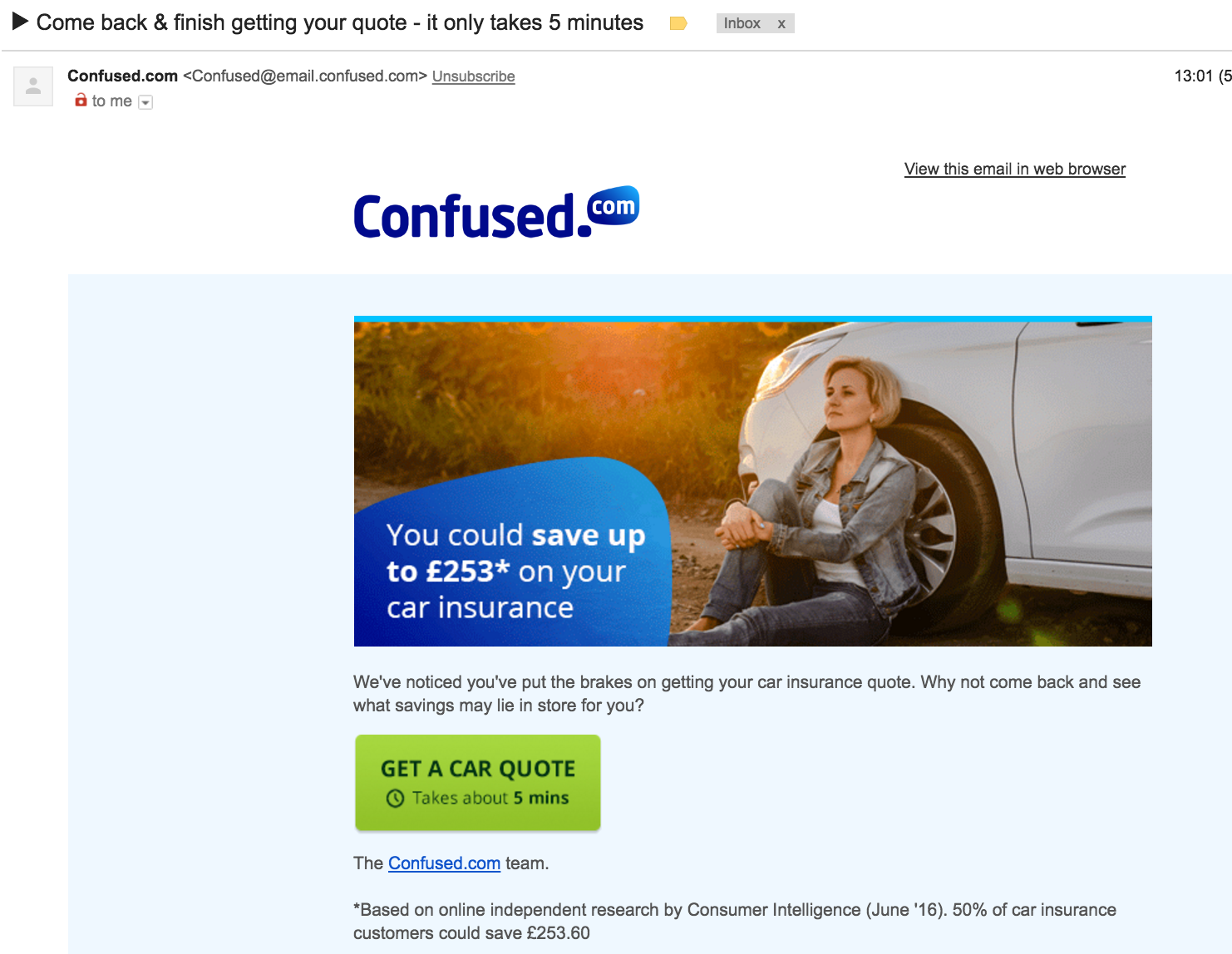
Here, Confused.com tempts me back to the form I’ve abandoned with an email reminder. It also reassures me that it’ll only take five minutes.
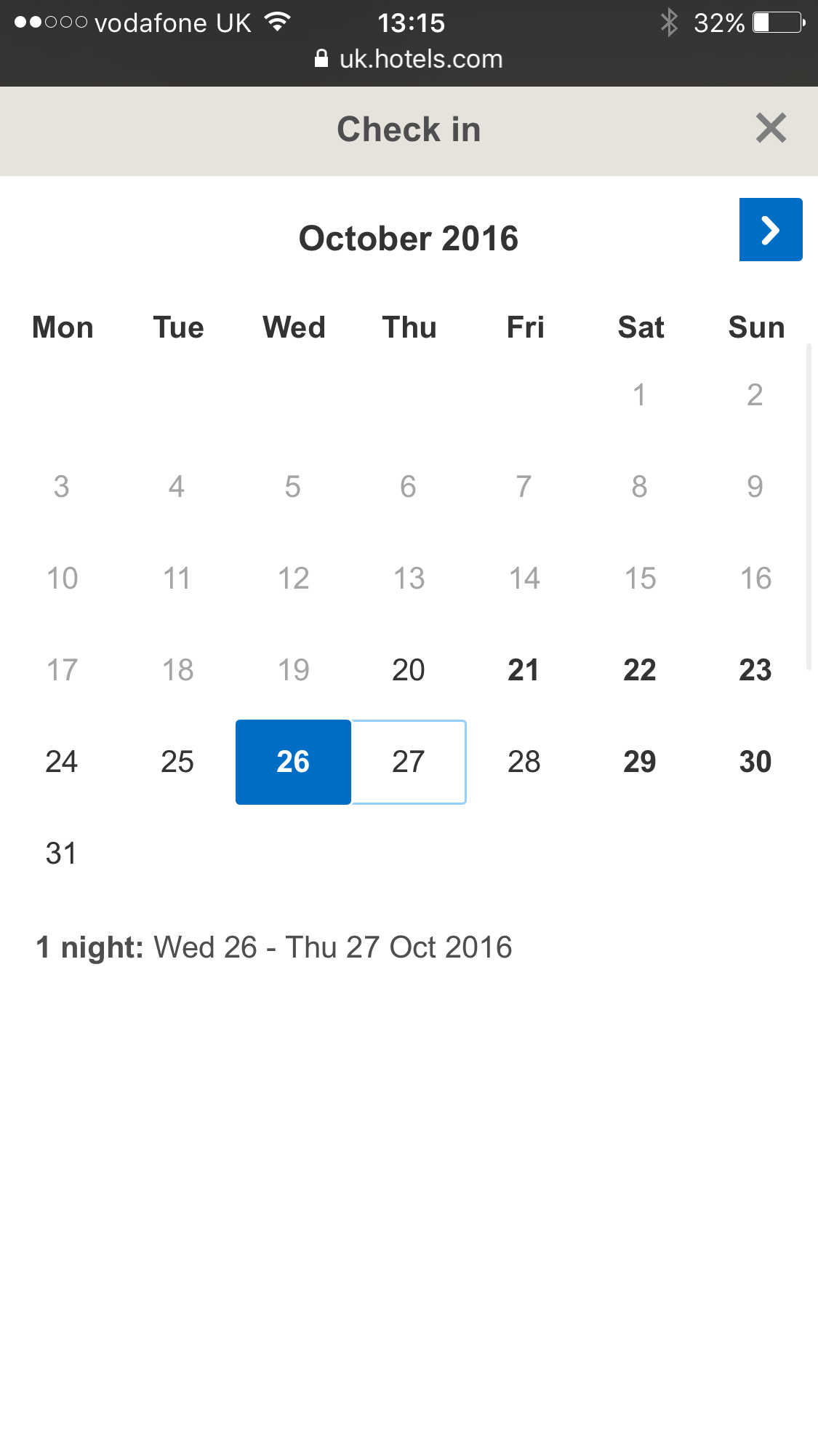
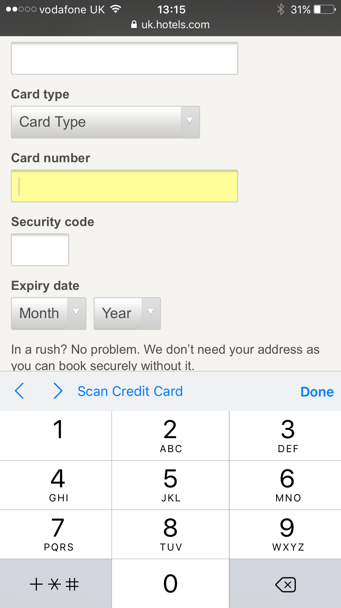
Mobiles are increasingly used for travel bookings, so sites need to cater well for mobile users, making forms readable, and adapting to the user’s device of choice.
Here, Hotels.com ensures that a) the calendar tool is easy to use (a common issue on mobile) and b) adapts for the kind of information required, so it shows the numerical keyboard for card entry (note that it also offers card scan for greater convenience).
Our new Marketer’s Guide to Form Optimisation, produced in association with Fospha, is free to download.
Leave a Reply
You must be logged in to post a comment.