A badly designed web form can mean a world of pain for users, and can be a major cause of abandonment.
Many web form mistakes are common, and can be easily avoided. Here’s a selection, but feel free to suggest others in the comments below.
Unclear error messages
Error messages should be used to explain why the visitor has made a particular error, and to tell them about the action (s) they need to take to rectify the problem.
For example, if I’ve forgotten to add my email in the correct format, the site should highlight the field where the error occurred and tell me what I need to fix.
However, many messages are generic and do too little to help, using language like this:

If the mistake isn’t immediately obvious, then users can be left scratching their heads wondering what they did wrong.
Image credit: uxmovement
Making data entry harder than it should be
It should be as easy as possible to complete forms. The smoother the process, the more likely that people will complete them.
Here, the Halifax mortgage quote form asks for users to enter their date of birth with the day, month and year separated by a dash.
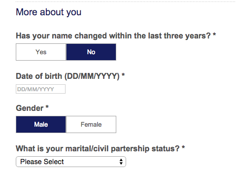
This means more work for users and also increases the chance that they’ll skim over the microcopy explaining the required format and make an error.
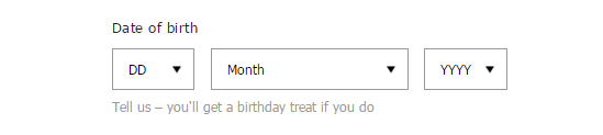
A better approach would be to split the fields, as ASOS does here:
Using captchas
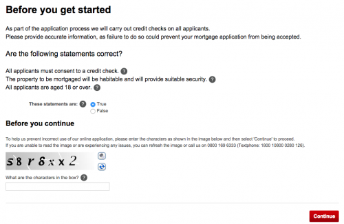
Captchas are sometimes necessary, but are generally very annoying. In web forms they can present a real barrier to conversion.
Here, Halifax uses one in its mortgage form. Why?
Label mandatory form fields
If form fields have to be filled in label then clearly. An asterisk is often the way.
Otherwise, people will leave fields blank and trigger errors.
Postcode entry issues
This can be a common problem, and is down to strict validation.
Zara’s forms look promising; the use of inline validation can be a great way to avoid too many user errors.
However, because I haven’t entered my postcode with a space in the middle, I’ve triggered this error message.
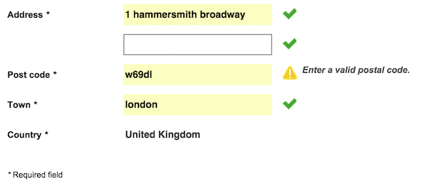
The problem is compounded by the fact that the error message doesn’t explain the problem. in this case, if users check and confirm that they have entered the correct postcode they may just assume there’s an error with the website.
The answer here is to allow users to enter their postcode in whatever format they like, as long as it’s correct.
Form fields in unexpected places
This is the shopping basket page for Playmobil (one of the worst sites you’ll see).
Normally this page is for checking basket contents and clicking through to the checkout to complete the order.
I tried this on Playmobil but wasn’t able to. This is because, unlike just about every other ecommerce site on the web, it asks for customers to read and accept the terms and conditions before checkout. Bonkers.

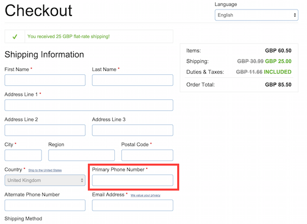
Asking for unnecessary information
Any extra information you ask for makes for harder work for visitors to complete forms and increases the chance that they’ll abandon the process.
Here, Chef’s Catalog asks for a phone number as a mandatory field.
This is something that is normally voluntary, and customers are likely to have concerns about whether this phone number will be used for marketing purposes.
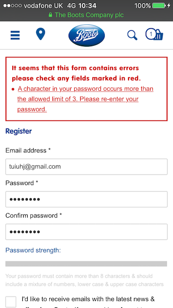
Failing to explain rules on input formats
If information has to be entered in a certain format, then say so clearly.
In this example, Boots wants customers to enter a password in which the same character is not repeated more than twice. How are they supposed to guess that?
Of course, this triggers an error message. Only then does Boots explain the rules.
In summary
I’ve listed eight mistakes to avoid here, but there are many more I could have mentioned.
The key here is that anything which triggers an error message or slows them down can make a user abandon a form.
Seems Halifax forgot to run a spell check on their form too : Is “Partership” what happens after Partnership?
I’m split on the terms and conditions one. Without it any consumer (or even worse, a class-action) would have a very strong argument that they were not bound by your terms and conditions. This might not matter for lower value, straightforward e-commerce, but could be a critical mistake for higher value sales or for things with recurring payments.
Most legal departments will insist it’s either shown on page (which is horrible, as they are generally massive) or linked with a tickbox to confirm the user has read the content. You’ll see it on most major sites.
Some manage to avoid it by making it part of the signup process. I think ebay does this – you accepted the T&Cs when you created the account, so you do not need to accept them again each time you make a bid/purchase.
Hi Jonathan. The problem with the example here is where the T&Cs are placed, before customers can enter the checkout process. Very few customers will be expecting to see it on the shopping basket page as the vast majority of ecommerce sites will ask customers to read and accept the T&Cs before they click the final confirm order button.
Of course, it’s a legal requirement but it’s foolish to place it before checkout where it adds friction.
I hate those buttons where it slides between something like YES/NO when you click – but you cant always tell which option is active, because the inactive option is not greyed out.