What does the ideal ecommerce product page look like?
The perfect product page probably doesn't exist, but it's something that the best ecommerce sites are aiming for.
The perfect product page probably doesn't exist, but it's something that the best ecommerce sites are aiming for.
The perfect product page probably doesn’t exist, but it’s something that the best ecommerce sites are aiming for.
It would be made up from a number of factors, including great usability, effective use of imagery and persuasive copywriting.
Here are some of the crucial ingredients for an effective product page, along with examples from some of the best sites around.
This is very important, for users and for the search engines.
Many customers are likely to land straight on your product page so it has to load quickly or you run the risk of them bouncing.
This means that your beautifully crafted product images and other features need to be optimised for speed, and for mobile.
On the second point, Google’s increasing focus on user experience factors in search rankings means that slow pages will not only affect bounce rates, but also your search rankings.
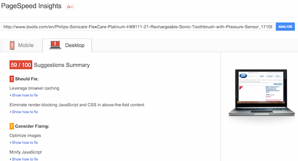
Google’s Page Speed Insights tool will help here. It shows a percentage score for speed on mobile and desktop, as well as some useful tips for improvement.
As we can see, Boots.com has some work to do to improve its product page performance.
With mobile commerce now responsible for 30-40% of total ecommerce sales, mobile optimisation is a must.
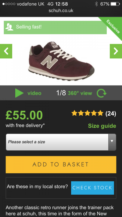
Beyond that, the challenge is to slim down the product page for mobile users while still retaining the features which make it successful.
Here Schuh’s responsive site retains the choice of images, and even manages to retain the 360 view of products.
The product name should be clear for customers and search engines, while the price should be clear.
It may seem obvious, but customers will quickly scan the page and make a judgement based on this.
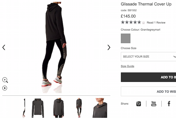
Good product imagery can really help to convert visitors into buyers.
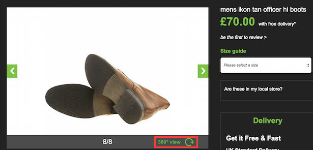
Images should show the product in its best light, and also from a range of angles.
They should answer potential customer questions about the product. For example, product pages showing shoes or boots often fail to show the soles of shoes.
It may seem a small detail but that can effect the decision to purchase. Schuh handles this with a good choice of images and a 360 view.
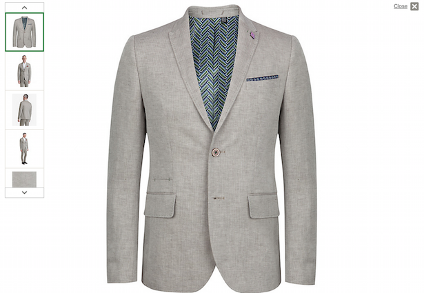
The ability to zoom in and out and see details like texture of clothing or material is very important. The zoom controls should also be intuitive.
Many sites zoom as soon as you mouse over the image, which isn’t always the best approach as it’s easy to trigger by mistake.
I like John Lewis’ approach, which allows you to zoom in from every available angle, as well as showing several different views.
Video can help to show product features in a way that static imagery can’t.
As here on ao.com, it can showcase the features and workings of a product like a washing machine:

Or it can provide an extra layer of detail which can help the customer decide. Here Sweaty Betty’s product videos are seamlessly integrated into the page.
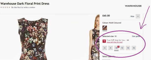
Providing a detailed size guide can ensure that customers are well-informed about the fit, which in turn minimises returns rates.
Indeed, any detail which helps the customer to find the best fit will help increase sales and minimise returns.
Here’s a good example from House of Fraser. It uses the True Fit tool to help people find the best size for them.
It takes a few minutes to enter your fitting details but, once done, the suggested size will be shown on all relevant product pages.
Little details also help, such as this information on the size and height of the model in the main image shown by ASOS.

Effective use of copy can make the product page more persuasive. Creating a sense of urgency in the customer’s mind in one way to achieve this.
Here, Booking.com uses all the tools in the book to persuade customers to act fast and book a hotel room.
We have information on how many times a room has been booked that day, a note on price trends, and a message on the second result to show that there’s just one room left.

Customer reviews can be used in many ways, but their natural home is the product page.
The presentation of product reviews should be considered carefully too. Users tend to scan pages rather than read in detail, so the key points need to be shown with this in mind.
The basic thing is to show the average review score and number of reviews near the price and product title. This information can be digested quickly and tells many people all they need to know.
The detail of reviews is normally shown further down the product page, as on ao.com.
The presentation of review information here is excellent. Those that scan the page can quickly see scores, the descriptive headlines – sturdy beast is a great way to describe a washing machine…
 There’s so much to help customers decide -the type of person leaving the review, the pros and cons, and the scores for each feature (quietness, ease of use etc).
A clear call to action is key, and should make clear the steps that users need to take to add items to their shopping basket.
Here are some general pointers:

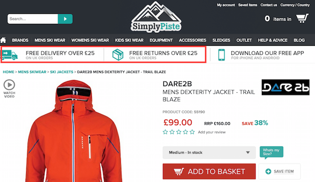
This is part of the purchase decision, so clear information on this should shown on the product page. No-one likes surprises during the checkout process.
Some sites, like Simply Piste, show this information clearly below the site header. It’s a way of using delivery and returns policies to drive sales, and also avoids the need for customers to hunt for this information.
AO.com has clear info on the page, just below the call to action. It helps when delivery options are simplified like this, but the important thing is that people can access them easily from the page.

Ideally, copy should be informative and persuasive. The use and need for persuasion will vary depending on the product, but it should be original.
So many ecommerce sites use the same manufacturer’s product description that they are less likely to rank highly in search as a result.
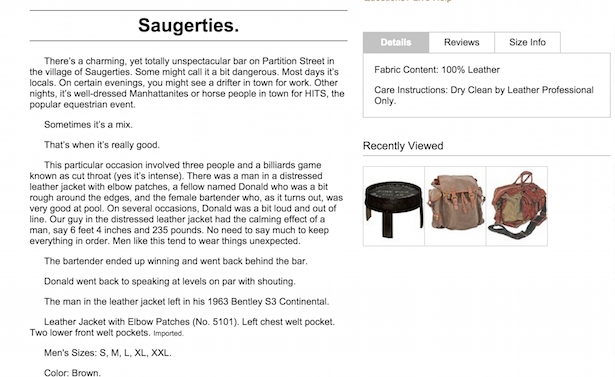
Original product copy is very important. I’ve written about it in more detail here, but here’s one of my favourite examples, from J Peterman, for a blazer.
User reviews, which I’ve already mentioned, are one form of social proof but there are other ways to use it.
Essentially, it’s about showing potential customers that other people have shopped on your site or bought the product in question, and are happy with it.
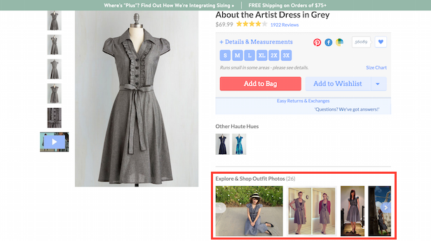
This can be achieved through reviews, number of social shares or, as Modcloth does, show images of customers wearing the very same dress.
If customers are interested in the product on the page, then related product recommendations can help to increase the average order value.
On offline example would be the range of hair slides, socks etc that you have to pass before you reach the Primark checkout.
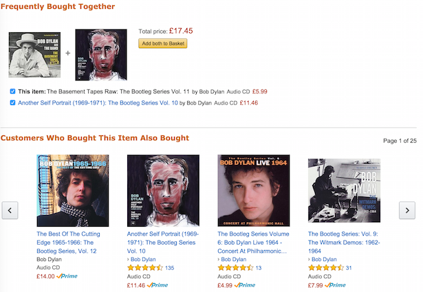
Amazon is a past master, using customer data to display ‘customers who bought this item also bought..’ suggestions.
Reserve and collect options are increasingly important for ecommerce, and the ability to check local stock availability before checkout is a major plus for customers.
Argos allows you to do this on its product pages by entering your postcode and selecting a local store.
Then, for subsequent product pages, it can tell you if items or available locally or not.

I haven’t necessarily listed every possible product page feature here. Others, such as the use of customer Q&As, options to to emailed for out of stock items, and social share buttons, are worth considering.
The features here are mainly essentials, all of which can have a real impact on sales if used well.
What other features should be added to the perfect product page? Let me know below…
Interesting article great detail on some of the things often overlooked. But surprised that you don’t put that much emphasis on product videos when they’ve been proven to dramatically reduce cart abandons, increase page dwell time and up avg order value. What are your thoughts on this?
Hi Tim, perhaps I should have said more about video, and will do in a future post. They are very valuable not only for conversions, but also for reducing returns rates. I especially like the instructional videos as used by ao.com and others.
Hi Graham, I don’t see any mention of product spec detail which is of huge importance. They not only educate customers on the features/specification, but also helps in ranking and especially person who comes with specific request is achieved only with such product detail. Product catalog is incomplete without complete product specifications.
It’s sort of there under product copy, but it probably does deserve more of a mention. I’ll update this post with suggestions at a later date.
Great detail here, Graham, and a wonderful article, but I’m surprised you didn’t spend more time on the positive contribution that nitpicky, contrarian comments revolving around the commenter’s particular hobby-horse product-page attribute didn’t feature more heavily here.
LOL!