What's the difference between UX and UI?
User interface isn’t the same as the user experience, though it’s part of it. The two terms are often confused, in part because they bleed together so much.
User interface isn’t the same as the user experience, though it’s part of it. The two terms are often confused, in part because they bleed together so much.
User interface isn’t the same as the user experience, though it’s part of it. The two terms are often confused, in part because they bleed together so much.
The best description I’ve ever heard is that user experience (UX) is what happens when you ride a horse, while user interface (UI) refers to the reins, stirrups and saddle. In other words, the things that make the experience possible and hopefully, seamless.
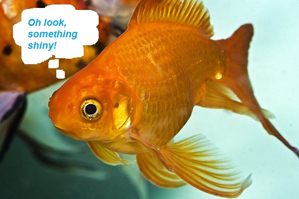
Having all the information in the world available in our pockets (or more likely, our hands) has created an age of instant gratification such that our attention spans are now shorter than those of goldfish. It’s the reason Google changed its algorithm to favor mobile-friendly sites; mobile websites were taking up to seven seconds to load, while people lose interest after five. And for nearly half of them, exiting your page because it’s taking too long means they are never coming back.
Loading time is just one of many examples of a UI element that ultimately contributes to the overall UX. With so many websites out there, if yours doesn’t give people what they want – generally, fast and easy – they simply aren’t going to bother with it. But UX can actually go beyond the experience itself and bleeds into how the experience makes people feel.
Menus and windows are important aspects of UI. Both of them tend to fall under the umbrella of visual design, which itself is an important aspect of the UX. Is your page easy to navigate or is it visually overwhelming? Is it more like the sleek Apple website or one of those supermarket circulars that are essentially a collage of coupons?
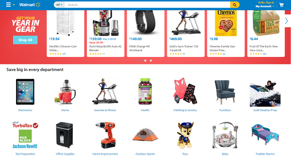
Retailers, especially those with a wide variety of products, could easily fall into that trap. Look at Walmart’s website. There is a lot going on and it’s not particularly well-organized. The line-up of “featured products” is random, ranging from body wash to a Microsoft tablet to tax software. A few scrolls below is where you can find the departments, but they’re laid out in a disorganized way and you can’t see them all without scrolling.
Bloomingdale’s does this much better. The department store condensed its many departments into a few more general departments, making it much easier to navigate. There’s no tab for “sweaters.” Instead, you click on “men,” “women,” or “kids,” and then you can find sweaters, which can then be sub-organized by things like brand, size, color, price and whether or not they’re available for in-store pick-up.

Do they take you where they’re supposed to take you, and quickly? On ClickZ, some of ours include the quote bubble that brings you to the comments of each article, or the social media icons that allow you to share them on Facebook, LinkedIn and Twitter.
An example of an exceptionally good icon is Amazon’s one-click button. How much money have you handed over to Amazon, just because they made it so easy? I subscribe to BookBub, a daily email with deals on Kindle books. I’ve bought a lot of books that way, many more than I would have if I had to first get out my card and start typing in numbers.
I don’t care enough about this particular book about the history of the Vikings to put any effort into acquiring it, but for $1.99 and one click? Sure.

Walmart, Bloomingdale’s and Amazon have product-heavy websites. It makes sense, given that the direct function of all three sites is to sell. But not every brand or vertical lends itself to e-commerce.
While Denny’s is lauded for its content – often by me in Tweets of the Week, but that’s neither here nor there – you can’t exactly go online and order a Grand Slam breakfast. The most striking UI element on the Denny’s website is the video in the background: the speed it plays, the way it loops without stopping, even the shots of the egg being cracked and the avocado being sliced.
The site exists more to sell indirectly. The UX isn’t about buying these things easily; it’s about wanting to go buy them later because this particular video makes you feel good and elicits hunger. The same applies to the icons on the homepage, which take you to watch episodes of The Grand Slams and read about the company’s social responsibility. Those two pages are designed to make you feel good by entertaining you and teaching you about the brand’s charitable endeavors.
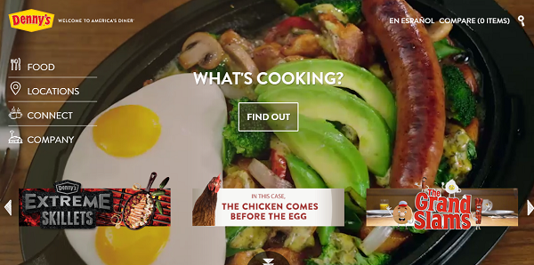
And then those good feelings are designed to translate to more direct selling the next time you’re around a Denny’s.
User experience and user interface are often mixed up. It makes sense, given the inherent crossover. The best way to think about it is as an ecosystem.
UI feeds into UX and improves it. Without UI, your UX won’t work and without UX, your UI is working for nothing.
Leave a Reply
You must be logged in to post a comment.