How to use images to bring real world credibility to your digital presence
Making your heritage, independence and expertise shine online is essential. The right image will deliver, but make sure it doesn’t impact performance and usability.
Making your heritage, independence and expertise shine online is essential. The right image will deliver, but make sure it doesn’t impact performance and usability.
We all know the importance of imagery, especially on mobile. However, the focus on icons and the fear of oversized pages has caused many designers to forget the power of pictures.
The right emotive photograph of the right proportions that loads rapidly is a fantastic way to bring your offline identity in a homogenous digital world.
In the physical world, many people love (or love the idea of) shopping in independent shops – music shops, fashion, books, surf shops, bicycles, delicatessens etc. –, eating in independent restaurants and/or staying in independent hotels. There’s some joy in their individuality, expertise, quirkiness, familiarity. However, this differentiation often fails to translate into the digital world.
This is particularly the case in retail. Too often websites are simply a list of products, often the same or similar products as can be found on plenty of other retailers… sometimes at a better price, with little (bar a logo) to express the retailer’s unique selling proposition (USP) that is so evident offline.
On the high street consumers are attracted into stores, restaurants, bars by what they see. The façade, name, logo, and any call-to-action, e.g. 50% off all helps gain attention, but mostly it is what we see inside.
This is why all shops and many other establishments have big windows. Sometimes it’s just a showcase window display, but often the window provides the opportunity to gaze into the soul and grasp the identity of the place.
It is this unique identity that most websites lack online and really lack on mobile.
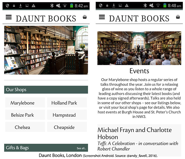
Take a look at the mobile site of Daunt Books below. That photograph of the flagship London store tells you more about this retailer than any “about” section, review or product catalogue.
It’s there: front and center, whatever the device. You don’t need to ever have visited the real store to know this isn’t Amazon, Walmart, Tesco or Barnes & Noble.
Daunt Books is not a perfect mobile experience, but it is considerably better than many independent retailers (plenty of chains also) and, with those images, it is certainly one of the most elegant.
So while we’re shopping in London, let’s visit the iconic department store Liberty. The image below shows the different experiences that greet the visitor to the physical store and to the mobile site. To find a picture of the store on the mobile site you need to look in the location tab.

Then let’s skip across the channel to Paris, to compare the gorgeous interior of Galeries Lafayette, pictured below, with its digital presence.
As you visit more sites of the world’s iconic department stores, it quickly becomes clear that they have all taken the decision to focus solely on product, with a utilitarian (though ironically not always user friendly) mobile web presence.
Try this: put your finger over the logo on any site (web or mobile), would you recognize the site? Is there anything that gives a hint of retailer’s real world physical presence, heritage or brand? Is there anything that demands: when I’m in New York, I’m going straight to this store?
Try Bergdorf Goodman, Bloomingdale’s, or any other of New York’s temples to shopping.

It seems surprising, when you have an iconic physical presence not to capitalize on it online, just to remind the customer of the heritage. But these department stores have strong brands, perhaps they feel the logo (with the look and feel of the site) is all that is required to give customers a sense of place, belonging and loyalty.
And of course, you can be sure that every retailer has conducted methodical tests to see what works best with mobile customers. Right?
But what about smaller stores, that aren’t such well-known brands?
Here’s the test.
Everybody loves a “best of” list. Best hotels in Singapore. Best restaurants in Berlin. The best surf shops in the world. Best coffee, boutique, pubs… whatever your poison.
All best of lists have a tried and tested format.
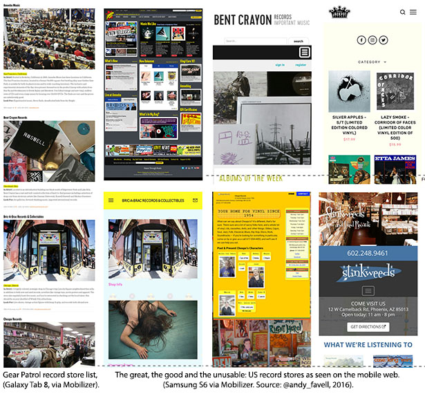
For example, take a look at: America’s 15 Greatest Independent Record Stores according to Gear Patrol. This was chosen purely at random for this test.
Record stores are great example because they look fantastic in photos, even if you are not a big fan. If you are a fan… you can almost smell the vinyl. But all sorts of outlets look great in a good photograph, inside or storefront: skateboards mountain bikes, shoes, garden nurseries, bars, restaurant, hotels… That’s why we love the tried-and-tested list format.
The question is: when you tap through to this outlet that looked so great in the physical world, do you get a mobile (or PC) experience as compelling that image? Because, let’s face it, no normal person is going to physically visit 15 record stores from San Francisco to Brooklyn; but plenty of people might indulge in a little m-commerce.
The image below shows a screenshot of our record store list on the left (a tablet view, much reduced), with screenshots from various examples, good and bad, mobile friendly and not, from the sites to which the list linked (the screenshots are taken on a Samsung S6, but iPhone 6 looks similar using Mobilizer, which is a freemium tool).
Conduct tests repeatedly on all best of lists you can find. You can use directory services such as Yelp or TripAdvisor, but these are less fun or interesting than random curated lists.
The test:
Arguably it is even more important to capture the essence of your physical presence, if mobile (and digital) is a vehicle to drive and/or pay for visits to your business in the real world.
If you are in the any of the following kinds of businesses, it’s not just a very good idea, it is, arguably, an imperative to use powerful, compelling imagery:
Not only do customers need to know what they are committing to/purchasing, i.e. is it their sort of place, people, good time; but also what the place actually looks like, so they can find it.
The following image shows four mobile experiences for the first five featured on Top 10 Museums and Galleries according to National Geographic. Two of the five, Le Louvre, Paris, France; and The Acropolis Museum, Athens, Greece (not pictured) lacked a mobile-friendly presence.
The homepages of The Smithsonian Institution, Washington, D.C. USA; State Hermitage, St. Petersburg, Russia; and The British Museum, London, England all suggest quite different approaches to mobile – including use of imagery.

Now let’s look at hotels:
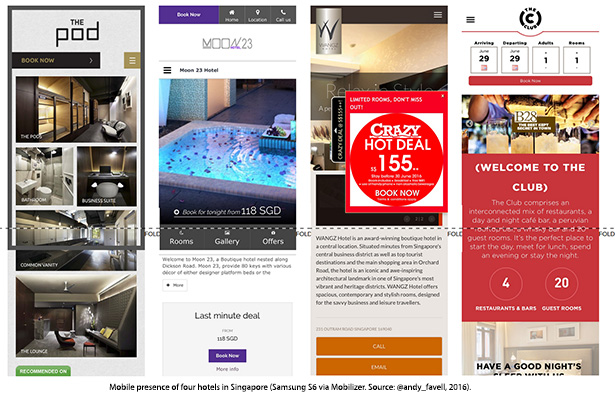
The following image shows the four results randomly chosen from Top 10 good-value hotels in Singapore according to The Guardian.
The images are iPhone 6 screenshots using Mobilizer. While all sites appeared to be mobile-friendly, Mobilizer found some of the sites slow to load and other sites on the Guardian list impossible to load. This may indicate some usability issues, which may or may not be caused by the images used.
A quick test of the four museum sites highlighted above using the excellent WebPagetest revealed that the best performer over a mobile network (at the time of the test) was the homepage of The Smithsonian. Looking at the images you might guess that, but the other results were less predictable.
With the exception of Smithsonian, the WebPagetest results suggested that one of the issues was images and suggested compressing the images should improve performance for all three.
Images will always come at a small cost when it comes to performance on a mobile network. It is essential to test your site to check that images are not causing unnecessary delay to page load. Consumers are becoming increasingly intolerant of slow mobile sites, so you must take measures to identify and reduce performance lag.
It is absolutely imperative that you test. Read this guide to testing the mobile-friendliness and performance of your site.
The following tools will help expose any issues, including image problems:
It is absolutely imperative that you also user test to establish if your imagery works with the users and if it justifies any latency in page performance. Read this guide to how to user test.
Among other measures, you should:
This is Part 24 of the ClickZ ‘DNA of mobile-friendly web’ series.
Here are the recent ones:
Read the report: DNA of a Great M-Commerce Site Part 1: Planning
Leave a Reply
You must be logged in to post a comment.