Which mobile fashion retail app has the best UX?
Mobile commerce apps are constantly evolving to cater to increasing consumer demand and simplify user journeys - and we're here to inform you which brands are keeping up, and falling behind.
Mobile commerce apps are constantly evolving to cater to increasing consumer demand and simplify user journeys - and we're here to inform you which brands are keeping up, and falling behind.
Mobile commerce apps are constantly evolving to cater to increasing consumer demand and simplify user journeys – and we’re here to inform you which brands are keeping up, and falling behind.
Navigating through five fashion retailer mobile commerce apps, I’ve tried to find and buy the same item on each app: a winter coat.
As I map my journey, I’m looking for:
Here goes…
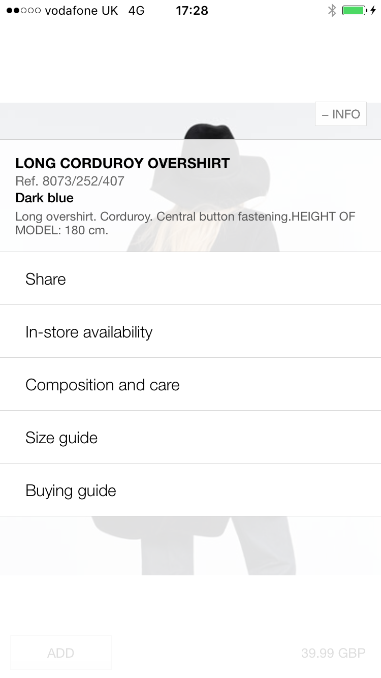
ASOS

I’m a regular user of the Asos app, because it’s well designed and super easy to navigate.
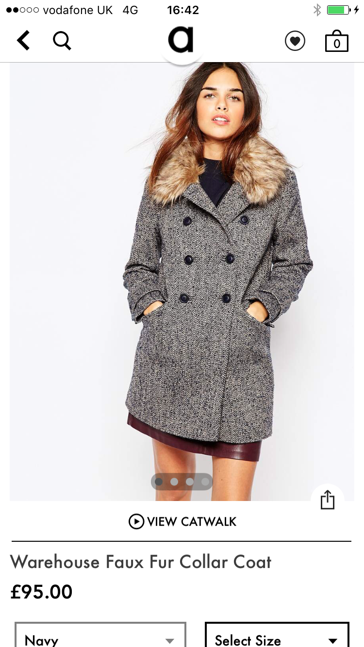
Product pages are simple but effective: images and prices are clear, and there are several images to scroll through.
Images are very important, and people need to see a range of images to help them makes a decision to buy. Just because it’s a mobile site or app, doesn’t mean customers have lesser expectations.

What I love about the app is the in-app catwalk feature: a video of a model wearing the clothes. In addition to a range of images, video helps to showcase products more effectively. And it helps to convert.
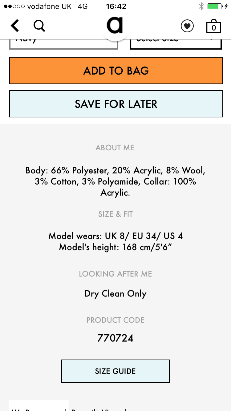
Under the image of my coat, Asos details more about the item, including care, sizes, and product codes – and, as well as the handy heart icon (which saves your items), there is also a save for later button. It does the same thing as the heart icon – but is under a particular item.
One thing I have noticed using this app is that when I sign in and save items on the app, then move over to desktop and sign in, the items disappear.
Many users may prefer to browse on an app, but checkout on a laptop or PC, so saving wishlists and basket contents can help these multichannel shoppers.
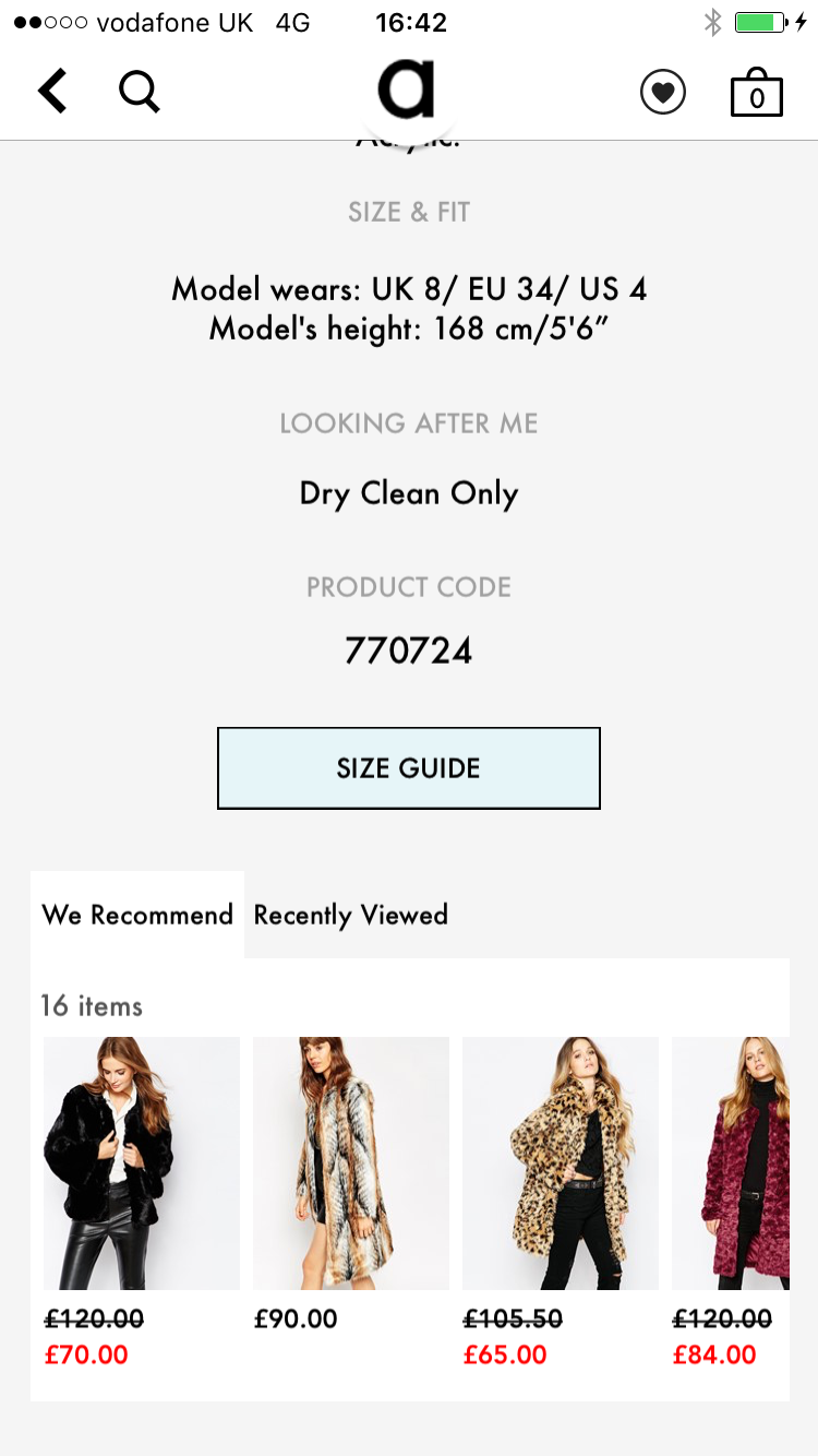
Under each item is recommended items, encouraging more navigation through the app.

There is a smooth transition from ‘saved items’ to the actual shopping bag, where certain items can be selected to move to the next process.

Unlike any of the other apps we looked at, ASOS has a touch ID checkout, which makes payments smoother and faster, and sets it apart from its website.
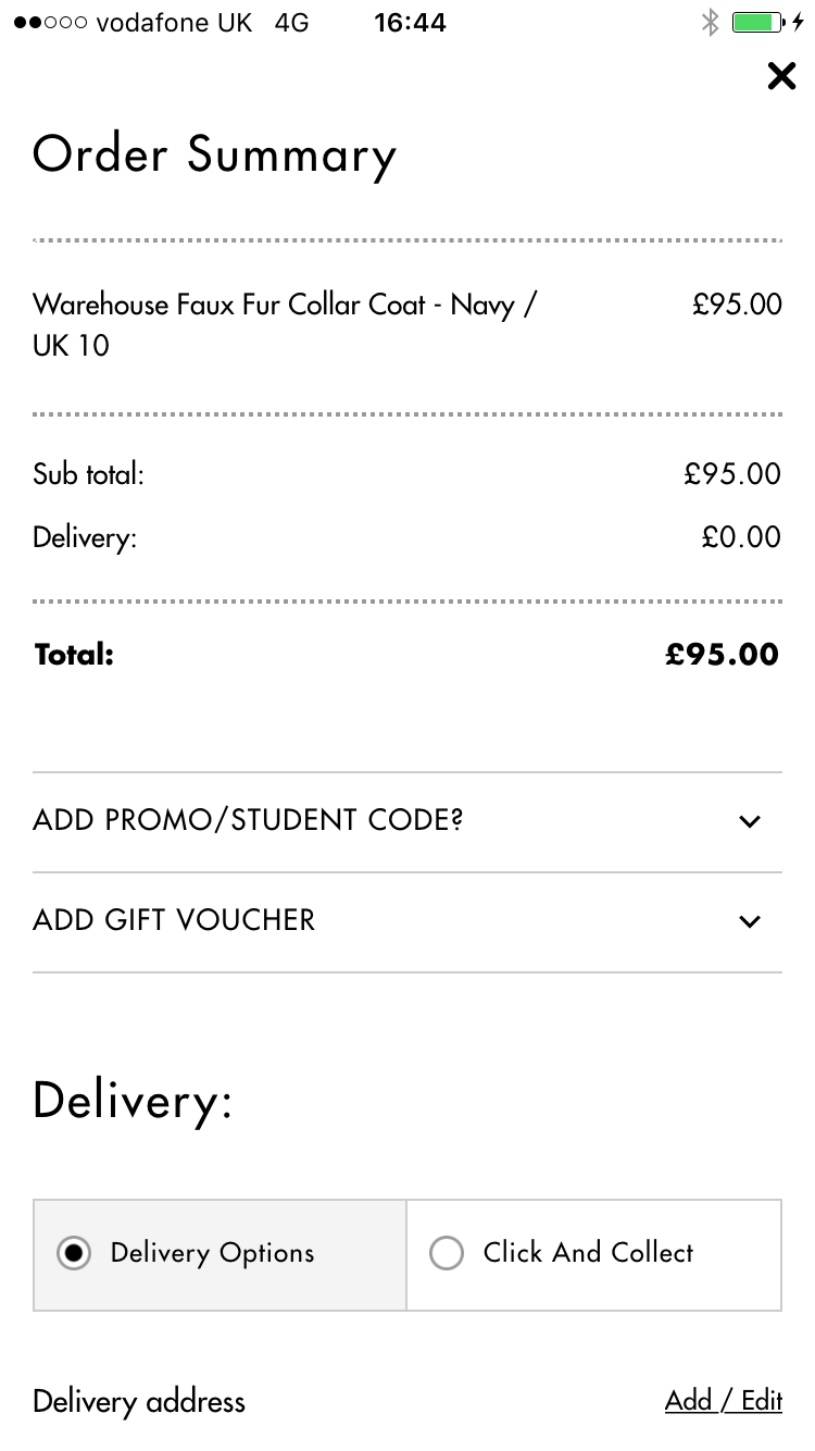
There is also a Click and Collect option and….

…a large range of delivery options.

However, clicking on delivery and customer care information takes users outside of the app to the mobile web page.
This disrupts the user’s experience and opens up the risk that they may not return to the app to complete their purchase.
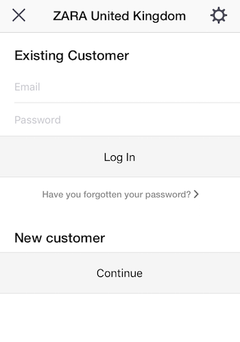
Another problem for the app is its approach towards new users. If you’re not signed in and try to add an item to your shopping bag, you get this message:
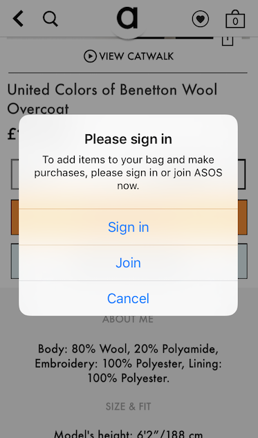
This is quite an interruption for the user, and something ASOS doesn’t (and probably wouldn’t) do on its mobile or desktop sites.
It clearly calculates that the app will be downloaded by existing users in the main, though this is something could deter new customers.
NEXT
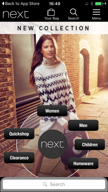
The next app’s main menu is circular, with the options spaced out in a strange, unequal manner. It isn’t the easiest navigational method.
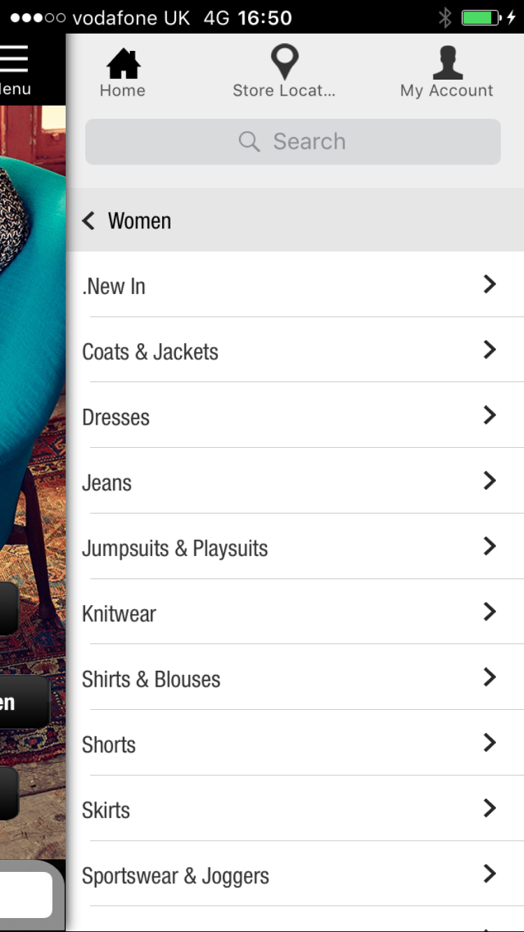
But once you click on ‘women’, there is a clear sidebar menu, similar to that of Asos.
One thing retailers need to be aware of on mobile sites and apps is text size and spacing between links, to avoid users clicking on the wrong link. Here, Next could make it easier.

Next’s product category menu is clunkier, and shows no info apart from price and customer review score. It could use this page more effectively.

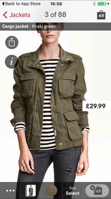
I’m going to buy this Jacket. Unlike Asos, it appears there isn’t an option to save and buy later. There is just an option to add to bag.
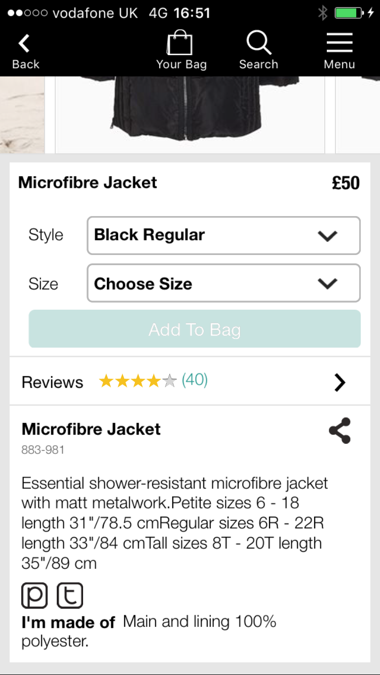
It’s great that Next makes customer reviews available, as well as detailed product information such as material and sizing.

If I didn’t want to buy the coat online, the app uses location services to find your nearest store.
Unlike some retailers like Argos and Schuh though, Next doesn’t allow users to check stock locally.
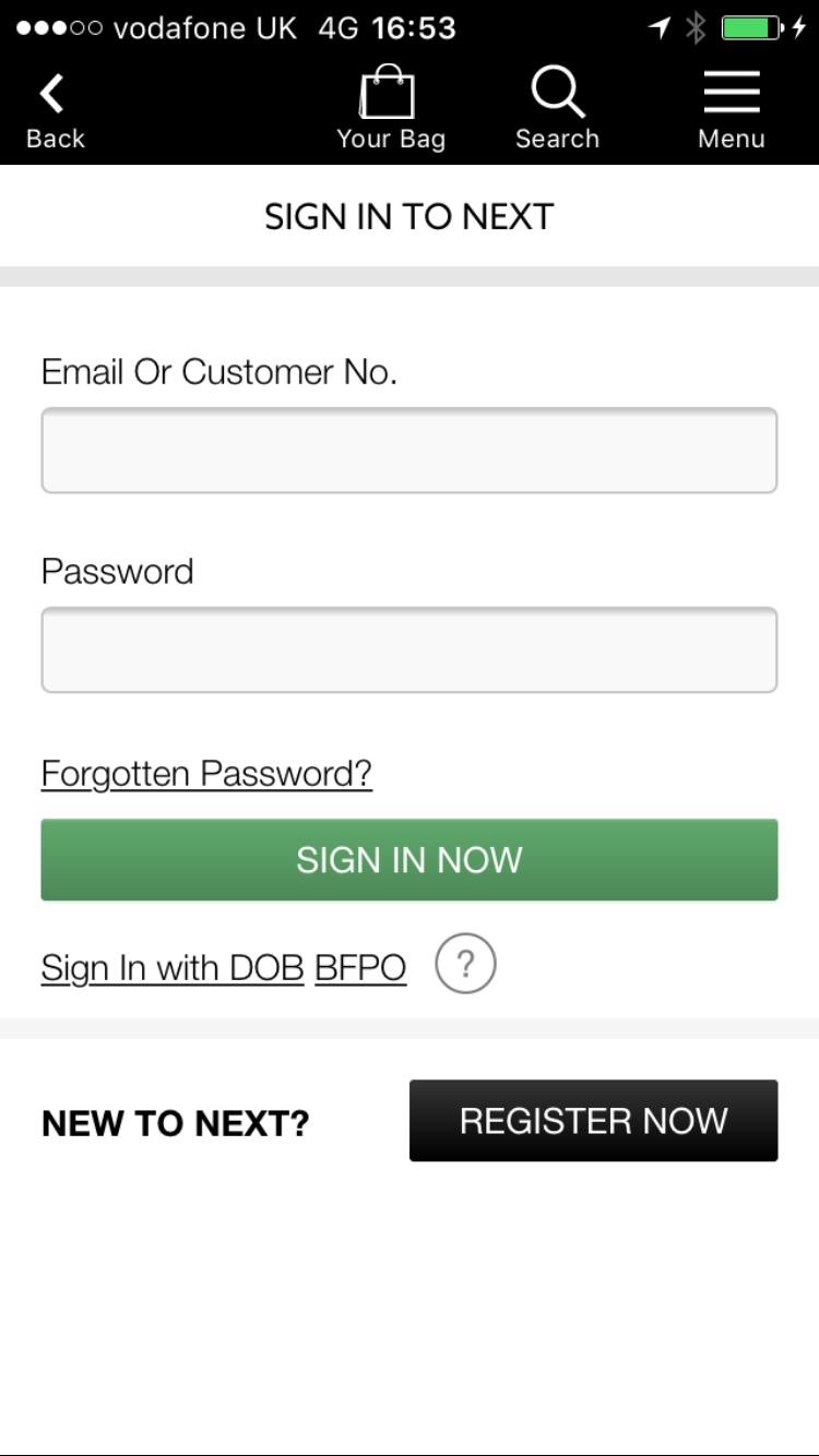
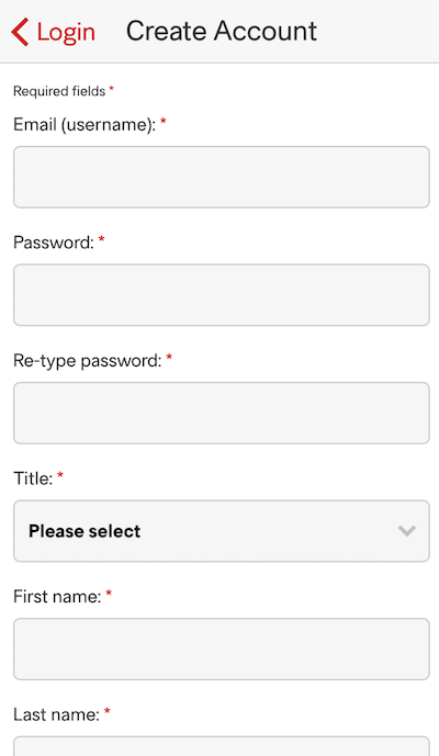
To complete my purchase, I have to create an account, which I don’t want to do because I want to buy the item as quickly as possible.
Next operates a credit account model, but it should provide shoppers with the option to make a purchase as a guest. I’m abandoning my coat!
This is similar to the registration issues on the Boots site. Registration is a barrier to purchase which slows shoppers down. Mobile sites and apps already convert at a lower rate than desktop, and obstacles like this don’t help at all.
H&M
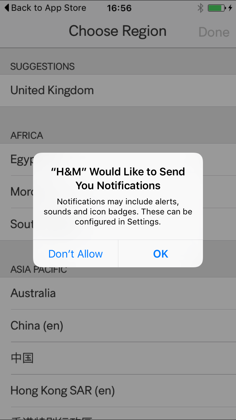
To use H&M’s app, customers must first specify location. Immediately, H&M encourages users to turn on notifications – an option that is missing from other apps.

The app caters to an international customer base, and changes its products and shipping info accordingly.
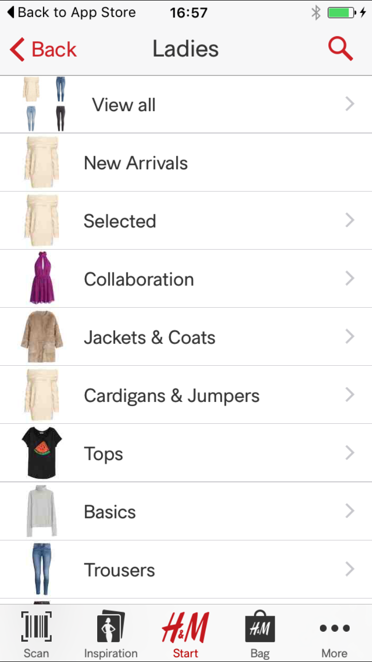
The menu features small images which haven’t been selected carefully – there is the same image used for ‘cardigans & jumpers’, ‘selected’, and ‘new arrivals’.

H&M has a barcode scanner, which helps in-store shoppers to see more details online. A nice touch.
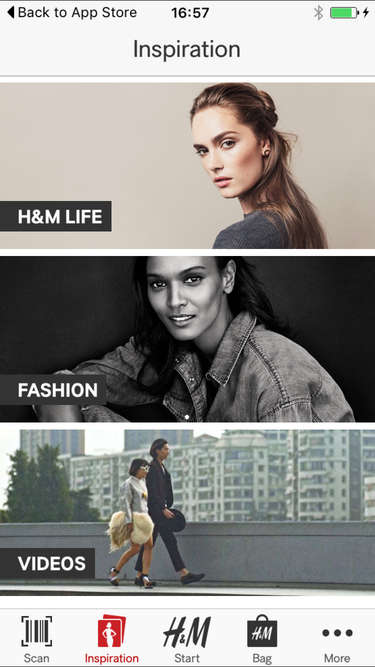
H&M, unlike other retailer apps I’ve looked at, pushes out great content. There is a whole inspiration section that features videos, fashion, and lifestyle pieces.

My H&M logs user activity, and has an inbox: features which are not available on the desktop site. This is clearly catering for existing customers.
Using location services, the app also tells me my nearest stores in miles.
Product images are larger on H&M’s app than others, and the pictures are great quality.

Underneath each product are corresponding items and clear prices.
On all other apps, scrolling from right to left revealed more pictures of the same item. On the H&M app, this action takes you to other products in the same category, which isn’t great.

Back to my coat. There isn’t an option to save items, so I’ve added it to my bag, where the item is clearly listed with an image and product information.
H&M makes the same mistake as Next though: asking users to register before they can checkout.
Registration is a pain on a mobile device, users don’t like it, and H&M will be losing sales as a result.
ZARA
Zara’s app provides product scanning and location services, as well as a centralised account.

The interface is super easy to navigate, with clear product info and menus.


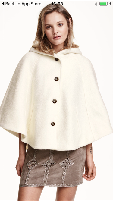
Zara’s photographs are impressive. The product is modelled from every angle on an actual person.
On other apps, there is a front view, and then the rest of the images are photos of the product.
There are options to share Zara’s products on social media, as well as find out availability in store.
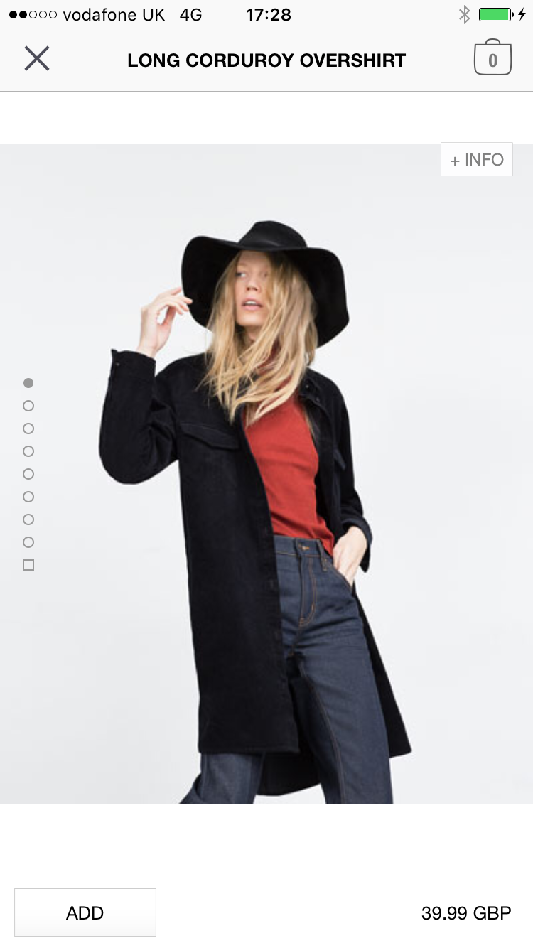
Zara makes checkout easier for new customers, just sending them straight into the process rather than insisting on account creation.
Customers will enter 95% of the information required to create an account as they checkout – email, address, card details – it’s just a matter of asking them to create a password at the end of the checkout process.
In summary
All these apps contain some useful features, and navigation is generally easy to use, while product pages show imagery and information effectively.
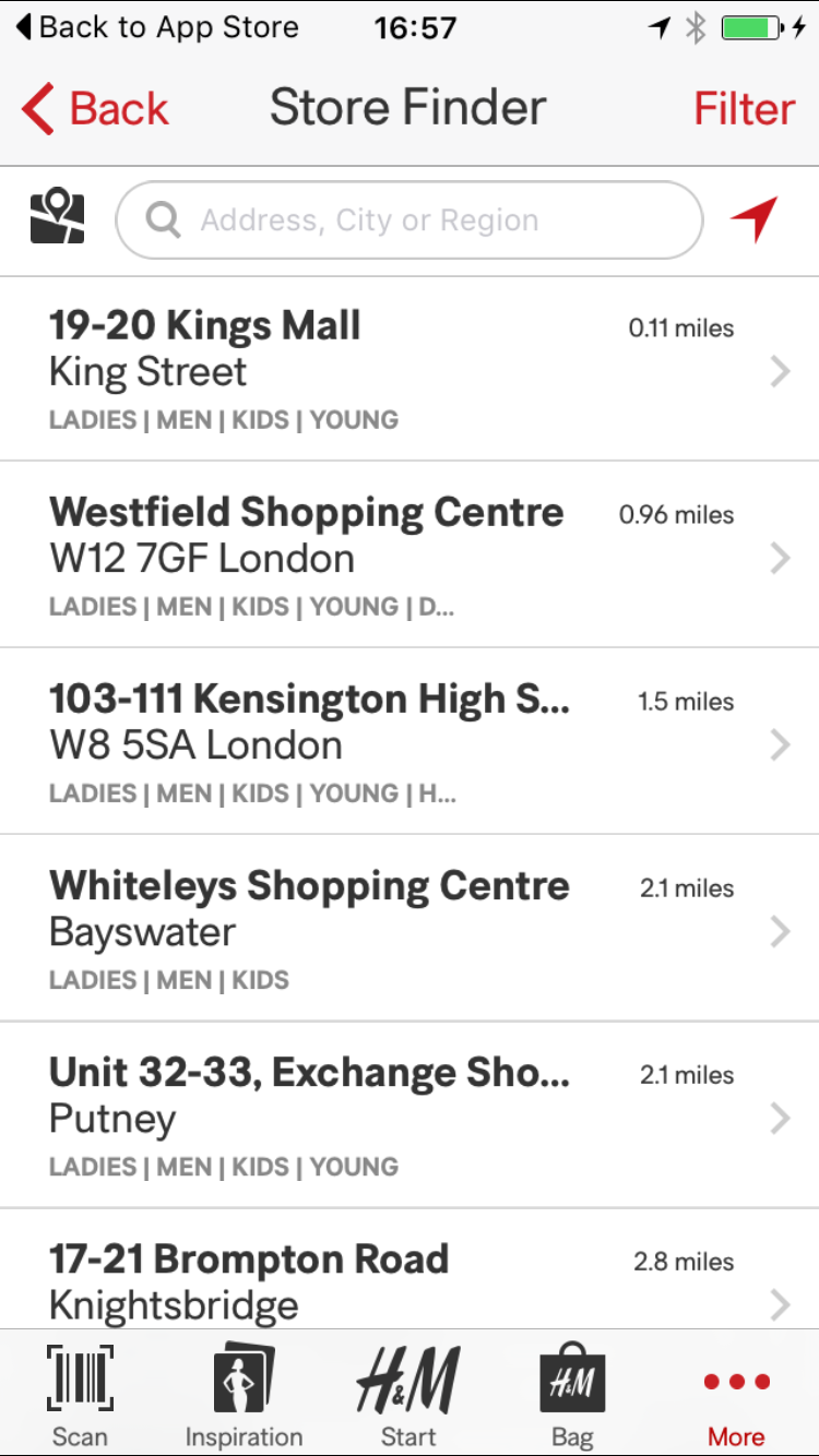
Some are better than others on location and offline shopping features. The ideal app would have a barcode scanner for in-store use, and the ability to check and reserve stock at local stores (obviously ASOS can’t do this).
H&M and Zara do well with barcode scanners, but I’d like to see more retailers adding reserve and collect where possible.
Checkout is crucial on mobile. Retailers need to realise that this is a major point of friction in mobile commerce and make it as easy as possible.
This means avoiding unnecessary barriers and allowing those that prefer to pay on desktop to save items for later.
One caveat here is that mobile apps are generally considered more of a retention tool for existing customers who may already have accounts and would therefore not resent having to sign in.
Indeed, for those with saved payment and address details, checkout can be much easier.
If I had to choose one, the ASOS app provides the best user experience, though it helps if you’re already registered…
Leave a Reply
You must be logged in to post a comment.